Download
1 / 5
50 likes | 119 Vues
Let's see how one can fix the issues that make a website look annoying.

E N D
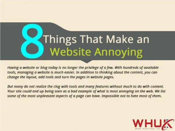
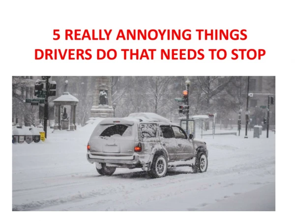
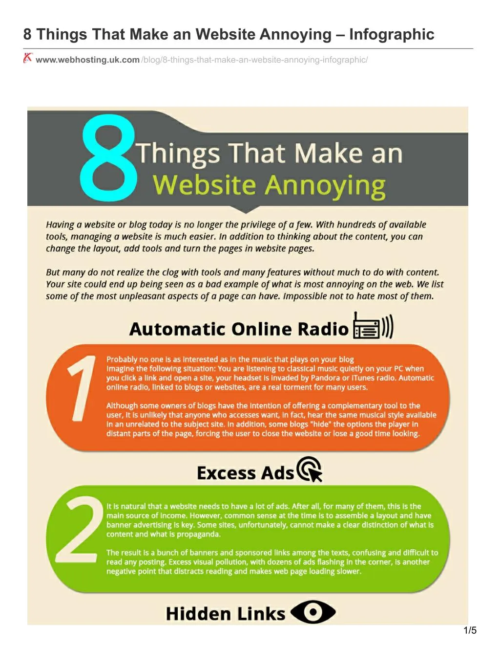
8 Things That Make an Website Annoying – Infographic www.webhosting.uk.com/blog/8-things-that-make-an-website-annoying-infographic/ 1/5
Having a website or blog today is no longer the privilege of a few. With hundreds of available tools, managing a website is much easier. In addition to thinking about the content, you can change the layout, add tools and turn the pages in website pages. But many do not realize the clog with tools and many features without much to do with content. Your site could end up being seen as a bad example of what is most annoying on the web. We list some of the most unpleasant aspects of a page can have. Impossible not to hate most of them. Automatic Online Radio Probably no one is as interested as in the music that plays on your blog. Imagine the following situation: You are listening to classical music quietly on your PC when you click a link and open a site, your headset is invaded by pandora or itunes radio. Automatic online radio, linked to blogs or websites, are a real torment for many users. Although some owners of blogs have the intention of offering a complementary tool to the user, it is unlikely that anyone who accesses want, in fact, hear the same musical style available in an unrelated to the subject site. In 3/5
addition, some blogs “hide” the options the player in distant parts of the page, forcing the user to close the website or lose a good time looking. Excess ads It is natural that a website needs to have a lot of ads. After all, for many of them, this is the main source of income. However, common sense at the time is to assemble a layout and have banner advertising is key. Some sites, unfortunately, cannot make a clear distinction of what is content and what is propaganda. The result is a bunch of banners and sponsored links among the texts, confusing and difficult to read any posting. Excess visual pollution, with dozens of ads flashing in the corner, is another negative point, that distracts reading and makes web page loading slower. Hidden links There is nothing more frustrating than getting into a site to download and you cannot even find a link. Problems like this are unfortunately very common. Many sites make money when the user clicks on contextual ad and to enhance that possibility, end up choosing the wrong alternative to confuse the user. So download links are replaced by sponsored links and what you really want to end up staying in the background. Even after much searching, in some cases, you will see that the page is there only for indexing in Google, without providing any useful link for the visitor. Obligation to register You found a headline that caught your attention, but clicking on the link discovers that it takes to make a register to be able to read it. Lack of agility and compulsory registration forms do not match the interest. Even when you choose to placing the order, the user ends up being directed to other pages and loses the original link of the news. In addition, cause the user to sign in multiple sites only increases the amount of necessary logins and passwords to be memorized. A positive point is to allow the possibility of login from a social network such as Facebook or Twitter. Popups As mentioned above, ads are the main source of income from a site. However, aggressively throwing them in the eyes of users have the opposite effect, preventing the click person or sympathize with propaganda. In this aspect, the popups are uncomfortable champions, forcing the user to click to close them or wait for the end of an animation. Not always the close button is clear and available. In some cases, you need to really wait for the display of the ad. When trying to close it, the accidental clicks, which open new pages and tabs or take the user to another link who was really interested in analyzing the page are common. Copied content Be original. Nobody likes to read a newspaper with news that was published several days ago. The web is no different. Just copy content from major portals do not take anyone anywhere. In some cases, when the author does not identify the original source of text, the problem is even worse and many users are led to believe that, in fact, the information came there. For those who research specific topics, find posts repeated to exhaustion in search engines is already a routine task. When in doubt, the best solution is to choose the links of sites that have greater credibility. This ensures that you will read the story in full and with proper details. 4/5
Integration with dozens of social networks Embed a site with social networks is critical. Thanks to them, you can extend the display options of content and ensure new visitors. However, we must be careful and watch a good sense of limit. Some blogs offer integration with dozens of social networks, which ends up confusing the lives of those who use only the main ones. Consider the following maximum adopted by Apple: “less is more”. Choose only those social networks that are really meaningful to you. Provide integration with more than five of them already is an exaggeration that most confuses rather than helps. Mirrors in downloads links You may have tried to download a particular content in any site and when clicked on the download link, saw that, instead of downloading anything, it was redirected elsewhere. Sites with mirrored links with opening secondary windows or requiring the user to register a mobile phone number are common. The solution, of course, pleases no one. Many users give up half way and others who choose to register several times just running out the download link. And there’s nothing more annoying than having a frustrated user experience. It is likely that this be your first and last visit on the site in question. What other problems make you angry when browsing the internet? What are the aspects that displease you when you visit a website? Join leaving your opinion in the comments. 5/5