Download
1 / 3
30 likes | 35 Vues
Businesses can make their website mobile friendly and easily accessible across all devices with the help of responsive web design services. To improve your sales and attract more customers, here is a list of tips to make your website a responsive one. <br>

E N D
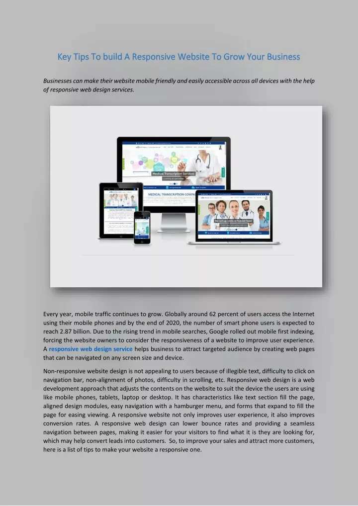
Key Tips To build A Responsive Website To Grow Your Business Key Tips To build A Responsive Website To Grow Your Business Businesses can make their website mobile friendly and easily accessible across all devices with the help of responsive web design services. Every year, mobile traffic continues to grow. Globally around 62 percent of users access the Internet using their mobile phones and by the end of 2020, the number of smart phone users is expected to reach 2.87 billion. Due to the rising trend in mobile searches, Google rolled out mobile first indexing, forcing the website owners to consider the responsiveness of a website to improve user experience. A responsive web design service helps business to attract targeted audience by creating web pages that can be navigated on any screen size and device. Non-responsive website design is not appealing to users because of illegible text, difficulty to click on navigation bar, non-alignment of photos, difficulty in scrolling, etc. Responsive web design is a web development approach that adjusts the contents on the website to suit the device the users are using like mobile phones, tablets, laptop or desktop. It has characteristics like text section fill the page, aligned design modules, easy navigation with a hamburger menu, and forms that expand to fill the page for easing viewing. A responsive website not only improves user experience, it also improves conversion rates. A responsive web design can lower bounce rates and providing a seamless navigation between pages, making it easier for your visitors to find what it is they are looking for, which may help convert leads into customers. So, to improve your sales and attract more customers, here is a list of tips to make your website a responsive one.
Test your website: Find out whether your website is responsive by testing each element. Test your website on a responsive design tool to know how it performs on different devices. There are several tools such as Google’s Mobile Friendly Tool, Cross Browser Tool, Google Resizer, and Am I Responsive that let you know how your website looks on various devices. Find the elements that are not responsive and fix them: Once you have tested your website on a responsive design tool, identify which site elements are not responsive. After identifying the responsive and non-responsive elements, fix the non-responsive elements. Some of the important elements that you should check include navigation bar, images, fonts, forms and buttons. Check site speed on different devices: The next step is to check the loading speed of your web page. Quick loading speed means lower bounce rates. Up to 83 percent of users expect the page to load in just three seconds, irrespective of the device they are using. Some of the factors that can slow down the page load speed are: images are not concise, many heavy elements like video, cluttered code, and non-responsive site elements. Tools like Google’s Page Speed Insight can help identify the reason for slow page loading speed and you can optimize page speed with the help of SEO services. Consider finger taps: Different users look at your website using different devices and they use different items to tap on your site elements, like a finger or a stylus. Consider how your site elements respond to those different options to ensure that it provides a great experience for whatever “tapping device” a site visitor uses. Things to consider include: •Button should be big enough for stylus on tablets and finger tips on smart phones •Ease of tapping on the navigation bar for any device •Ease of filling up forms using fingertip or a stylus Check your web navigation: Responsive web design will have hamburger menu style navigation instead of spanning along the top of the page. This prevents the need for zooming in on your navigation bar to see the options. Providing an easy navigation experience that works on all devices is important website because navigation acts as roadmap for your users to find what they want. Poor navigation can lead to higher bounce rates. The pop-ups should be responsive: Once you assure that all your website element are responsive, the next step is to make your pop-ups responsive. Pop-ups usually come up as a result of an actions like leaving the website, staying on the home page for a certain amount of time, clicking on specific link, etc. These pop-ups could provide a special offer for users to sign in. So making your pop-ups responsive is important to make it easier for users to sign in.
Make your website appealing across all devices: Ensure that your responsive web design looks appealing on all devices. When you design a site specifically for desktop, it can be difficult to make your site elements look good on other devices like smartphones and tablets. Check on items such as: •Images don’t take up too much space •Menus are not cut off •Properly formatted images and description •Bullets are correctly formatted •Forms are aesthetically placed and effective too •Proper rendering of service lists •Well organized shopping carts that are easy to use Considering all these elements in a website is important because it takes only 50 milliseconds for user to form an opinion about your website. Check your website as site visitor: Once your web design has become fully responsive, the next step is to audit the website. Check your website to make sure that you didn’t miss any responsive design elements. For example •Test every step of submitting a form •Test every step of purchasing a product •Test navigation bar links •Test different areas of your site like your blog and your product pages Business can hire responsive web design services to make their website design mobile friendly and easily accessible across all devices. With responsive web design, all content and pages become flexible across all screen sizes and devices. Responsive web design means your user can read and navigate the site with minimum resizing and scrolling. Responsive web design and mobile-first indexing are important ranking factors too. Sites that are responsive will generally load faster which is likely to boost your ranking and decrease your bounce rate. It also makes social sharing easier, helping you to grow a bigger audience for your brand. (631) 494-3324