Download
1 / 4
40 likes | 341 Vues
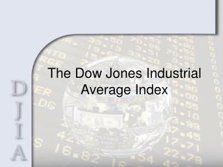
The graph below shows the data in blue as it happened and the data in red, as it should have happened. The blue graph shows the monthly averages. It can be observed the investment aberration of the late 1920's, then the same after WWII until 1966. Then it shows the deflated bubble back to normal in the 1970's and again a bubble behavior since the 1980's..

E N D
1. Analysis of the Dow Jones Index since 1900 The following graphics analyze the data under the light of recent investment bubbles, to make a prediction of the value of the Stock Market in the next decade.
3. The graphs below show the same Dow Jones values since 1900 plotted in a semi-logarithmic scale as they happened, in blue, then as they should have happened, in green, and finally the yearly P/E ratio since 1928, in red. The correlation between the bubbles and P/E ratios over a value of 10, is obvious.
4. Comments The analysis of the data offered in the previous graphs is entirely based on my own interpretation methods of the Real Estate bubbles (see my Real Estate Bubble analysis). Those interpretation methods (for the Real Estate bubbles) seem to be applicable to the Dow Jones, when sufficient number of years are studied in a single graph.
After the stock market bubble and subsequent adjustment of the 1925-1935 period, came a generally non-bubble behavior that lasted until the late 1940�s. (Exception made of a brief surge and fall in 1936)
Then the exuberance of the post-war era seems to have taken hold of the investors, creating a bubble that lasted from the late 1940�s until about 1966, when the Viet Nam era seems to have suffocated the American confidence.
From that point on, a flat market behavior allowed inflation to catch-up with the Dow, which occurred in the late 1970�s.
Then the market behaved for a few years in a non-bubble fashion, just riding the inflation, until the early 1980�s.
From the early 1980�s to the present, the market has behaved as a bubble, with its ups and down, but always a bubble.
What I can foresee, based on the highly predictable behavior of the Real Estate bubbles, is a drop from the current value of nearly 10,000 points. If the adjustment were to occur right now, the new value would have to be about 4,000 points. Since the adjustment is more likely to occur along the next decade, the probable readjusted value would be around 6,000 points.
This prediction is in keeping with the progressive decay of the American entrepreneurial spirit in the hands of governmental interventionism and also in keeping with the rise of China and India as emerging substitute powers.
It is important to point out that the Stock Market is always riding atop inflation, but if an inflationary debacle of the dollar were to take place, driving the value of the stock market sky-high, we would still have a deflating bubble riding atop an inflationary surge. The net effect would be exactly the same, the recognition that the American industry is really worth today about half of what it is currently valued at.
Eduardo Paris
Florida, December 2009