Download

1 / 3
30 likes | 69 Vues
Power Bi Dashboard serve as powerful tools for data visualization and decision-making in various industries. An effective dashboard not only presents information in a clear and concise manner but also offers an intuitive and visually appealing user interface (UI) design. In this article, we will explore seven essential tips for creating compelling Dashboard UI Design that enhance user experience and enable users to derive valuable insights effortlessly.<br>

E N D
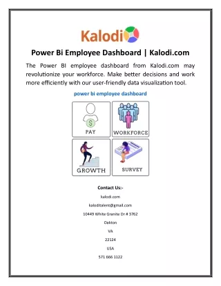
7 Essential Tips for Our Most E?ective Power Bi Dashboard Power Bi Dashboard serve as powerful tools for data visualization and decision-making in various industries. An effective dashboard not only presents information in a clear and concise manner but also offers an intuitive and visually appealing user interface (UI) design. In this article, we will explore seven essential tips for creating compelling Dashboard UI Design that enhance user experience and enable users to derive valuable insights effortlessly. ● Prioritize Data Relevance and Hierarchy The first step in designing a successful dashboard UI is to prioritize data relevance and hierarchy. Identify the key metrics and information that are crucial for your users and place them prominently. Organize the dashboard in a hierarchical manner, emphasizing the most important data at the top or center. Use visual cues such as size, color, and positioning to guide users' attention to the most critical information. By focusing on data relevance and
hierarchy, you can ensure that users quickly grasp the key insights without being overwhelmed by unnecessary details. ● Use Consistent and Intuitive Visual Elements Consistency and intuitiveness are key factors in software dashboard UI design. Use a consistent visual language throughout the dashboard to maintain a cohesive and unified experience. Ensure that fonts, colors, icons, and other visual elements are consistent across different sections of the dashboard. Intuitive navigation and labelling are also crucial. Users should be able to navigate through the dashboard effortlessly and understand the purpose of each element without confusion. Adopting industry-standard conventions for icons and labels can enhance familiarity and usability. This is where you should pick the best dashboard template. ● Embrace White Space White space, also known as negative space, plays a vital role in Dashboard software UI. By incorporating ample white space around elements, you create a clean and uncluttered visual environment. White space helps separate different sections, making it easier for users to focus on individual components and avoid visual overload. It improves readability, highlights important data, and enhances overall aesthetics. Embracing white space also provides room for scalability and future additions to the dashboard without sacrificing clarity and usability. ● Leverage Data Visualization Techniques Data visualization is at the core of software dashboard UI. Utilize appropriate data visualization techniques to present complex information in a visually engaging and easily understandable manner. Choose the right charts, graphs, and diagrams that best represent the data being conveyed. Consider the context and purpose of the dashboard to determine the most effective visualization methods. Use color coding, labels, and tooltips to provide additional context and insights. Well-designed visualizations can help users interpret data quickly, identify trends, and make informed decisions. ● Ensure Responsiveness and Compatibility In today's multi-device landscape, it is crucial to design responsive Software Dashboard that adapt to different screen sizes and resolutions. Users may access the dashboard from desktops, laptops, tablets, or smartphones. Ensure that the dashboard UI design is responsive and maintains its usability and visual integrity across devices. Test the Dashboard UI Design on various screen sizes and platforms to ensure compatibility and responsiveness. Adaptive layouts, fluid grids, and flexible elements are essential to deliver a consistent experience and enable users to access critical information on the go. You can take a look at Bootstrap Admin Template examples for inspiration. ● Provide Customization and Personalization Options Different users have varying preferences and needs when it comes to data visualization. Offering customization and personalization options within the Software Dashboard UI design can greatly enhance user satisfaction and engagement. Allow users to select the
types of data they want to view, customize the layout, and set their own preferences. Provide interactive elements such as filters, search functionalities, and drill-down capabilities that enable users to delve deeper into the data based on their specific requirements. Customization empowers users to tailor the dashboard to their unique needs, making it more valuable and user centric. ● Conduct User Testing and Iteration Lastly, user testing and iteration are critical steps in dashboard software UI design. Gather feedback from users and conduct usability testing to identify pain points and areas for improvement. Observe how users interact with the dashboard, identify any confusion or difficulties they encounter, and make necessary adjustments. Iterate on the design based on user feedback to refine the UI and enhance user experience continuously. User-centric design principles, such as user testing and iteration, ensure that the dashboard meets the specific needs of its target audience and remains relevant over time. Final words Designing an effective Power Bi Dashboard careful consideration of data relevance, visual elements, responsiveness, and user preferences. By following these seven essential tips, you can create a compelling dashboard. It can empower users to make informed decisions and extract valuable insights from complex data sets.