Download
1 / 3
0 likes | 16 Vues
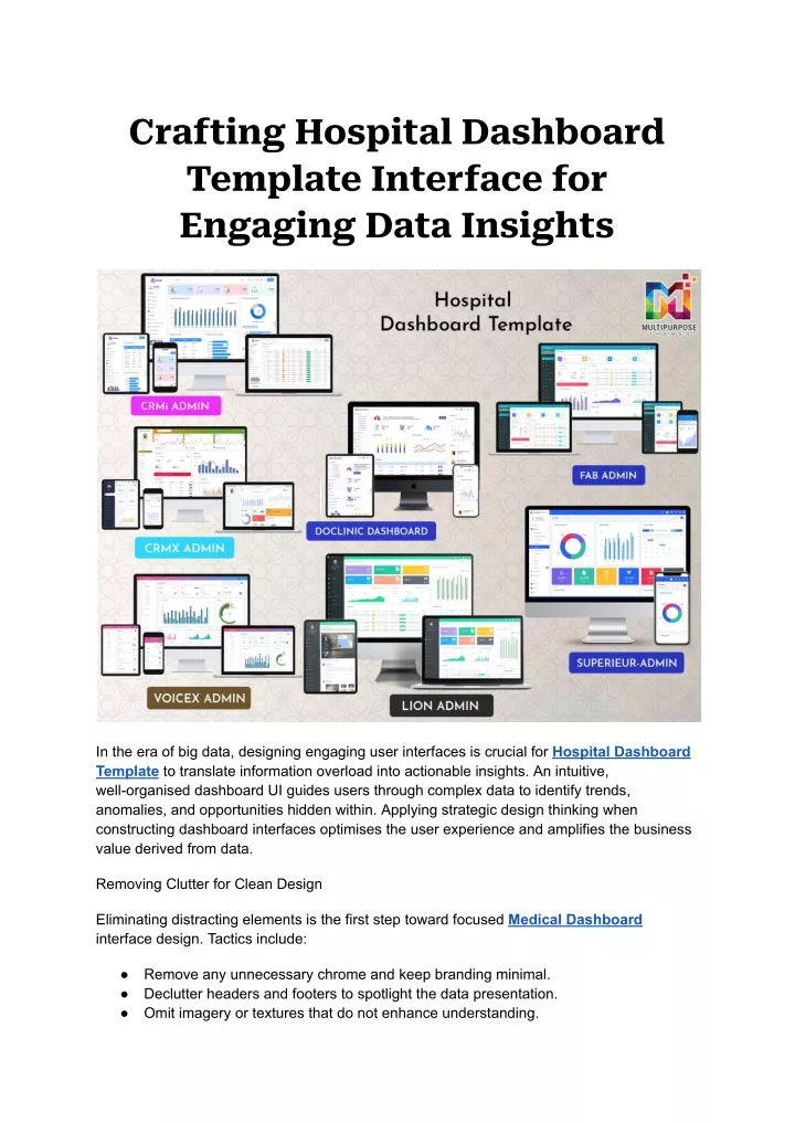
In the era of big data, designing engaging user interfaces is crucial for Hospital Dashboard Template to translate information overload into actionable insights. An intuitive, well-organized dashboard UI guides users through complex data to identify trends, anomalies, and opportunities hidden within. Applying strategic design thinking when constructing dashboard interfaces optimizes the user experience and amplifies the business value derived from data.<br><br>

E N D
Crafting Hospital Dashboard Template Interface for Engaging Data Insights In the era of big data, designing engaging user interfaces is crucial for Hospital Dashboard Template to translate information overload into actionable insights. An intuitive, well-organised dashboard UI guides users through complex data to identify trends, anomalies, and opportunities hidden within. Applying strategic design thinking when constructing dashboard interfaces optimises the user experience and amplifies the business value derived from data. Removing Clutter for Clean Design Eliminating distracting elements is the first step toward focused Medical Dashboard interface design. Tactics include: ● ● ● Remove any unnecessary chrome and keep branding minimal. Declutter headers and footers to spotlight the data presentation. Omit imagery or textures that do not enhance understanding.
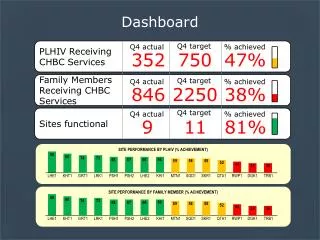
● ● Use blank space and boundary boxes to segment key groups of data. Pare down the interface to only the most essential components to lower cognitive load. Directing Focus Through Layout There are some layouts designing techniques to keep in mind when creating a dashboard. If you are going to use a Medical Dashboard template, you should have a strong understanding of this. ● ● ● ● ● Arrange key charts, graphs, and figures prominently in the visual hierarchy. Align related data points using invisible layout grids for clean organisation. Use positioning, spacing, and dividers to form clear section relationships. Make important marks like averages and outliers large and impossible to overlook. Strategic interface layout establishes clear visual paths leading users to key takeaways. Encoding Information Visually Visual encodings optimise rapid information processing. Therefore, you should be careful in selecting a dashboard UI design that incorporates following elements. ● ● ● ● ● Assign distinct saturated colours to represent data categories. Vary shapes to distinguish multiple data series in charts. Use size, height, and depth to highlight relative value and volume. Employ bold fonts and text treatments to direct focus to critical marks. Judicious use of colour, shape, scale, and typography transforms raw data into meaningful graphics. Facilitating Exploration and Discovery Interaction design unlocks Hospital Dashboard Template potential. That’s why you must always stick to a dashboard software that offers highly interactive elements. ● ● ● ● ● ● Incorporate search bars and filtering to drill into data subsets. Add hover and selection states for tooltips revealing data details on demand. Link charts and filters so selections highlight related data dynamically. Support pan and zoom interactions on large datasets. Animate changes over time and transitions between views. Explorable interfaces empower users to uncover deeper insights through active data engagement. Optimising Display Constraints Adaptability allows dashboards to shine across contexts. Your Medical Dashboard should be properly optimised and make sure that you keep the following factors in mind. ● ● ● Use responsive columns and text sizes for cross-device accessibility. Test usability under different display sizes and resolutions. Support dark and light mode viewing preferences.
● ● ● Accommodate localization and translations. Build accessibility features supporting screen readers and keyboard navigation. Dashboard interfaces designed for flexibility excel across diverse delivery scenarios. Evaluating Success Metrics The true test of any Hospital Dashboard Template UI lies in how well it meets user needs. Relevant success metrics include: ● ● ● ● ● ● Task time and completion rates for key analyses and decisions. User satisfaction ratings based on ease of use. Frequency of dashboard use and depth of exploration. Recall accuracy for displayed data points. Impact on business metrics affected by dashboard insights. Carefully designed interfaces catalyse deriving value from data. Evolving Through Continuous Improvement Medical Dashboard should not end at launch. To ensure your interfaces remain optimised for evolving user needs: ● Instrument Hospital Dashboard Template to gather usage metrics like interactions, dwell time, clicks, and more. Analyse metrics to identify areas of low engagement or confusion. Look for drop off points in exploration. Survey users regularly for subjective feedback on ease of use and potential improvements. Monitor support tickets and social channels for pain points experienced by users. Establish a streamlined process for submitting enhancement requests. Prioritise changes delivering the greatest impact for users based on data. Release iterations frequently to respond to user needs in real-time. Communicate updates and invite feedback on latest changes. Recognize interface improvements that had particular business impact. ● ● ● ● ● ● ● ● The best Dashboard UI Design continue to get better long after launch. Continuous improvement based on measured user experience ensures sustained value delivery over time. Final words By applying user-centric design principles, Hospital Dashboard Template can evolve from simply displaying data into highly intuitive platforms that engage audiences and deliver actionable insights. Thoughtfully crafted UIs allow organisations to realise the full potential of their data assets.