Download
1 / 4
0 likes | 23 Vues
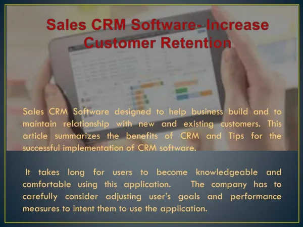
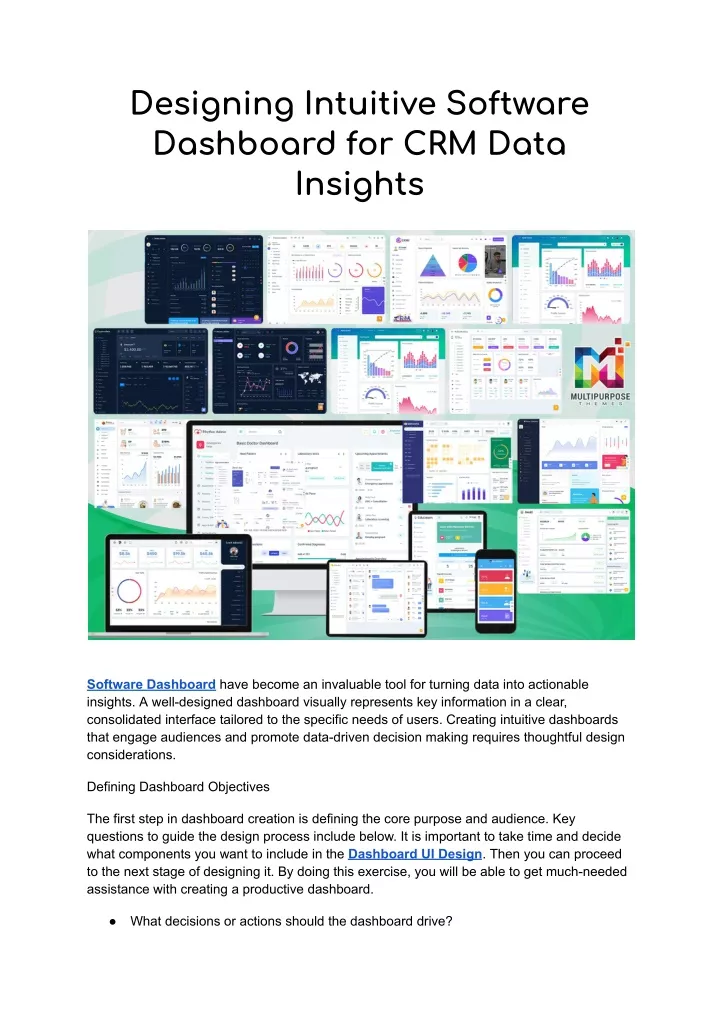
Software Dashboard have become an invaluable tool for turning data into actionable insights. A well-designed dashboard visually represents key information in a clear, consolidated interface tailored to the specific needs of users. Creating intuitive dashboards that engage audiences and promote data-driven decision making requires thoughtful design considerations.

E N D
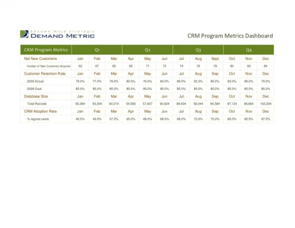
Designing Intuitive Software Dashboard for CRM Data Insights Software Dashboard have become an invaluable tool for turning data into actionable insights. A well-designed dashboard visually represents key information in a clear, consolidated interface tailored to the specific needs of users. Creating intuitive dashboards that engage audiences and promote data-driven decision making requires thoughtful design considerations. Defining Dashboard Objectives The first step in dashboard creation is defining the core purpose and audience. Key questions to guide the design process include below. It is important to take time and decide what components you want to include in the Dashboard UI Design. Then you can proceed to the next stage of designing it. By doing this exercise, you will be able to get much-needed assistance with creating a productive dashboard. ● What decisions or actions should the dashboard drive?
● ● ● ● Who are the target users and what information do they need? How will dashboard insights be applied by users? What metrics and KPIs are most relevant to showcase? What data sources will the dashboard synthesize? With a firm handle on user requirements, the Dashboard Software can be optimized around presenting the most critical information. Prioritizing Visual Information Design Dashboard Template design should apply principles of visual information design for clean, uncluttered interfaces that allow users to quickly extract insights: ● ● ● ● ● ● Eliminate non-essential elements and reduce noise. Structure related data points into logical groups or sections. Use negative space, alignment, and positioning to direct focus. Make key metrics and trends visually prominent. Employ color strategically to encode meaning and relationships. Ensure text is legible, concise, and supports the visuals. Well-organized, proportional use of Software Dashboard space creates visual hierarchy and flow for easy data absorption. Guiding the Viewing Experience Dashboard ui design should guide users through an intuitive viewing sequence to key takeaways: ● ● ● ● ● Funnel attention to the most important data summaries first. Use layout, labels, and formatting for seamless drill down into details. Draw attention to significant data patterns, outliers, and trends. Allow custom views to suit different user perspectives. Progressive disclosure reveals deeper layers of data as needed without overloading users upfront. Promoting Interactivity The full potential of dashboards is realized through interactive features: ● ● ● ● ● ● ● Filters to dig into breakdowns by date, location, department etc. Graphical parameters to highlight or suppress data. Data export ability to feed analysis. Annotation layer for collaborating. Notifications when metrics cross thresholds. Tooltips providing context and definitions. Making dashboards explorable and customizable amplifies their utility and longevity. Simplifying Updates and Distribution
To maximize adoption, Dashboard UI Design should be simple to update as new data arrives and easy to share with stakeholders: ● ● ● ● ● ● Automate data connectivity to feed visualizations. Provide edit access and templates to authorized users. Use responsive designs viewable on all devices. Build in user management controls and access permissions. Enable scheduling or subscriptions for recurring delivery. Removing friction around Software Dashboard distribution helps put data insights in more hands. While keeping these facts in mind, you need to select a dashboard template. It will be quite overwhelming to browse through the templates and pick the right Bootstrap admin template. Make sure that you have a clear idea about your final requirement in mind and go for something appropriate. For example, if you are designing a hospital dashboard, you need to be careful in selecting a medical dashboard template. It will fit perfectly well to your needs. Choosing the Right Dashboard Software Platform The right software platform is key to efficiently developing, managing, and sharing dashboards: ● ● ● ● ● ● Integrate easily with existing data sources and BI tools. Provide extensive visualization options. Include templates to accelerate design. Offer capabilities for interactivity, access controls, governance. Enable cloud-based or on-premises deployment. Scale across the organization’s needs. Leading dashboard tools like Microsoft Power BI speed up building highly functional dashboards. Designing for Dashboard Template Adoption Driving dashboard adoption ultimately hinges on user experience: ● ● ● ● ● ● Continuously gather user feedback during development. Measure usage metrics like engagement and return frequency. Refine designs based on behavior analytics. Educate users on interpreting and acting on Software Dashboard. Showcase success stories and adoption goals. Ongoing user input ensures dashboards evolve to maximize business value. Final words Data visualization tools have made Software Dashboard more powerful than ever. But realizing their potential requires carefully crafted designs cantered around specific audience needs. Well-designed dashboards turn raw data into human insights that guide better decisions.
Explore Multipurpose Themes for Collection of Admin Template, WordPress Themes, Opencart Themes, and HTML Templates Designed to Meet All Your Website Needs. Choose From a Wide Range of Customizable Options and Create a Stunning Website and Web Applications.