Download
1 / 15
160 likes | 463 Vues
Principles of Graphics Design. Howell Istance School of Computing Technology De Montfort University. Principles in Graphics Design.

E N D
Principles of Graphics Design Howell Istance School of Computing Technology De Montfort University © De Montfort University, 2001
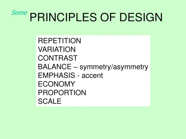
Principles in Graphics Design Visual language - visual characteristics of a set of objects (point, line, plane, volume) and the way in which they are related to each other (balance, rhythms, structure, proportion) Design is valued for its fitness to a particular user and task design aesthetic is always related to the intended function of the resulting product 3 design themes Elegance and Simplicity Scale, Contrast and Proportion Organisation and Visual Structure © De Montfort University, 2001
Elegance and Simplicity Seen in the immediately obvious success of a novel approach that solves a problem completely yet in a highly economical way Principles • Difficult to achieve understatement through conscious effort • Elements in the design must be unified to produce a coherent whole • The parts (and the whole) must be refined to focus the viewers attention on the essential parts • The fitness of the solution to the communication problem must be assured at every level. © De Montfort University, 2001
Elegance and Simplicity Techniques • Reduce a design to its essence • Regularise the elements of the design • Combining the elements for maximum leverage "Simplicity doesn't mean poverty, it does not mean the absence of any décor or absolute nudity. It only means that the décor should belong intimately to the design proper and anything foreign to it should be taken away." © De Montfort University, 2001
Scale, Contrast and Proportion • Scale - feeling of the design fitting into its space and surroundings • Contrast - noticeable differences along a common visual dimension • Proportion - metric that guide choice of scales in a contrast relationship • Differentiation - contrast essential for differentiating elements from one another © De Montfort University, 2001
Scale, Contrast and Proportion • Emphasis - scale and contrast used to emphasize important elements • Activity - scale and contrast move viewers eye through a composition in a predictable sequence • Interest - scale and contrast can add visual interest by counter posing elements with strongly opposed visual qualities © De Montfort University, 2001
Scale, Contrast and Proportion Principles • Clarity • Harmony • Activity • Restraint Techniques • Perceptual layering • Sharpening visual distinctions © De Montfort University, 2001
Organisation and Visual Structure Principles • Grouping - related • Hierarchy - of importance for elements and groups • Structure - to reflect relationships between groups • Balance - in resultant composition Techniques • Using symmetry to ensure focus • Using alignment to establish visual relationships • Optical adjustment for human vision © De Montfort University, 2001
Rules of Thumb • Understand the medium • Establish a visual hierarchy • Direct the reader’s eye • Avoid graphics distractions • Be consistent © De Montfort University, 2001
Visual Scanning • Readers see pages first as large masses of shapes and colour • second, they pick out specific information, initially from graphics... • ..then starting to get information from text image taken from Yale Style Manual at http://info.med.yale.edu/caim/manual/index.html © De Montfort University, 2001
Establish visual hierarchy • ...through graphic balance and organisation of the page image taken from Yale Style Manual at http://info.med.yale.edu/caim/manual/index.html © De Montfort University, 2001
Direct the reader's eye • In the West, readers of English • read from left to right, • top of the page to the bottom. • In page layout top of the page most dominant location, • Subtle pastel shades of colors for background or minor elements • Avoid bold, highly saturated primary colors except in regions of maximum emphasis • Type must always contrast sharply with any background color © De Montfort University, 2001
Avoid graphic distraction • Use horizontal ruler, bullets, icons sparingly to avoid a patchy and confused lay out image taken from Yale Style Manual at http://info.med.yale.edu/caim/manual/index.html © De Montfort University, 2001
Consistency • Consistent colour schemes aid user orientation about where they are image taken from Yale Style Manual at http://info.med.yale.edu/caim/manual/index.html © De Montfort University, 2001
Consistency • Consistent navigation mechanisms retain elements of the ‘look’ (visual appearance) and ‘feel’ (behaviour - response to user input) image taken from Yale Style Manual at http://info.med.yale.edu/caim/manual/index.html (main page) (subsequent pages) © De Montfort University, 2001