Download
1 / 2
20 likes | 26 Vues
Mobile web development is becoming increasingly important as mobile devices continue to dominate internet usage. Responsive design guarantees that websites appear amazing and perform smoothly on a variety of screen sizes, whereas progressive web apps provide users quick, engaging, and offline-capable experiences. By using these principles, web developers can fully realise the potential of mobile web development and create user-centric, accessible, and future-proof web apps.

E N D
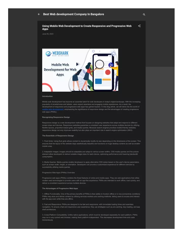
Best Web development Company In Bangalore Using Mobile Web Development to Create Responsive and Progressive Web Apps June 05, 2023 Introduction Mobile web development has become an essential talent for web developers in today's digital landscape. With the increasing popularity of smartphones and tablets, users expect seamless and engaging mobile experiences. As a result, the development of responsive and progressive web apps has gained traction. In this blog article, we will delve into the world of mobile web development, emphasizing the significance of responsive design and the advantages of creating progressive web apps (PWAs). Recognizing Responsive Design Responsive design is a web development method that focuses on designing websites that adapt and respond to different screen sizes and devices. Responsive websites guarantee a consistent user experience across multiple devices by utilizing flexible layouts, proportion-based grids, and media queries. Because search engines prioritize mobile-friendly websites, responsive design not only improves usability but also plays an important role in search engine optimization (SEO). The Essentials of Responsive Design 1. Fluid Grids: Using fluid grids allows content to dynamically modify its size depending on the dimensions of the screen. This ensures that the layout of the website stays aesthetically beautiful and functions on huge desktop screens as well as smaller mobile ones. 2. Adaptable Images: Images should be adaptable and adapt to various screen widths. CSS media queries and the picture element allow developers to deliver suitable image sizes for each device, optimizing performance and lowering bandwidth consumption. 3. Media Queries: Media queries enable developers to apply alternative CSS styles based on the user's device parameters, such as screen width, height, or orientation. Developers can provide a customised experience for different devices by successfully utilising media queries. Progressive Web Apps (PWAs) Overview Progressive web apps (PWAs) combine the finest features of online and mobile apps. They are web applications that utilise modern web technologies to provide users with an app-like experience. PWAs are intended to work offline, load quickly, and deliver a consistent experience across multiple devices. The Advantages of Progressive Web Apps 1. Offline Functionality: One of the primary benefits of PWAs is their ability to function offline or in low-connectivity conditions. PWAs may store and deliver content by utilising services workers and caching methods, letting users to access and interact with the app even while they are offline. 2. Fast and Responsive: PWAs are designed to be fast and responsive, with immediate loading times and seamless navigation. To ensure a fast and responsive user experience, they use strategies such as pre-caching, lazy loading, and app shell architecture. 3. Cross-Platform Compatibility: Unlike native applications, which must be developed separately for each platform, PWAs may run in any current web browser, making them platform-independent. This decreases development time and costs tremendously.
4. App-like Experience: PWAs, like native apps, can be put on the user's home screen. Users are no longer need to download apps from app stores, allowing for a smooth onboarding experience. Conclusion: Mobile web development is becoming increasingly important as mobile devices continue to dominate internet usage. Responsive design guarantees that websites appear amazing and perform smoothly on a variety of screen sizes, whereas progressive web apps provide users quick, engaging, and offline-capable experiences. By using these principles, web developers can fully realise the potential of mobile web development and create user-centric, accessible, and future-proof web apps. Follow Us On Facebook: www.facebook.com/webshark.in/ Instagram: www.instagram.com/webshark.in/ Twitter: https://twitter.com/webshark_in LinkedIn: https://www.linkedin.com/company/webshark-in/ To leave a comment, click the button below to sign in with Google. SIGN IN WITH GOOGLE Popular posts from this blog Importance of Digital Marketing Technology - Guide From The Best Web Development Company, Bangalore October 03, 2022 Once there was a time when Business strategies were restricted to one particular place or one’s Home town platform for businesses like Restaurants, stationeries, Grocery shops, Jewelry shops, etc, Have you ever thought of how these type of businesses will generate their leads, Yes, They were … READ MORE Webshark Web Services - An Inspiration mile August 25, 2022 Hello all, We, Webshark web Services one of the Best Web Development company in Bangalore, India. Decided to share the journey story that how we helped our client to established their business in Dubai People who are residency in Bangalore will identify us as the Top web development company in … READ MORE The Best Web Development Company In Bangalore - Webshark web Services August 09, 2022 TOP RATED WEB DEVELOPMENT COMPANY IN BANGALORE We established a Website Design & Development Company - Webshark web services in 2011 in Bangalore. Webshark is extensively regarded in the industry and is a step ahead of the Top Website Design and Development Agencies. We… READ MORE Powered by Blogger Theme images by Radius Images