Download
1 / 3
30 likes | 34 Vues
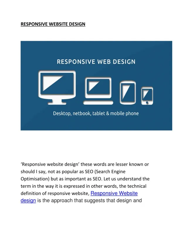
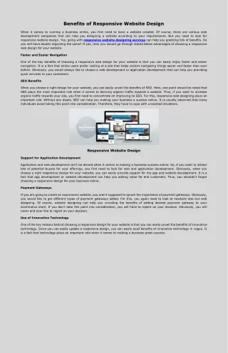
With mobile devices becoming the preferred way of communication and people use the web, responsive design is necessary. Responsive web design changed the way we design for all screens, lifting simpler look and offering more streamlined experiences.<br>

E N D
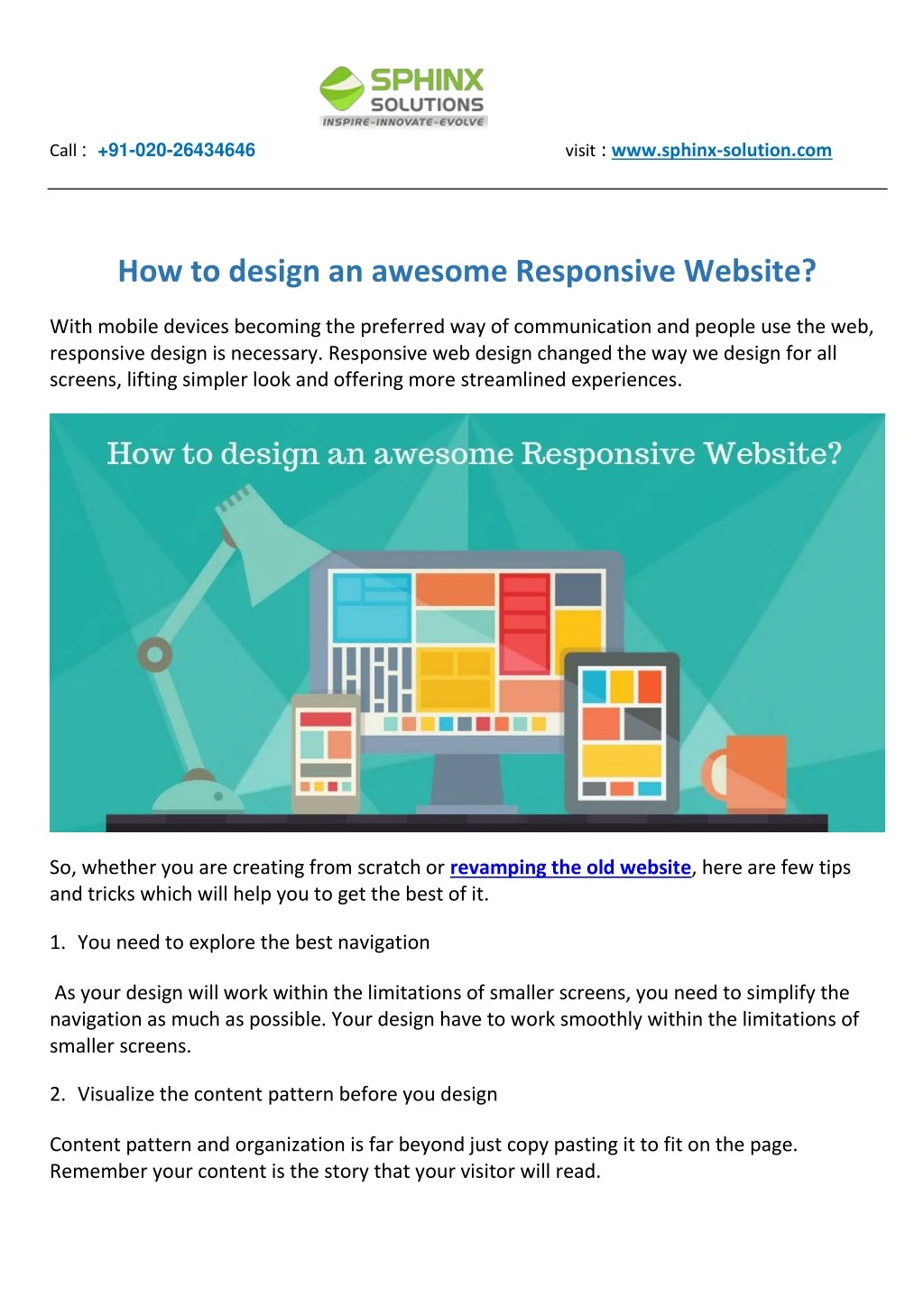
Call :+91-020-26434646visit : www.sphinx-solution.com How to design an awesome Responsive Website? With mobile devices becoming the preferred way of communication and people use the web, responsive design is necessary. Responsive web design changed the way we design for all screens, lifting simpler look and offering more streamlined experiences. So, whether you are creating from scratch or revamping the old website, here are few tips and tricks which will help you to get the best of it. 1.You need to explore the best navigation As your design will work within the limitations of smaller screens, you need to simplify the navigation as much as possible. Your design have to work smoothly within the limitations of smaller screens. 2.Visualize the content pattern before you design Content pattern and organization is far beyond just copy pasting it to fit on the page. Remember your content is the story that your visitor will read.
3.Use words you need With mobile devices, you are working on the smaller screens. So, just cut off the unnecessary words. Use only the content which is most appropriate to deliver the information you want your reader to know. Use bullets and other structural styles to make it look good. 4.Typography is another important point to Choose the best font style and make sure you measure the font size to fit best on different screen size. The web designing team have to understand the importance and work accordingly. 5.Make proper use of the whitespace While creating content and navigation there must be a minimalistic approach, on the other hand, you need to carefully use the whitespace to create breaks in the design. Also, you have to highlight the content so that viewers don’t miss anything. 6.Make use of responsive images We don’t like to see a slow loading page, so responsive images are vital to add. It offers a powerful and effective workaround, but it takes time to hand code it. 7.Use the power of Flexbox in the layouts Flexbox is an interesting layout module which takes care of the responsive look of the layout and makes sure it offers similar feel in different devices. It is a powerful tool to use during any custom website development. Is your website mobile-friendly yet? With the increase in smartphone usage, businesses should adopt to responsive design. We can help you out, contact us today for a free consultation.
USA : +1 732-947-4310 | UK : +964 0771 7777 916 | Malaysia: +6017-2126274 IRAQ : +964 0771 7777 916 | BRAZIL : +55 21 2258-7260 | INDIA : +91-020-26434646 https://www.sphinx-solution.com Copyright© 2018 Sphinx Solutions Pvt Ltd. All rights reserved.