Download
1 / 12
120 likes | 178 Vues
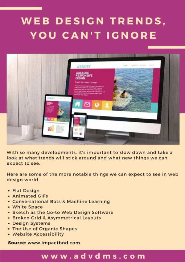
This is yet another one I’ve started to notice. It seemed that for the longest of times, 12-14px fonts were the standard across the web for body text. I’ve seen many websites opt instead for much larger fonts in the range of 16-18px for just their body text. Here is one by Trent Walton. This is significant in the fact that with responsive web design, typography plays an important role in the readability of content. When 18px font is displayed on a Phone, it’s much easier to reading than having to read 12px text. However, the trade-off on this is that when large Blog, articles are written with such a large font, it becomes rather obnoxious when viewing it on a larger, less pixel-dense screen.

E N D
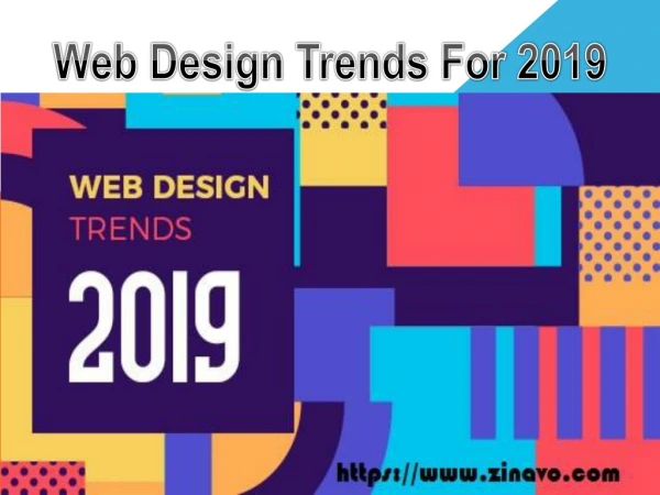
Web Design Trends History Web design company uae
History Of Trends • Larger Fonts • Large Search Bar • New Colors • Branding • Social Integration • Large Photos • Responsive Design • Typography • Huge Buttons
Large Fonts • 12-14px standard across web text • Now 16-18px is standard • 18px is displayed on phone • Much easier to read than 12px • Less pixel dense screen
Large Search Bar • Significant factor in every aspect of designing • Google search hit the plateau • Proprietary forms of search • This doesn’t refers to a large search field • Custom made search service
New Colors • 60% apps are one color • Icons to represent apps • Tumbler to Pandora are lathered generously • Not every color going to work • Experiment and step out of the norm • It is not a trend but a plea
Branding • Web design doesn’t harmonize your mission • Revamp your image • Lay of the quirky image • Play with what you have • Don’t imitate
Social Integration • Integrate social sharing • People like something, they talk about it • Promote customer engagement • Social integration as free marketing • Get your brand in front of potential visitors
Large Photos • Multiple images and loads of intricate graphics • Large images grabs visitor attention • Large graphics are not new • Sites are optimized for tablets and mobile devices • Large visuals help company’s visual branding
Responsive Design • Monster splash in 2012 • Tablet & mobile use is increasing • Responsive web design has made great strides • Mobile idea first • Desktop first is quickly becoming obsolete • Designing with mobile can lead to cleaner content
Typography • Rapid rise of web font • Verge of a typographical renaissance • Designers use these services in their repertoire • Look for less Arial and Georgia
Huge Buttons • Responsive web designs have a lot of tapping and swiping • Interface design to be as mobile-friendly as possible • Lately, big-buttons were used for beautification • Designers are opting for larger type • 16px body font size and 48px wide buttons are the new Black