Download
1 / 5

E N D
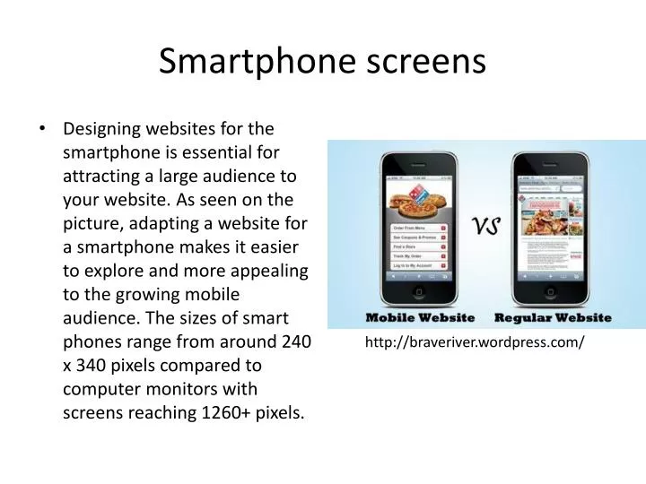
Smartphone screens • Designing websites for the smartphone is essential for attracting a large audience to your website. As seen on the picture, adapting a website for a smartphone makes it easier to explore and more appealing to the growing mobile audience. The sizes of smart phones range from around 240 x 340 pixels compared to computer monitors with screens reaching 1260+ pixels. http://braveriver.wordpress.com/
Screen designing for a Smartphone • Smartphones come in a variety of sizes: an iPhones screen is 1.92 inches width to 3.49 height, which is very different to a blackberry or android. The blackberry’s screen has 2.5 inches height to 2.5 inches width and the android are from 920dpi to 720dpi, 640dp x 480dp, 470dp x 320dp and 426dp x 320dp. http://www.mybanktracker.com/news/2010/01/22/survey-shows-mobile-banking-is-most-commonly-used-service-by-smartphone-users/
Screen designing for a tablet • Unlike smartphones, tablets try to use the same screen dimensions of 7 inches horizontally with the exception of Apple’s IPad that has a width of 9.7 inches http://forums.appleinsider.com/t/151145/rumor-7-inch-ipad-to-be-produced-in-brazil-for-fall-launch
Screen designing for a Desktop • Unlike Smartphones. Desktop screens are constricted to the dimensions on the image, they can be slightly different sizes to the ones shown on the image but most applications won’t work properly and objects might appear oddly since they aren’t following the main desktop sizes. https://blogs.dal.ca/MedIT/feed/
References • http://www.hongkiat.com/blog/designing-for-mobile-devices/ • http://www.webdesignerdepot.com/2011/05/big-vs-small-challenges-in-responsive-web-design/ • http://webdesign.about.com/od/mobile/a/write-a-mobile-friendly-website.htm • http://www.cultofmac.com/159980/this-could-be-the-key-to-apple-creating-a-4-inch-iphone/ • http://www.iphoneworld.ca/news/2007/06/24/apple-iphone-vs-nokia-n95-vs-samsung-blackjack-vs-blackberry-8300-vs-palm-treo-750/ • http://developer.android.com/guide/practices/screens_support.html • http://www.pcworld.idg.com.au/article/402475/amazon_kindle_fire_vs_ipad_2_vs_nook_colour_vs_everything_else/