Download
1 / 64
650 likes | 845 Vues
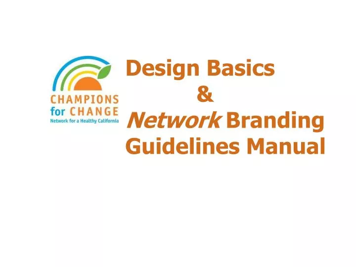
Design Basics & Network Branding Guidelines Manual . Overview. PART I – Design Basics History of our Brand Branding and Design Design Principles PART II – Network Branding Guidelines Draft vs. Final Branding Guidelines Manual– What Has Changed?

E N D
Overview PART I – Design Basics • History of our Brand • Branding and Design • Design Principles PART II – Network Branding Guidelines • Draft vs. Final Branding Guidelines Manual– What Has Changed? • What Elements/Visual Clues Make up Our New Brand? • The Branding Guidelines Manual in Practice • A Good Branded Example • Things to Avoid • Parting Thoughts
PART I – Design Basics • History of our Brand • Branding and Design • Design Principles
History of our Brand The 5 a Day Brand
Branding and Design Big Picture… • Millions of dollars are being spent promoting our message; make it count. • With consistent brand implementation, each project benefits from the success of the previous one. • Each project is a building block of our larger Campaign. • Design is important. It influences retention and perception of the brand.
Branding and Design Benefits What’s in it for you? • Recognition with a larger Program • Look Bigger than you are • Increase perceived credibility • Confidence in the effectiveness of your projects
Context Branding and design are useless - If not steered by context. Consider: • How the message will be distributed • The venue and reading distance • Whether the audience is “captive” or the message is competing for attention • Know the target audience
Design Principles • HIERARCHY – “Levels of Information” • WHITE SPACE – “Less is More” • ORGANIZATION – “Relationships” • TYPOGRAPHY – “Fonts and Spacing” • CONSISTENCY – “Cohesive Look”
Hierarchy – “Levels of information” • Don’t let the consumer become overwhelmed. • Ensure the information is presented in stages. • How the information is read can and should be controlled. • Is the focus in the right place?
Where do I look first? What is the take away message? Who is this from?
If the viewer is interested enough to get close, the details are presented
How you organize the information can ensure that you’re reaching the right audience. Trust that relevance and interest will draw the reader in to read all thesmaller details.
White Space - “Less is More” • The absence of visual elements — direct the reader’s attention to the information • Allows the eye to rest • Less is more - too many elements becomes ineffective • The more type you have, the more white space you need • It might not be literally white
Too much text!! …and a jammed page will be passed over.
With ‘breathing room’… ……the reader can engage.
Easy on the eyes, invites the reader in. Organized with good flow
Organization – “Relationships” • Unify, group, and distinguish information • Creating relationships with alignments
Too much information? Where do I find what I’m looking for?
Same information with a structure. Reader can digest the information.
Adapted from the same format… …to Network look & feel.
Typography – “Fonts and Spacing” • Simple typography makes it easier for the viewer to engage in the material • Everything cannot be ‘equally important’ • Ensure fonts, sizes, and weights communicate the information well • Don’t let ‘fun’ fonts distract from the message • Avoid using WordArt – it’s hard to read and distracting
Too many fonts Fonts don’t match the message Type sizes don’t correlate to importance
Simple and clean, lets the message get through Bold and strong font chosen for gym Only two type faces used from one font family Franklin Gothic –Bold and Regular
CONSISTENCY - “Cohesive Look” • Increases credibility and impact • Easier workflow process • Intentional connection to other projects • You can have a good design without consistency • You cannot have a strong brand without consistency
Draft vs. Final Branding Guidelines Manual- What Has Changed? • Color Palette and Typography are Simplified • No longer tie colors to pillars • Typography is easier to follow • More Descriptive • Each section has more detail • Easier to put into practice • Better Organized • From strategy to tactics • Added Two New Pages • Copy Readability • Electronic Formats
What Elements/Visual Cues Make up Our New Brand? • The operational elements below frame your projects and together form our brand • Language/Tonality • Logo Prominence • Use of White Space and Organic Flow • Consistent use of Colors(primary and complementary colors) • Imagery (photography, visual/graphic elements) • Typography
What does our brand look like when you put all the elements together?
The Branding Guidelines Manual in Practice Language/Tonality • It’s not just what we say, but how we say it. • When writing copy – lead with passion and vision. • Present the Network as a “we” organization. Be inclusive and avoid sounding exclusive, authoritative, or preferential. • “Be Real” – emote confidence and a “you can do it” attitude. • Be inspirational, but don’t sugar coat the message. Remember-Copy should be written at a 5th grade literacy level Page9in manual
The Branding Guidelines Manual in Practice Thematic Elements • White Space – roughly 20-50% of the page NOT occupied with words or images. • A page filled with wall-to-wall text or graphics appears busy, cluttered, and difficult to read. • Organic Flow – when text follows the organic shape of a knock-out photo it adds visual interest. • White space and organic flow together allow the readers eye to move freely through the page – less daunting, easier to read, and easier on the eyes. Page 12 in manual
Wall-to-Wall Text Organic Flow White Space White Space/Organic Flow Examples
The Branding Guidelines Manual in Practice Network Logo • Place the logo in a prominent position. • Use the full color logo on a white background whenever possible. • Do not distort the logo, place a box around the logo, or modify the logo in any way. • The minimum size of the logo is .75 inches for all printed materials. Page 13 in manual
The Branding Guidelines Manual in Practice Network Logo, continued • Spanish logo is now FULLY TRANSLATED! • The new version of the Spanish logo should now be used on all Spanish materials. Page 13 in manual
The Branding Guidelines Manual in Practice Network Color Palette • 9 colors in the full Network color palette • 4 primary colors Page 17 in manual