Download
1 / 16

E N D
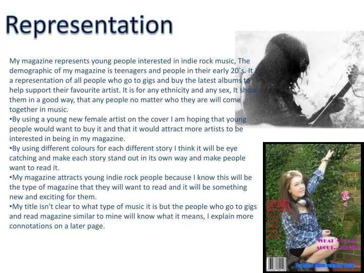
Representation • My magazine represents young people interested in indie rock music, The demographic of my magazine is teenagers and people in their early 20`s. It is a representation of all people who go to gigs and buy the latest albums to help support their favourite artist. It is for any ethnicity and any sex, It shows them in a good way, that any people no matter who they are will come together in music. • By using a young new female artist on the cover I am hoping that young people would want to buy it and that it would attract more artists to be interested in being in my magazine. • By using different colours for each different story I think it will be eye catching and make each story stand out in its own way and make people want to read it. • My magazine attracts young indie rock people because I know this will be the type of magazine that they will want to read and it will be something new and exciting for them. • My title isn't clear to what type of music it is but the people who go to gigs and read magazine similar to mine will know what it means, I explain more connotations on a later page.
Myaudience • The audience for my magazine will be mainly young, the young audience are easily influenced and will still be finding their feet in what music they prefer rather than just following the crowd. One of the main points of my magazine is so that young people can find themselves, you need to be individual when you chose you music, hence the term Indie rock, indie standing for individual. • My audience will probably be in any profession as music in general isn't specific to a certain career, but my guess would be students at high school or university, still yet finding themselves. • These will be people who live very freely and every song is another great night and means something to them and so by buying this magazine they could get the first previews of what their next memory could be. • The type of things that they will consume will probably be cheap and easy, not very expensive and heavy items etc so this magazine will probably be a good thing to purchase based on price and quality. • In entered in my relationship with the audience because I am young and read magazine likes this one and would like there to be more out there to choose from. • I encoded many messages in my magazine like in one specific picture I had a plain green background and a bright pink flower next to my artist, I did this to show how she in a English rose, which fits in with my interview with her when I called her `pale like a porcelain doll`. Small things such as this I paid a lot of attention too to make my magazine professional. • I think my messages will be decoded by the audience in a way that they can relate too, the way I have displayed my artist Leila as a normal English girl who is just living her dream is a very real term for my audience as they will all be around her age.
Myaudience : Indie kids • Usually between the ages of 13/15 and 24 • usually go to local shows, willing to meet new people interested in the same thing. • there for mainly the music but going to socialise and have a drink with friends • Doesn't necessarily conform the to general image of indie rock people but at the same time still connects to it. • is expressing themselves through music, music is important to them at this point in their lives. • The type of products that my audience might consume: • Hair dye • Unusual clothes (baggy old cardigans, worn out jeans etc) • Usually lots of ear piercings • Skinny jeans • Converse/van trainers • Tattoos • Probably music magazines and music itself
I tilted the subtitles `Leila is back` and the small bit of information about it because I wanted to create more of an attitude to my front cover, I wanted it to be black because that usually makes thing stand out a bit more but in this case it doesn't so I will have to re think the colour scheme for this sub heading. Because this story is my main story I really want to make it pop out from the rest. I see more words as being more important that more pictures. So I wanted to be different and create a front page based mainly on words and just one eye popping picture, and I think it works really well. On my front cover I put this line, `what's it all about Alfie?` I did this because it leaves the reader hanging, they don't really have any idea what it means and will be intrigued to read more.
This is my main title that is going to be on my front cover, i think this is a very good title and I have many reasons why. • There are lots of connotations to what it could mean. • Firstly, it could be that in a song there is usually a `drop` this basically means that the tune that has been constant throughout the song suddenly changes and usually becomes a lot quicker and there's more base. • Secondly it could be a connotation to drugs. At gigs and clubs where people go to hear their singers live they may take drugs, some people refer to there being a `drop` using cocaine, when it falls down your throat and also using ecstasy people call swallowing the pill `dropping`. • Lastly it could simply be that you have been dancing all night to the music that u need to `drop`, sit down or sleep. Also in the title the O in the word drop in made out of small droplets of water, I thought this was a good affect because in has more than one meaning and more than one drop. I am going to do another version of this drop and make the O just a but lower down than the rest of the letters so that the O actually DROPS.
This is my Final version of my title and as you can see I have made the O drop below the rest of the words
Semiology I chose to display a guitar in a few of my pictures because I know a lot of young indie people either already own or play the guitar or want to learn. Indie music is seen as a type of music that actually uses real instruments, rather than the pop or techno music there is around lately. A lot of indie people admire those who can play a musical instrument, I want my magazine to relate to people of my target audience and I feel this does it. Laying the guitar is an individual thing to do, yes you can do it in a band but if you need to escape on your own for a while it is a perfect pass time and I think my readers will really connect to this. I also feel that the bright green background and sunny exposure will bring a subconscious happiness to my readers, they will feel like they do on a sunny day and make them want to read it because it already has a subtle hint that it is a good magazine to read, out of all the magazines on the shelves that are covered in dark colours I think mine will stand out and will make them look at mine first. This is important to me because I want to draw the regular NME readers away from their normal magazine and try something new and I think `drop` should be that something new!
CONVENTIONS OF LAYOUT, OF FONT, OF COLOUR, OF LAYOUT, OF LANGUAGE, OF STYLE, OF POSE I think the ultimate convention of my magazine is that it is fun, it doesn't take life too seriously and in a world where everything is so serious I think it would be nice for my readers to have an escape. An escape through music that its real and fun and something they can all relate too. The two pictures of my main artist Leila are fun poses and show her being silly and enjoying playing the guitar, a thing she loves to do, so I think people would be interested in reading what she is all about. And also the picture in the top left hand corner in a more dim photo even thought they are smiling the lighting of them is a lot more serious that the other photos which I think my readers will find endearing.
I decided to write an article about Leila and what she is all about, I think this is important for my readers to read about new people who came from nothing. I highlighted the fact that she has always been a much grounded person and is slightly worried that she will fall out of that and get big headed with all the attention she has received recently. I believe this is a good message to send to my readers because even though my readers are al normal people I'm sure they have all had their moments of big headedness and wish they hadn't. Whether it is work or boys or friends everyone is prone to getting a bit arrogant and that you should never forget where you come from. I do think this is quite a serious note in my fun filled magazine but it is important to get it across.
I noticed that in a lot of my pictures Leila is looking away, I did this deliberately to show a more sense of seriousness. I've found that my magazine is mainly based on fun with a carefree attitude but i wanted to display that my magazine is serious and should be taken seriously. I think that by the artist looking away it creates more of a professional look to the photos. I like that the photos look serious because the article isn't that formal and it shows that it can have its serious/professional moments and its fun moments.
In this picture I thought it would be better if I had Leila looking directly at the camera, its a kind of look to show that she is really innocent and sweet and with the connotation of the pink rose I think its really effective. I knew straight away that this was the picture I wanted for my front cover. I think the slight tilt of the head and holding onto the wall shows a type of attitude. I think this is a really nice connotation because the rose and the sweet face shows off innocence and calmness yet the had holding on and the tilted head does show a type of rebellious attitude and that maybe she is not a girl to be messed with. This picture of Leila shows her when she is out on the street, she certainly looks more serious here. I took it deliberate in a pub garden to show she has a side of rebellious charm, she shows definite attitude here, like that is her territory. The way she is looking straight at the camera could cause the reader to feel quite uneasy but in a good way.
Technology • During the process of making this magazine I have used all different types of technology, • I've used digital cameras, which make taking pictures quick and easy and changing the setting of the camera makes the photo look better than it necessarily would have looked without it. • I've also used Photoshop to create a smooth photo with bright features and also to create special effects such as the `drop` in my title. • In the real world most photos look totally different in-between editing and that of when the photo was taken, this can distort what our image is in our heads of what is right, or normal but I haven't over used it in my work so I would say my photos and pages are mainly real, and not going to confuse any reader of mine.
I only did one version of my front cover and my double page spread, I had messed about with putting pictures in other places first but landed on these ones and felt no need to change. I can see how I could make them a bit more packed with information but I don't want my magazine to be seen as messy, I know a lot of Indie people and I know what types of things they want in a magazine I feel that if I filled it and made it really busy then most people would see it as too much. Sometimes less is more.
In my double page spread I really need to add more photos and I'm going to put some photos behind the quotes to make it stand out. “ I really don't want to get big headed” “ I really don't want to get big headed” These are just a couple ways I could do that.
conclusion I have realised throughout this whole process that everything I do, whether its as small as moving a picture or changing the font, everything has a big affect on the outcome of my magazine. Also I have learned that nothing is done by accident, all little things you may or may not notice in magazines are out there for a reason and everything matters. Everything I do is trying to convey a different message to my audience and that all the small things are just as important as all the bug things.