Download
1 / 31
340 likes | 659 Vues
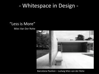
- Whitespace in Design -. “Less is More” Mies Van Der Rohe. Barcelona Pavilion – Ludwig Mies van der Rohe. The Need for Space. A good friend of mine is moving into a new apartment after being away from the area for a few years.

E N D
- Whitespace in Design - “Less is More” Mies Van Der Rohe Barcelona Pavilion – Ludwig Mies van der Rohe
The Need for Space A good friend of mine is moving into a new apartment after being away from the area for a few years. Needing quite a bit of furniture and having limited funds we’ve been scouring used furniture stores. Sadly some of these stores had a design flaw, one that also exists in many graphic design examples.
The Need for Space Recently we were in one store that was so crammed full of furniture and nicknacks it was difficult to move around in. To get into some aisles you needed to turn your body sideways. You’d have to watch where you stepped in order not to trip over something sticking too far into the aisle. If you tried to take something off a shelf several other items might fall off the shelf with it.
The Need for Space At one point we saw a nightstand that looked very much like one she wanted. In order to get to it we would have had to move several large desks and a dresser out of the way. Even though my friend had a long list of items she wanted and that the store probably had, we didn’t stay too long and walked out without making a purchase.
The Need for Space The store needed to rethink it’s design and make better use of empty space. Many designs suffer from a similar malady, that of trying to cram everything onto the page and lacking enough whitespace to help you find what you’re looking for.
The Need for Space “Architect Ludwig Mies van der Rohe adopted the motto “Less is more” to describe his aesthetic tactic of arranging the numerous necessary components of a building to create an impression of extreme simplicity, by enlisting every element and detail to serve multiple visual and functional purposes.” —Wikipedia entry on Minimalism
What is Whitespace? Whitespace or negative space is the space between design elements.
What is Whitespace? On a macro level it’s the space around your design and the large blocks of empty space between elements.
What is Whitespace? On a micro level it’s the space between two lines of text or the space between an image and it’s caption.
What is Whitespace? Many new designers think the object is to fill the page, to leave no space unused. In general that’s not conducive to good design. What’s left out is often just as, if not more, important than what’s left in.
Why Use Whitespace? A good use of whitespace will lead to a cleaner and more professional design. Allowing the elements of your design to breathe makes it easier for visitors to absorb your content. Whitespace helps create design flow and helps achieve balance in design. Paul Rand
Why Use Whitespace? Day exists in contrast to night. Without cold there is no hot. It’s the yin-yang of interconnected opposites. S p a c e is no different.
Why Use Whitespace? Filled space sits in opposition to negative space, but neither exists without comparison to the other. Both are necessary to create a harmonious balance in a design.
Why Use Whitespace? When all your design elements crowd each other it’s hard to find your way through them to any one element. Whitespace gives organization to those elements and provides visual relief. It provides a way for elements to stand out and makes your copy easier to scan.
Why Use Whitespace? Whitespace can also add elegance and sophistication to a design. Empty space might be seen akin to wasted space. Who can afford to waste? Space then is a luxury and the less you use the more you must have.
Why Use Whitespace? More whitespace is seen as upscale and can position your brand with a higher end market. Densely filled space is seen as a way to save on cost. Leaving space empty can actually add value to your brand.
Why Use Whitespace? Consider retail clothing outlets. Low end stores will have more items on the sales floor and less space between aisles. Shoppers will take items off the rack and leave them sitting on top.
Why Use Whitespace? At the other end, high end stores will have much less merchandise on the sales floor and most of the space in the store will actually be empty.
Why Use Whitespace? Look at the images at left from inside a Banana Republic store and an Old Navy store. Both are owned by the same parent company, but one is clearly positioned toward a higher-end shopper and one toward a lower-end shopper. The image at top is a Banana Republic store and the one underneath is an Old Navy store.
Why Use Whitespace? Each store’s sales floor gives a completely different impression and clearly appeal to a different market of shopper.
How to Use Whitespace Effectively The first step in using whitespace effectively is to actually use it. Don’t try to fill every space on the page. Don’t try to jam everything onto a page. Leave space around your design elements.
How to Use Whitespace Effectively Margins and paddings are your friends. Be conscious of how they are set for every element on the page. You can use either effectively, though using both will yield the best results.
How to Use Whitespace Effectively In web design, give all of your main containing divs (header, footer, content, sidebar, etc) some padding so the elements inside them don’t crowd the edge.
How to Use Whitespace Effectively Use margins between different elements to separate them from each other. Think padding when you want space inside an element and margin when you want space between two different elements.
How to Use Whitespace Effectively Compare the two images below with the associated text around each. Which is easier to read? The one with space between image and text or the one where the text butts up against the image?
How to Use Whitespace Effectively Line-height is another CSS property to become familiar with. Most people leave it set at the default, but by setting a good line-height you allow all the text on your page to breathe. It’s not an absolute rule, but I prefer a line-height 1.5 times the font-size. If your font is set to 12px, try setting your line-height to 18px.
How to Use Whitespace Effectively Experiment with different line-heights and see what works best for your design. The important thing is to be aware of it. Use headings to structure your content and remember the principle of proximity when styling. Keep headings closer to the text below and further from the text above. The space will make your content easier to scan and read and help create a flow through your design.
Summary Less is more is the idea that simplicity and clarity lead to good design. All design is an attempt to solve a problem. Graphic and web design aims to solve the problem of how to communicate clearly.
Summary Crowding too much information on a page does not communicate that information clearly. Surrounding that information with space enables readers to find the information relevant to them and gives you a measure of control over what information gains their attention.
Summary Whitespace or negative space is an essential part of any design. Without it you don’t have a design.