Download
1 / 63
630 likes | 897 Vues
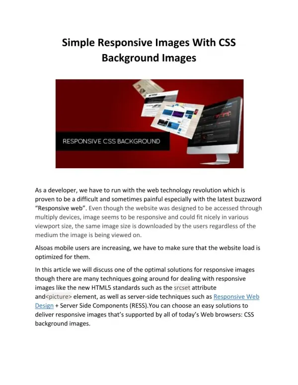
Responsive Images and Effects for Drupal 7. Presentation by Trent Wyman. Who am I?. Trent Wyman Drupal Developer / Drupal Trainer Isovera http://www.isovera.com Acquia Training Partner. Presentation by Trent Wyman. Topics for Discussion.

E N D
Responsive Images and Effects for Drupal 7 Presentation by Trent Wyman
Who am I? • Trent Wyman • Drupal Developer / Drupal Trainer • Isoverahttp://www.isovera.com • Acquia Training Partner Presentation by Trent Wyman
Topics for Discussion • Adaptive versus Responsive – Is there a difference? • Misc. contrib modules for setting up responsive images • Imagecache effects for responsive displays • Drupal image presets for JavaScript cropping • Using media queries to conditionally load CSS Presentation by Trent Wyman
Contrib Modules for Responsive Images and Effects • Breakpoints: https://drupal.org/project/breakpoints • Picture: https://drupal.org/project/picture • Image JavaScript Crop: https://drupal.org/project/imagecrop • Imagecache Actions:https://drupal.org/project/imagecache_actions Presentation by Trent Wyman
Adaptive versus Responsive • Adaptive technique loads the original (full scale) image to the device and applies CSS to resize it accordingly • Both respond to media queries defined by CSS3 - @media rule • Adaptive is quicker to theme and develop • Performance cost associated with downloading a large file for smaller display – especially if there are multiple images on a page Presentation by Trent Wyman
Adaptive CSS Technique Presentation by Trent Wyman
A Simple Adaptive Style Rule • Set image max-width to be 100% - completely fills parent container • Set image height to automatically scale according to width (keeps original aspect ratio) Presentation by Trent Wyman
Original Image Scaled to Parent Presentation by Trent Wyman
Notice Image File Properties Presentation by Trent Wyman
Image Adapts to Screen Width Presentation by Trent Wyman
CSS3 Media Queries • Used to apply variations in style rules depending on device screen width • Examples: Presentation by Trent Wyman
Performance Consideration • Regardless of device width, the Adaptive technique always loads the original image with a file size of approx 1.5 MB • Maybe ok if there is only 1 large image on a page • Consider the performance cost if there are multiple large images • 1.5 MB X (3 +) = slower page load Presentation by Trent Wyman
Other Adaptive Considerations • If the parent container is set to a strict width or a min-width, then the image will only adapt to a particular point • Adaptive parent container(s) should be set to a percentage value so that they scale across all device types (smart phone, tablet, portrait, landscape, etc.) Presentation by Trent Wyman
Responsive Images • Adaptive technique scales the original file after it has downloaded • Responsive technique serves different instances of the original file, resulting in smaller files and quicker page loads • Delivers different image files based on defined breakpoints Presentation by Trent Wyman
The Responsive Difference Serving an image that is 11.94 kb versus 1.5 MB Presentation by Trent Wyman
Install & Enable Responsive Modules • Picture Module* requires Breakpoints & Chaos Tools modules • Breakpoints Module* requires Chaos Tools module Presentation by Trent Wyman
Configure Breakpoints • Add breakpoint definitions to the theme’s .info file (recommended method) • Alternately, http://yoursite.com/admin/config/media/breakpoints to define breakpoints Presentation by Trent Wyman
Defining Breakpoints in .info File • Set minimum screen widths per device type Presentation by Trent Wyman
Breakpoint Group Added Presentation by Trent Wyman
Breakpoints & Image Styles • Next, Image Style presets need to be created and then mapped to the defined Breakpoints • The Image Style presets will create different snapshots of the original image file to serve smaller versions per device width (as defined by the breakpoints) Presentation by Trent Wyman
Create a Base Image Style • http://yoursite.com/admin/config/media/image-styles/add and add a new image style. Name = “responsive” Presentation by Trent Wyman
Apply Image Style Effects Presentation by Trent Wyman
Defining Scale Effect • Set the max scale width to your largest image display size in relation to the breakpoints in your .info file (for this example 1024px) • Avoid using the “upscaling” option as this distorts & pixelates images when they are stretched • Good rule of thumb is to always use image sources that as large (or larger) than your largest display size Presentation by Trent Wyman
Configuring Scale Effect • Note: when using the “Scale” option, only the width needs to be defined. • Leaving the height field blank allows the height to scale relative to the width, which maintains the image’s aspect ratio. Presentation by Trent Wyman
Scale Effect Example Presentation by Trent Wyman
Configure Image Style Base Names for Breakpoints Go to: http://yoursite.com/admin/config/media/breakpoints/create_style Presentation by Trent Wyman
Generated Responsive Image Styles Presentation by Trent Wyman
Edit Each Generated Styles Presentation by Trent Wyman
Replace the Inherited Scale Width Desired Max-Width Per Device Presentation by Trent Wyman
Change Width Value to Max-Width (relative to min-width set in .info file) Presentation by Trent Wyman
Let’s Review So Far • In the previous example the scale effect width was changed from the default 1024px to 240px. • For this device (smartphone) we need to set the maximum width our image will scale to. • Based on the min-width set in the .info file, this effect will serve for devices with screen widths between 0px – 240px Presentation by Trent Wyman
Set Image Styles for Other Devices • Following the previous example for the smartphone scale, set the scale (max-width) for the other devices • responsive-scale-breakpoints_theme_bartik_custom_tablet_landscape_1x = 960 • responsive-scale-breakpoints_theme_bartik_custom_tablet_portrait_1x = 768 • Etc. Presentation by Trent Wyman
Add Image Styles to Picture Module Go to: http://yoursite.com/admin/config/media/picture Presentation by Trent Wyman
Configure Content Type Display • Go to the display mode for your content type and on the image field, change the format widget from “Image” to “Picture”. • Example: http://www.yoursite.com/admin/structure/types/manage/article/display Presentation by Trent Wyman
Change Format Widget from “Image” to “Picture” Presentation by Trent Wyman
Configure Fallback Image Style Presentation by Trent Wyman
Set Fallback to “Automatic” Presentation by Trent Wyman
Now Test Your Responsive Image • Return to the page where your image displays and compare the image properties among different display widths (may need to clear cache) • Notice that the file size now varies depending on screen width • Smaller image files are being served as the display width decreases Presentation by Trent Wyman
11.94 KB Responsive versus 1.5 MB Adaptive Presentation by Trent Wyman
Now for Some Fun! • Additional effects can be applied to the image styles created for the Responsive displays • Examples: Cropping, Desaturation, Watermarks, Canvas Effects, etc. • Different effects can be applied per device type based on the breakpoints & image styles already defined Presentation by Trent Wyman
Enable Imagecache Actions Module & Related Submodules Presentation by Trent Wyman
Return to the Image Styles List & Select the Style to Apply Effects Presentation by Trent Wyman
Simple Example: “Desaturate” Presentation by Trent Wyman
Update Image Style Effect Presentation by Trent Wyman
Testing the New Effect • After saving the new effect, clear cache and return to the page that has the image • Reload the page at the target screen size (Tablet Landscape for this example) to see the change • For this example we should see the image displayed in black & white on Tablets when in the landscape orientation Presentation by Trent Wyman
Check the Results for the Display Assigned to this Image Style Presentation by Trent Wyman
That Was Easy Now Let’s Do Something Practical • A useful effect may be to serve an image that has a landscape aspect ratio for horizontal tablets • Image JavascriptCrop Modulehttps://drupal.org/project/imagecrop • Provides a crop preset for image styles (and also on image upload fields) Presentation by Trent Wyman
Enable Image JavaScript Crop & Apply to Image Style Presentation by Trent Wyman
Add JavaScript Crop Effect to a Defined Image Style (ex: Tablet Landscape) Presentation by Trent Wyman
Configure JavaScript Crop Effect Presentation by Trent Wyman