Download
1 / 38
380 likes | 384 Vues
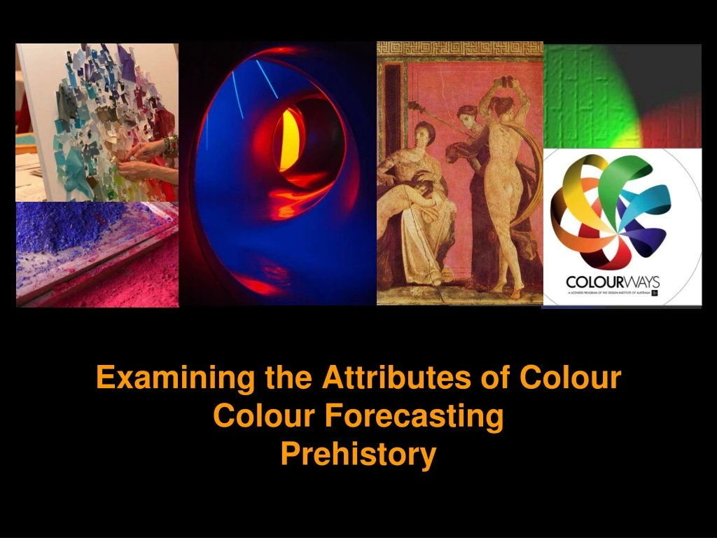
Examining the Attributes of Colour Colour Forecasting Prehistory. Common Constructs in Theories of Colour. Primary colours A representative set of hues that is often used to describe & explain colour And as a basis for colour creation & combination theories

E N D
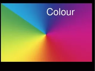
Examining the Attributes of ColourColour Forecasting Prehistory
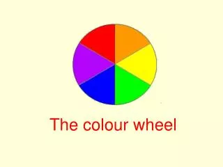
Common Constructs in Theories of Colour • Primary colours • A representative set of hues that is often used to describe & explain colour • And as a basis for colour creation & combination theories • There is no single, standard set of primary colours • Colour correspondences • Devised since antiquity • Elements, seasons, geometric shapes, etc
Different Sets of Primary Colour Red, yellow & blue Red, yellow, blue & green Red, green & blue White, black, yellow, red, green & blue Albers (1963) Spectral profile colours Ostwald (1916) Red, yellow, blue green & purple Cyan, magenta, yellow & black Printing industry (CMYK) NCS (2001) Munsell (1911) Itten (1961)
Different Sets of Primary Colour Substance & Formula colour (paints, pigments, dyes, etc) Spectral profile colour (colour in the form of light-waves) Subtractive colour mixing Additive colour mixing
Secondary Colour • Hues created by mixing two primary colours • Different variants of secondary colour occur (Depending on the definition of primary colour).
Tertiary Colour • Colours achieved by an admixture of 1) Two secondary colours; or, a primary/secondary colour and its complementary/contrasting colour. • Tertiary colours often include colours that are not classified as primary or secondary & difficult to categorise such as brown, olive, khaki, ochre, bronze, silver, gold, etc. Tertiary colours mixed from: purple-yellow green-red purple-orange plus tints
Tertiary Colour Tertiary Colours
Three Attributes of Colour Colour is widely considered to have three attributes & these enable the identification & classification of colour (Gage, 1995, 2000; Itten, 1973) In reference to substance colour & formula colour, these attributes vary somewhat across the literature and in practice; however, they are generally referred to as: hue saturation (chroma, chromaticity) tone (tonal value, value, lightness-darkness)
Three Attributes of Colour In reference to spectral profile colour, these attributes are generally referred to as: hue saturation luminance
Three Attributes of Colour Tone High Low Hue Red Saturation Low High
Three Attributes of Colour Hue The quality by which an object or substance (ie substance colour or formula colour) is recognised as being red or green or blue, etc. Various theorists have devised hue circles/colour wheel models & these indicate the hues considered to be key hues: Chevreul (1855) Hering (1878) Itten (1961)
Three attributes of colour Saturation The degree of ‘purity’ or chromatic intensity of a colour (also referred to as chroma, chromaticity & brilliance) High/strong saturation Low/weak saturation
Three attributes of colour Saturation The degree of ‘purity’ or chromatic intensity of a colour (also referred to as chroma, chromaticity & brilliance) Different levels of colour saturation can lead to different visual impressions
Primary hue: Red To create a Shade: Blend the primary hue with black or a darker colour (complementary or contrasting) Shade To create a Tint: Blend the primary hue with white or a lighter colour Tint A note on tints & shades
Colour forecasting In early 1900s, hat milliners in the USA set the colour trend for each season in the USA based on their access to imported dyes from Europe; Underlying aims: 1) Colour consistency across different industries 2) Create differentiation between seasons to maximise sales • Information about new colours was passed on to manufacturers in the apparel, textile & footwear industries • Ensured colour consistency of textiles, clothing, buttons, thread and footwear, etc, for each season
Colour forecasting Textile Colour Card Association (TCCA) Formed in 1915, the initial 117 members met to determine and produce colour cards representing each new season’s colour palette (Rorke, 1931) Bi-annual colour forecasts Meeting on a regular basis in New York, the TCCA produced bi-annual colour forecasts for each new season and colour forecasts were provided for different market segments: Men, Women & Children.
Colour forecasting Colour forecasting spread to countries outside the USA • By the 1940s, TCCA colour forecasting spread to Great Britain, Australia, New Zealand, Canada, Middle East & South America. Colour forecasting for interior design & industrial design • TCCA colour forecasting spread to upholstery, drapery, etc, in the 1950s (renamed the “Total Environmental Forecast for Homes & Interiors” 1982) • Linked in to industrial design for appliances, electrical goods, etc.
Colour forecasting TCCA became the Color Association of the United States (CAUS): http://www.colorassociation.com/ in 1955 • Current subscription costs range from US$50 to US$1500 per annum for corporate, education & individual subscriptions.
Colour forecasting Sample of a colour forecast from the Color Association of the United States
Colour forecasting Color Marketing Group: Provide a colour forecasting & technical colour advice to multi-nationals such as General Motors, Proctor & Gamble, Kimberly-Clark
New colour Cadillac: ‘Majestic Amethyst’ Sold out in 14 Minutes! Leatherman tools: Increased market share by introducing a range of colours
Colour forecasting Pantone:Provide a colour forecasting service for subscribers Fashion colour forecasts are given themes & illustrations are provided to support each colour forecast theme
Colour forecasting Cullachange A Sydney-based professional dyeing service for the apparel & textile industries provides seasonal colours linked to Australian fashion industry colour forecasts (http://www.cullachange.com.au)
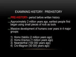
Use of colour: Pre-history period • Our understanding of how colour was used in the pre-history period comes about from examining examples of art & applied design dating from this period. • The Pre-history colour palette was limited to accessible pigments such as ochres, charcoal, earth brown & crushed bone mixed with water, resin, animal fat, or any similar binding agents (Delamare & Guineau, 2000). The pre-history colour palette
Use of colour: Pre-history period During the pre-history period, coloured pigments were mostly derived from locally available natural sources & were generally applied in a realistic, representational manner (Delamare & Guineau, 2000). Natural pigments were used to decorate the body & in cave paintings in Spain, France & Australia. Aboriginal rock painting, Kakadu National Park (Image: Australian Heritage Photographic Database: http://www.environment.gov.au/cgi)
Ancient Egypt (c5,000 – 300BC) The ancient Egyptian civilisation (c5000-300BCE) flourished in eastern North Africa along the banks of the Nile River. During this period, blues, greens, violet, white & gold were added to the prehistory palette of ochres & earth colours. • Pigments were derived from a range of mineral sources such as silicates of copper and calcium; powdered, crushed malachite, carnelian and lapis lazuli (Delamare & Guineau, 2000). The pre-history colour palette The colour palette of ancient Egypt
Ancient Egypt (c5,000 – 300BC) Colour was generally used symbolically: • Red skin implied health & youth. • Green represented Spring & renewal. • Blue & gold were associated with royalty or divinity due to the preciousness of these pigments (Ball, 2001; Delamare & Guineau, 2000). Image from the Book of the Dead, c1240BC. (Image: http://www.egyptarchive.co.uk/html/british_museum_35.html). Egyptian tomb relief
Ancient Egypt (c5,000 – 300BC) Blue & gold were reserved & used for royalty & divinity due to the cost & rarity of these pigments. Tomb painting & funerary mask of Tutankamun; Cairo Museum
Ancient Greece (c750 – 146BC) • The ancient Greek period is considered to have extended from the 8th century BCE through to 146BCE. • The colour palette of ancient Greece built on colour palette of the earlier Egyptians. • Greek art & design display a fairly large range of pigments and dyes applied in a representational as well as symbolical manner (Ball, 2001; Delamare & Guineau, 2000; Janson, 1995).
Ancient Greece (c750 – 146BC) Key ideas that came to influence later colour theorists... Pythagoras (c570-c497BCE) The Universe & its workings are underpinned by mathematical proportion. This Pythagorean aesthetico-mathematical understanding of the universe led to the ‘music of the spheres’ concept wherein the movements of all celestial bodies work in harmony & reflect mathematic proportion (see Johannes Kepler, etc). Colour correspondences: Linking four key colours to the elements, geometric shapes & Seasons (Gage, 1995; Kuehni & Schwarz, 2008; Magee, 2001).
Ancient Greece (c750 – 146BC) Key ideas that came to influence later colour theorists... Heraclitus(c535-475BCE) ‘Everything is flux’ – nothing remains stable & everything is in a state of transition • A key notion in regard to colour which is always open to the influence of factors such as changing light conditions, etc. The Universe is comprised of opposing forces & balance represents the ‘Unity of opposites’ • The notion of creating harmony via the balancing of opposing forces (Complementary colour) echoed in many colour theories of 19th & 20th centuries (Gage, 1995; Kuehni & Schwarz, 2008; Magee, 2001). .
Ancient Greece (c750 – 146BC) Key ideas that came to influence later colour theorists... Plato(c428-347BCE): Two realms: the visible world where nothing stays the same and everything changes and decays Theory of Ideal Forms: In the second world, perfect order and ideals forms reign. It is here that Beauty, Harmony, Order & Perfection exist, & Plato suggested that these had universal appeal (Gage, 1995; Magee, 2001). The Elgin Marbles from the Parthenon (examples of ideal beauty)
References Albers, J. (1963). The interaction of color. New Haven, NY: Yale University Press. Delamare, F., & Guineau, B. (2000). Colour: Making and using dyes and pigments. London: Thames & Hudson Gage, J. (1995). Colour and culture. London: Thames & Hudson. Itten, J. (1961). The art of color (Revised edition, 1973). New York: John Wiley. Janson, H. W. (1995). The history of art (revised and expanded by A.F. Janson). New York: Thames & Hudson. Kuehni, R. G. (2002). The early development of the Munsell system. Color Research and Application, 27(1), 20-27 Kuehni, R. G., & Schwarz, A. (2008). Color ordered: A survey of color order systems from antiquity to the present. Oxford: Oxford University Press. Magee, B. (2001). The story of philosophy. London: Dorling Kindersley Munsell, A. H. (1912). A pigment color system and notation. The American Journal of Psychology, 23(2), 236-244. Munsell, A. H. (1921). A grammar of color. Retrieved 20 October 2003, from http:/www.gretamacbeth.com/Source/Solutions/munsell/index.asp Munsell. (2003). Munsell: The universal language of color. Retrieved October 2003, from http:/www.gretamacbeth.com/Source/Solutions/munsell/index.asp Ostwald, W. (1916). Die Farbenfibel (The colour primer). Cited in Gage, J. (2000) Colour and meaning - Art, science and symbolism. London: Thames & Hudson. Rorke, M. H. (1931). The work of the Textile Color Card Association. Journal of the Optical Society of America, 21(10), 651-653.
Websites A&BC. (2005). Argyll and Bute Local Plan: Conservation, Character Appraisal and Key Environmental Features for Tobermory. Retrieved 20 April 2007, from http://www.argyll-bute.gov.uk/localplans Adobe. (2011). Adobe Photoshop CS5 - Overview. Retrieved 9 May 2011, from http://www.adobe.com/products/photoshop.html Aristotle. (335). Poetics. Section 1450b Retrieved 23 April 2010, fromhttp://www.perseus.tufts.edu/hopper/text?doc=Perseus:text:1999.01.0056 Barragan, L. (1980). Acceptance speech, Pritzker Architecture Prize. Retrieved 20 April 2007, from http://www.pritzkerprize.com/barragan.htm CAUS. (2009). Color Association of the United States. Retrieved 30 November 2009, from http://www.colorassociation.com/ CIE. (2008). CIE 1931 XYZ colour space. Retrieved 14 July 2008, from Commission Internationale de l'Eclairage http://www.cie.co.at/ Colourways. (2011). Colourways - Overview. Retrieved 9 May 2011, from http://www.colourways.com.au/pdf/Colourways%20Overview.pdf Cullachange. (2011). Cullachange - Colour charts. Retrieved 9 May 2011, from http://www.cullachange.com.au/colour-charts.html Dailyicon. (2009). Nestle Laboratory by Rojkind Arquitectos. Retrieved 25 March 2010, from http://www.dailyicon.net/2009/04/nestle-laboratory EFCD. (2011). Eva Fay Colour Design Retrieved 9 May 2011, from http://www.efcd.com.au/index.html EurekaVideo. (2010). Metropolis (A film by Fritz Lang, Germany, 1927; Reconstructed & restored 2010). Retrieved 23 June 2011, from http://metropolis1927.com/#home Funny Wildlife. (2012). Funny Wildlife Sleeping Animals. Retrieved on 28 November 2012 from http://www.funnywildlife.com/funny-sleeping-animals.html Frampton, K. (2002). The architecture of Glenn Murcutt. Pritzker Architecture Prize 2002 Essay Retrieved 10 March 2009, from http://www.pritzkerprize.com/laureates/2002/essay.html HSA. (2010). North Apartments - Project description. Retrieved 3 November 2010, from http://www.seidler.net.au/ ISO. (2011). ISO 15076 - Image technology colour management. Retrieved 10 May 2011, from http://www.iso.org/iso/iso_catalogue/catalogue_tc/catalogue_detail.htm?csnumber=54754 JVA. (2010). Jarmund Vigsnaes Projects - The Red House. Retrieved 25 March 2010, from http://www.jva.no/ Metrolic. (2012). Metrolic – Brothes Into Sleep. Retrieved 27 November 2011, from http://www.metrolic.com Morovic, J., & Morovic, P. (2003). Determining colour gamuts of digital cameras and scanners. Color Research and Application, 28(1), 59-68. Munsell. (2003). Munsell: The universal language of color. Retrieved October 2003, from http:/www.gretamacbeth.com/Source/Solutions/munsell/index.asp
Websites Munsell. (2011). Munsell: Products and services. Retrieved 10 May 2011, from http://www.munsellstore.com/default.aspx?menuitemid=476 Munsell, A. H. (1921). A grammar of color. Retrieved 20 October 2003, from http:/www.gretamacbeth.com/Source/Solutions/munsell/index.asp Newton, I. (1704). Opticks: A treatise of the reflections, refractions, inflections and colours of light (4th ed.). Retrieved 30 March 2010, from http://books.google.com/books?id=GnAFAAAAQAAJ OFA. (2011). Organic Federation of Australia - webpage. Retrieved 28 March 2011, from http://www.ofa.org.au/ MCSL. (2011). Munsell Color Science Laboratory. Retrieved 10 May 2011, from http://www.cis.rit.edu/mcsl/ NASAA. (2011). Association for Sustainable Agriculture Australia (NASAA) - webpage. Retrieved 28 March 2011, from http://www.nasaa.com.au/ NCS. (2009). The Natural Color System (NCS). Retrieved 14 July 2009, from http://www.ncscolour.com/ NCS. (2011). NCS Notation and colour space. Retrieved 10 May 2011, from http://www.ncscolour.com/en/rm/about-us/colour-knowledge/how-ncs-works/ncs-notation/ NHPL. (2011). NHPL Colour Pty Ltd - Calibrated digital capture of colour Retrieved 9 May 2011, from http://www.nhplcolour.com/digitalcolour.html Pantone. (2011). Pantone - Products and services. Retrieved 10 May 2011, from http://www.pantone.com/pages/pantone/index.aspx Rorke, M. H. (1931). The work of the Textile Color Card Association. Journal of the Optical Society of America, 21(10), 651-653. Schroeder, M. D. (1997). JPEG compression algorithm and associated data structures. <http://people.cs.und.edu/~mschroed/index.html>. Retrieved September 2003SLA. (2011). Sustainable Living Association - webpage. Retrieved 28 March 2011, from http://www.sustainableliving.org.au/home Shocking Newz. (2012). Shocking Newz. Retrieved on 28 November 2012 from http://shockingnewz.com/animals-sleeping-with-funny-styles.html Travel Photo. (2012). Travel Photo Animals. Retrieved on 28 November 2012 from http://www.travelphoto.net/a-photo-a-day/wordpress/category/photos-by-subject/animals/
Websites UNESCO. (1987). Venice and its lagoon (Reference 394). Retrieved 27 April 2010, from http://whc.unesco.org/en/list/394 UNESCO. (1994). World Heritage Site 712: City of Vicenza and the Palladian Villas of the Veneto. Retrieved 1 February 2011, from http://whc.unesco.org/en/list/712 Vargas, J. A. (2010). The face of Facebook - The New Yorker, 20 September 2010. Retrieved 23 March 2011, from http://www.newyorker.com/reporting/2010/09/20/100920fa_fact_vargas?currentPage=all Wall Paper Us. (2012). Wall Paper Us Animals Rocks Fennec Sleeping. Retrieved on 28 November 2012 from http://wallpapersus.com/animals-rocks-fennec-sleeping/ WallpapersWa. (2012). WallpapersWa Animals Sleeping Polar Bears Sunbathing. Retrieved on 28 November 2012 from http://wallpaperswa.com/Animals/Bears/animals_ sleeping_polar_bears_sunbathing_1920x1080_wallpaper_36045 Zuza Fun. (2012). Zuza Fun Sleeping Animals. Retrieved on 28 November 2012 from http://www.zuzafun.com/sleeping-animals Other images: Wiki Commons and Public Domain