Download

1 / 11
120 likes | 520 Vues
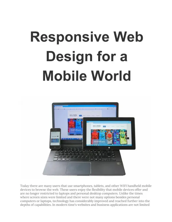
The rise in mobile web usage has brought the Responsive Website Design phenomenon into limelight. This presentation explains what responsive web design is all about and uses statistics to support the idea that it is a better alternative to dedicated mobile websites. It also highlights the need to move towards a Responsive Web Design to prepare your business for future.

E N D
Call: 1300 760 363 • The rise in mobile web usage has brought the Responsive Website Design phenomenon into limelight. • This presentation explains what responsive web design is all about and uses statistics to support the idea that it is a better alternative to dedicated mobile websites. • It also highlights the need to move towards a Responsive Web Design to prepare your business for future.
What is this? Call: 1300 760 363 • When a website adjusts itself according to the device it is being viewed on and fits to the screen, it is said to based on responsive web design (RWD). • There are three major principles of RWD • CSS3 Media Queries • Fluid Grid Concepts • Flexible Images
Why you need it? Call: 1300 760 363 Because Tim Berners-Lee (Director of the World Wide Web Consortium) says so – “The web should be accessible from any kind of hardware than can connect to the internet – stationary or mobile, small screen or large.”
Because these statistics say so Call: 1300 760 363 Internet Usage – Mobile vs. Desktops Global Mobile vs. Desktop Internet Users Projection, 2007 - 2015 This graph indicates that ensuring a good mobile web experience becomes almost mandatory
Percentage of Mobile versus <<PC>> Web traffic, by location Call: 1300 760 363 Within 2 years, there has been remarkable increase in mobile web traffic across the globe.
Email Opening Ratio Call: 1300 760 363 These figures are bound to spiral in 2013
Because it has these benefits as well Call: 1300 760 363 Google recommends it You get an SEO advantages! Site maintains a Consistent look across all platforms Superior UX! No need to separate Mobile version Cost and Time saved!
How does it work? Call: 1300 760 363
Call: 1300 760 363 • Use Media Queries • Easy to use • Optimum utilisation of space • Cross-browser compatibility • Keep your layout flexible • Use grid system like these: • 960 Grid System • Gridset • Golden GS • Add Fluidity • Adaptive resizing for images • Use breakpoints Responsive Web Design for those who want one-size-fit all website
Contact Us Website: http://awebsitedesigner.com.au/ Phone No.: 1300 760 363 Twitter: http://twitter.com/tanuj_rastogi Facebook http://www.facebook.com/pages/A-Website-Designer/675016145842611