Download
1 / 6
60 likes | 170 Vues
We researched many websites that focuses on text based content rather than on generic graphics as readability of content is the main concern of these publications.In this article we will explore some website design patterns and current practices in web typography .

E N D
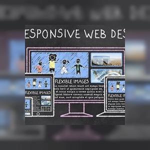
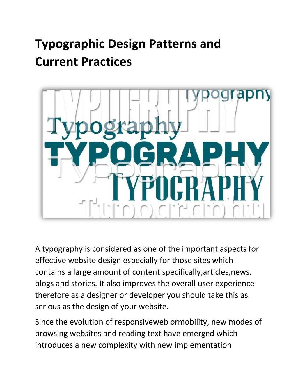
Typographic Design Patterns and Current Practices A typography is considered as one of the important aspects for effective website design especially for those sites which contains a large amount of content specifically,articles,news, blogs and stories. It also improves the overall user experience therefore as a designer or developer you should take this as serious as the design of your website. Since the evolution of responsiveweb ormobility, new modes of browsing websites and reading text have emerged which introduces a new complexity with new implementation
challenges to make theweb typography as rich, versatile and accessible as ever before. We researched many websites that focuses on text based content rather than on generic graphics as readability of content is the main concern of these publications.In this article we will explore some website design patterns and current practices in web typography . Popular Serif and Sans-Serif Fonts A typography has capability to set the tone for the entire website, and a wrong choice could send the wrong message.Contrasting a serif headline with a sans-serif body or vice versa can improve the overall visual appeal and readability of a website.
Serif and sans-serif are almost equally popular in headlines. The two most popular typefaces are Georgia — used on such websites as The Guardian and the Financial Times — and Arial — found on Zeit.de and the BBC’s website. The most popular serif typefaces for headlines are Georgia (14%) and Chaparral Pro (6%). The most popular serif typefaces for body copy are Georgia (20%) and Chaparral Pro (4%). 66% of headline typefaces and 39% of body copy typefaces are found in only one instance. The most popular sans-serif typefaces for body copy are Arial (14%) and Helvetica (6%).
Light or Dark Background? - Black text on a white background is a common pattern for body copy. Other important points to consider are - Average Font Size for Headlines - The most popular sizes range from 20 to 32 pixels.
Optimal Line Height for Body Copy– line height (pixels) ÷ body copy font size (pixels) = 1.46 line length (pixels) ÷ line height (pixels) = 24.9 space between paragraphs (pixels) ÷ line height (pixels) = 1.39 Ratio of Headline to Body Font Size HEADLINE ÷ BODY COPY = 2.5 Characters per Line Web Typography and Responsive Design Average Font Size for Body Copy
However, employing these practices to improve the pleasant reading experience and keeping the reader’s interest on a site can be quite a challenge. With the help of this article you can sharpen your typographic skills to develop a quality website. iMediadesigns provide cost effective web design and development solutions and offers custom web design services in Toronto