Download
1 / 4
40 likes | 148 Vues
In what ways does my media product use, develop or challenge forms and conventions of real media products?. Design:

E N D
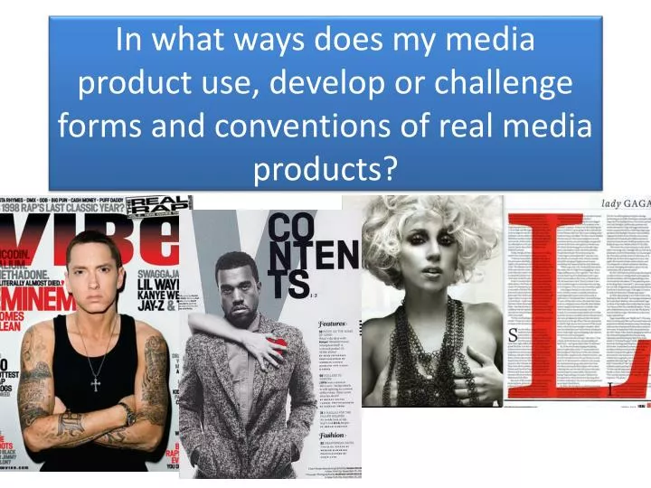
In what ways does my media product use, develop or challenge forms and conventions of real media products?
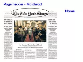
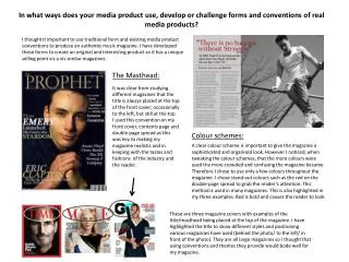
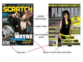
Design: The Background of my magazine was manipulated in Adobe Photoshop using the gradient tool. I have decided to use these colours because they follow the colour scheme of red and grey, and these colours are used a lot for backgrounds of typical rap magazines which makes the background a convention. Masthead The masthead of my product is in bold block capitals. I have made the masthead as large as possible in order to catch the readers eye. Most rap magazines have a really bold font. I have followed the convention of most rap magazines so that my magazine is sold to my intended target audience. The Masthead reads ‘Immense’, his connotes how great this magazine is and why the cosumer would want to pick up he magazine and buy it Main Image: My main image is a medium shot in the centre of the front cover. The pose that the model has is a stern pose looking directly towards the camera, this follows the conventions of a typical music magazine where the model is, most of the time, looking to the camera. The costume that the model is wearing, has been planned in order to connote that this is a rap magazine. The puffer jacket is what most rappers wear which indicates to the reader what genre of music the magazine entails. Selling Line: The selling line of my magazine is at the top of the magazine directly above the masthead. My selling line is ‘THE UK’S HOTTEST RAP MAG’ which is similar to Q’s selling line, which is ‘the UK’s biggest music magazine’. My selling line in particular is following the colour scheme and only a 5 word sentence. This is similar to a typical music magazine. The selling line is supposed to be short and sharp. Issue Number, Price and date: The issue number, price and date are all together placed in a black box above the barcodes and the website. This is where these devices normally are, therefore it means that my issue number, price and date are in the typical place for a magazine. Magazines have to include this information so that the reader knows whether the magazine is in or out of date. Coverlines: The coverlines surround my model and they follow the colour scheme of my magazine, which is grey and red. My coverlines use colloquial language to engage with the reader and allow the reader to feel comfortable reading my magazine. The font is in sans serif which attracts the wider audience and creates a modern atmosphere to my magazine. This follows the conventions of most rap magazines because most rap magazines use the font sans serif. Barcode: The barcodes have been hidden in the bottom left of the front cover. I have included a BlackBerry barcode as well as an ordinary barcode to make the magazine convenient for people with these type of phones. This means that more people would buy it. I have placed social networking pages along with the website, issue number, date and price which is similar to vibe magazine where they have used a textbox for these types of information. Main coverline: The main coverline reads ‘Papps’ which is the name of the rap artist and is in a large and bold font, differentiating the main coverlines from the ordinary coverlines. It is a convention to have two parts to the main coverline, this is why I have added a quote which the rap artist has said. The quote is in grey writing whereas the name of the rapper is in red which is following the colour scheme.
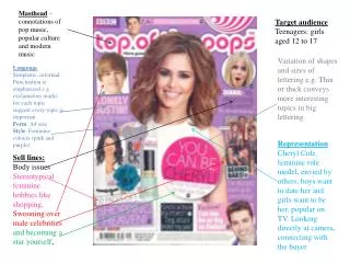
Small Version of Masthead: The small version of my front cover is a typical convention which is sometimes added in the contents page, usually at the top. The small version of a the front cover is in order to show the reader that this contents page belongs to this front page. It also connotes how exclusive this issue is. The front page needs to be emphasised. Masthead: The masthead is a typical convention of a magazine, to have a smaller version of the masthead in the contents page. I have put the masthead in the top left corner of the page because this is where the masthead is normally on the contents page. The masthead shows the reader that it is part of the same magazine. The masthead is like a logo. The more it is seen, the more the reader will remember it Title: I have used a different technique of typography which they have used in the Vibe contents page. This is where the word ‘contents’ carries on across three line which makes the title look creative and challenges the reader to keep on reading. It is at the top of the page to show importance. It is a typical convention for a magazine to have the word ‘contents’ at the top of the contents page. This is so that it is clear to the reader that this is the contents page. Colour Scheme: The colour scheme of this contents page, follows the colour scheme of the front cover which is red and grey. This is a convention due to the fact that most magazines are consistent with the colour scheme throughout their magazine. Main Image: The main image is the same person as the front page with a microphone as a prop. The main image is in black and white apart from the microphone, this is so that the microphone stands out from the rest of the image. I have taken inspiration from the Vibe magazine contents page where the model, Kanye West is black and white but the heart on his chest is red. It isn’t a typical convention to have the main image black and white, although I wanted to emphasise the connotation of the model to be a rapper. I have done this by taking inspiration from the Vibe magazine, (the main image black and white apart from the prop). Editor’s Note: This is a typical convention of a contents page where I have talked about how great this month’s edition is and what the magazine includes. I have added a picture of someone else which I have taken the picture of. This follows the convention of a real contents page Categories: I have included two categories, features and regulars. It is a typical convention for a magazine to have regulars and features. The features are what is in this edition of a magazine and the regulars are what is in the magazine every month.
Title: The title reads a quote, ‘rap is my life’ which is the same quote as the main coverline on the front cover. The title is in the font sans serif and in two different colours, the red is highlighting the important part of the title whereas the grey highlights the ordinary words. It is a typical convention to repeat the main coverline somewhere on the double page spread. I have chosen to repeat it in the title, the most eye catching part. The title bleeds across the double page spread Sub-Headline: The sub-headline is in the typical place for a sub-headline to be, directly under the title. The name of the rapper, Papps is highlighted in red to make it clear to the reader what the subject is. I have written Papps in the exact same font as the main coverline on the front page, Ebrima, which shows consistency throughout my magazine. Main Image: The main image a colour image of the same person as the front cover. However, here the rap artist has the prop of a microphone and his arm is taking up the full length of the double page spread. The main model is not looking directly towards the camera therefore, it is following the conventions of a real music magazine. Article: I have used two columns in my article so that the double page spread doesn’t look cluttered. It is a convention to have columns to lay out the article in double page spreads. I have also used red to highlight the interviewer’s questions, whereas I have used white to highlight the rap artist’s answers, it is typical to use different colours due to whether it is the interviewer or interviewee talking. I have used a drop capital at the start of the article. Drop capitals are a typical convention, commonly used in double page spreads Quotes: Quotes are a commonly used convention for a double page spread and are almost always included. They engage the reader because of how this is what the interviewee actually said. My quote covers a quarter of the whole double page spread and is red which accomplishes the colour scheme which I am trying to achieve through this magazine. I have used the outer glow effect on the quote to make it stand out.