Download
1 / 5
50 likes | 110 Vues
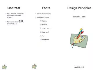
Design Principles. By: Jonathan Gross. Contrast. It’s what makes a reader look at the page in the first place because it gets the readers attention. When you look at a paper, why did you look at it in the first place? Because you thought it look interesting, because of the contrast.

E N D
Design Principles By: Jonathan Gross
Contrast • It’s what makes a reader look at the page in the first place because it gets the readers attention. • When you look at a paper, why did you look at it in the first place? Because you thought it look interesting, because of the contrast. • Good use of contrast would be: • Bad use of contrast would be:
Proximity • Items relating to each other should be grouped close together. • It helps organize information, reduces clutter, and gives the reader a clear structure. • Good use of proximity would be: • Bad use of proximity would be:
Alignment • Nothing should be placed on the page arbitrarily. Every elements should have some visual connection with another element on the page. • This crates a clean, sophisticated, fresh look. • Good use of alignment would be: • Bad use of alignment would be:
Repetition • You can repeat colors, shapes, textures, spatial relationships, line thicknesses, fonts, sizes, graphic concepts, etc. • This develops the organization and strengthens the unity. • Good use of repetition would be: • Bad use of repetition would be: