Download
1 / 16
170 likes | 365 Vues
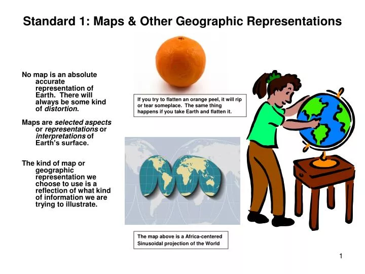
No map is an absolute accurate representation of Earth. There will always be some kind of distortion . Maps are selected aspects or representations or interpretations of Earth’s surface.

E N D
No map is an absolute accurate representation of Earth. There will always be some kind of distortion. Maps are selected aspects or representations or interpretations of Earth’s surface. The kind of map or geographic representation we choose to use is a reflection of what kind of information we are trying to illustrate. Standard 1: Maps & Other Geographic Representations If you try to flatten an orange peel, it will rip or tear someplace. The same thing happens if you take Earth and flatten it. The map above is a Africa-centered Sinusoidal projection of the World
FROM: The Adventures of Tom Sawyer… Tom Sawyer and Huck Finn are in a hot air balloon somewhere over Illinois…. HF: "I know by the color. We're right over Illinois yet. And you can see for yourself that Indiana ain't in sight." TS: "I wonder what's the matter with you, Huck. You know by the COLOR?" HF: "Yes, of course I do." TS: "What's the color got to do with it?" HF: "It's got everything to do with it. Illinois is green, Indiana is pink. You show me any pink down here, if you can. No, sir; it's green." TS: "Indiana PINK? Why, what a lie!" HF: "It ain't no lie; I've seen it on the map, and it's pink." ….. TS: Seen it on the map! Huck Finn, did you reckon the States was the same color out-of-doors as they are on the map?" HF: "Tom Sawyer, what's a map for? Ain't it to learn you facts?" TS: "Of course." HF: "Well, then, how's it going to do that if it tells lies? That's what I want to know." • Do Maps Lie • What’s a Map’s Perspective • How Do Maps Tell Stories & Highlight Themes
MAPS & OTHER GEOGRAPHIC REPRESENTATIONS Aerial views of parts of Indiana – and they ain’t pink! These maps use GIS, remote sensing, & hydrologic modeling: They’re not pink, but the one on the left is certainly brightly colored. This ‘remote sensing’ map allows efficient identification of degraded riparian areas in the watershed. It provides a basis for assessment and prioritization of areas to target for restoration. And, the area can be described and analyzed on the basis of channel geometry, land use, soil types, and vegetation.
Whether we’re traveling from point A to point B in a car, checking out the contours of a favorite mountain hiking trail, planning a city, or identifying riparian degradation in Young’s Creek Watershed in Indiana (previous slide), understanding how to analyze information from a spatial perspective is a task that we engage in everyday as ordinary people, as well as highly trained professionals. Piestewa Peak
Every Geographic Representation has a purpose Geographers categorize maps into two main categories: general reference maps and thematic maps. Of the maps depicted here, which do you think are general, and which are thematic? Using high resolution thermal infrared data from the Landsat and Terra satellites, the map on the left shows thermal upwelling jets at Lake Tahoe.
The Stories Maps Tell The theme of this map tells the sad story of just one county and city in the US, that is virtually the same story across many, many counties in the US over the past few years. The map illustrates neighborhoods where housing foreclosures occurred most frequently in Cook County, Chicago, IL in 2007.
More ways to display geographic information Above, the globe shows us a more true representation of the continents shapes and sizes. In addition, we see the lines of longitude and latitude
‘Isoline’ maps Above: Amount of solar energy reaching the US by region
This map of Wisconsin illustrates the occurrence of the Polish surname “Zywicki” in Wisconsin using a color scale, with the darkest blue representing the highest density of Zywicki surnames. Thematic Maps
Maps’ limitations & projections Above =Three classes of map projections: Example: Large area/US = Cylindrical Medium area/state = Conical Small area/city = Azimuthal
Maps’ limitations & projections • As mentioned, no map is an absolutely accurate representation of Earth’s surface. The most accurate is a globe, but you really can’t carry a globe around in your pocket or backpack, and it isn’t likely to help you find your way to any given point. If you try to flatten a globe, what happens? Think about what would happen if you tried to take an orange peel and flatten it – it cannot be done without tearing, breaking, or distorting the orb. The map below shows an equidistant map projection, which correctly represents distances. Above, an equal-area map projection correctly represents areas sizes of the sphere on the map On a Mercator or conformal map projection (left) meridians and parallels intersect at right angles
Map Scale Map scales are represented in 3 main ways: Graphic Scale – using a bar or line showing the equivalent miles or kilometers on the Earth Verbal or Written Scales - using words, such as “1 inch = 5 miles”, and Representative Fraction – (see examples on left) A way to remember and differentiate ‘large’ from ‘small’ scale maps is: ‘small scale’ = little detail; and ‘large scale’ = greater detail on the map.
Patterns & Distribution • Maps, like other images, convey a great deal of information at a glance. Geographers use maps to plot and show ‘patterns’ on Earth’s surface, and ‘distribution’ of phenomenon on Earth. The map above illustrates the spatial ‘distribution’ of six religious denominations
The graph below illustrates religious diversity in Hawaii by percent of Hawaii’s population.
Conclusion: Maps & Other Geographic Representations Knowing how to identify, access, evaluate, and use all of these geographic resources will ensure students of a rich school experience in geography and the prospect of having an effective array of problem-solving and decision-making skills for use in both their other educational pursuits and their adult years.
By Elizabeth Larson, PhDLecturer, School of Geographical Sciences and Urban Planning, Arizona State University, 2010.