Download
1 / 8
0 likes | 11 Vues
Youu2019ll find both successful and unsuccessful case studies in this guide. Each illustration will demonstrate a different method that can be used for your call-to-action button. Follow these rules, and youu2019ll be well on your way to increasing your conversion rates.

E N D
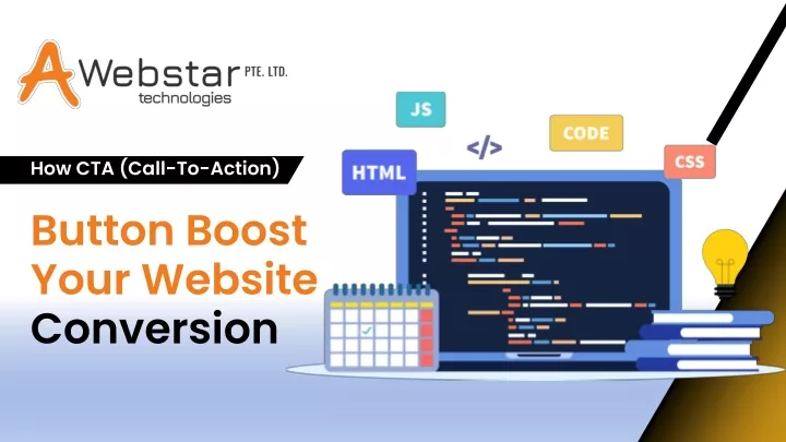
How CTA (Call-To-Action) Button Boost Your WebsiteConversion
INTRODUCTION Call-to-action buttons are a critical component of a landing page. They can have a significant impact on the conversion rate of your page, especially when they are strategically placed, easy to find, and clearly labelled. You’ll find both successful and unsuccessful case studies in this guide. Each illustration will demonstrate a different method that can be used for your call-to-action button. Follow these rules, and you’ll be well on your way to increasing your conversion rates. Alternatively, you can also get assistance from an agency that can provide you with the best Digital Marketing Services to optimize your Website with an effective CTA.
What is Call to Action Button? A call-to-action button is a button that directs visitors where to go next. Its main purpose is to get visitors to act by clicking the button and completing the desired task. A call-to-action button can be a link, a button, a text, or any other element on a page that directs users to take action. Call-to-action buttons are highly effective tools that can help you increase your conversion rate. Today, we will be discussing the different types of buttons, how to make the button more effective, and where to place them.
Tailoring Communication To The Audience Placement of the CTA Button: Apply Delay Call-To-Action Popups: Make Your Design Unique: Even if your call-to-action (CTA) is amazing, you may not be satisfied with your conversion rate. Where did all these people go? Maybe your call to action (CTA) is hidden in the depths of a landing page’s extensive menu structure. Keep your call-to-action front and center. Put it front and center so that it grabs the attention of your buyer right away. Approximately, Eighty percent more people will convert if a call to action is included on the landing page You’re not necessarily incorrect if you’ve formed a bad view of popup integration based on what you’ve read. Nevertheless, it’s possible that you haven’t seen the complete account. Google will downrank websites that use intrusive interstitials, such as pop-ups. This includes pop-ups that show up when a user clicks on a mobile search result from Google. There are exceptions, such as secondary sites and delayed call-to-action pop-ups, which are not covered. You may attribute roughly 50% of your site’s visitors using some sort of mobile device to see your content. You need to make sure that your website looks different from the rest of the crowd. Make use of a layout that changes proportionally to the screen size of the user’s device. If you want to keep your consumers’ fleeting attention, the content on your website must be legible even on mobile devices. Your CTA relies even more heavily on this tactic.
Make Use of Color: Determine the Button Size: Be sure your landing pages are Effective: Your goal is to get the user to make a purchase or download. Your first step should be to grab their interest. So how do you get people’s attention and direct it where you want it to go? Create a lively call to action. Color schemes, gradients, reflections, typefaces, line spacing, and other design elements can be combined in an unlimited number of ways. When it comes to picking the right hue, there is no right solution. You need to make sure your button fits properly. The CTA button needs to stand out, but not be enormous. So far, most calls to action have used an appropriate button size. The call-to-action button should blend in with the screen’s background and be conveniently located. Also, there’s a new worry for online stores. The “add to basket” button needs to stand out sufficiently so consumers don’t have to look for it, but not so much that they feel awkward clicking it. If your landing pages aren’t functioning properly, your calls to action won’t do you any good. The effectiveness of your calls to action depends on your clicking on them. Nothing is more frustrating for a customer than a website stating that they have reached an error or 404.
Conclusion: On the few occasions when a lengthy explanation is needed, one word will suffice. There is no right or wrong place for the CTA; testing will reveal the optimal placement. It might be spherical, rounded, circle-shaped, or a rainbow of colours. Ensure that your call-to-actions (CTAs) are not overly aggressive and that clicking on them will benefit the customer. Get your calls to action in order, and watch your conversion rates soar. If you face any difficulties while optimising the CTA, you can take help from a reliable Web Development Company. They will ensure to optimize your website with the CTA that will increase your conversions.
Thank You Get in touch with us: info@awebstar.com.sg Contact Us Now Visit our website https://awebstar.com.sg/