Download
1 / 115
1.16k likes | 1.33k Vues
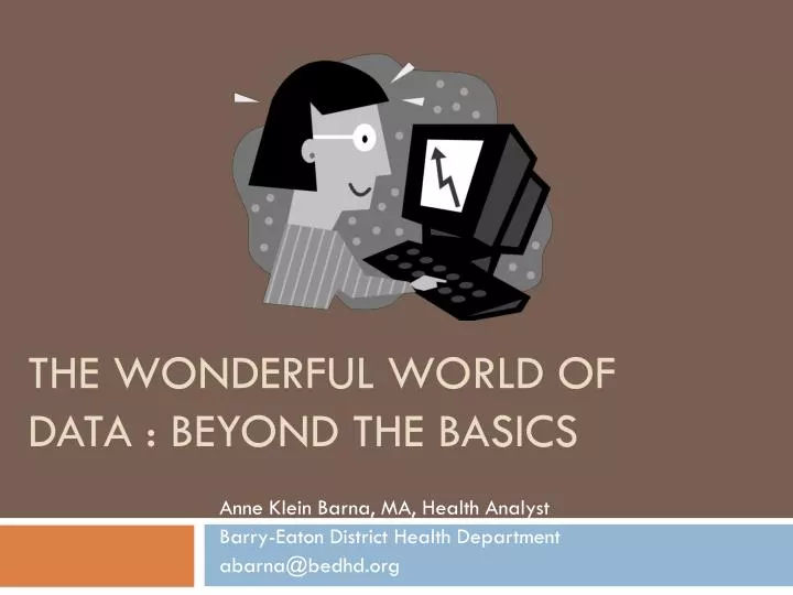
The Wonderful World of Data : Beyond the Basics. Anne Klein Barna, MA, Health Analyst Barry-Eaton District Health Department abarna@bedhd.org. Outline . Data Visualization Charts: Best Practices Using data in coalition and program evaluation. Social determinants and health equity data.

E N D
The Wonderful World of Data : Beyond the Basics Anne Klein Barna, MA, Health Analyst Barry-Eaton District Health Department abarna@bedhd.org
Outline • Data Visualization • Charts: Best Practices • Using data in coalition and program evaluation. • Social determinants and health equity data. • Techniques for problem prioritization. • New tools in data communication • Qualitative analysis techniques • Storytelling in prevention
Visual communication Our eyes provide the greatest amount of information that is processed by our brains. Show, don’t tell!
General Principles of Tufte http://www.youtube.com/watch?v=HfXSltlDfDw
Grand Principles of Analytical Design (Edward Tufte) • Show comparisons. Compared with what? • Show causality. How did it happen? • Multivariate analyses. To clarify, add detail. • Choose the best mode. Integrate words and numbers. Don’t restrict yourself. Whatever it takes. • Document everything and tell people about it. Integrity, quality, and credibility are important. • Passion about the content. High quality and high integrity of the content.
Data Journalism Handbook (free) • http://datajournalismhandbook.org/
Enhancing Visual Communications • Attract attention in an aesthetically pleasing way • Integrated into written and oral communications • Relevant and tailored to the audience • Gender, race, ethnicity, socioeconomics • Simplicity! Note this section adapted from: Communicating Public Health Information Effectively, 2002, Nelson et.al.
Table • Great way to bore someone! • OK for lists • Must rapidly display a clear pattern Actual Causes of Death, 1990 Tobacco 400,000 Diet and Physical Activity 300,000 Alcohol 100,000 Firearms 35,000 Illicit Use of Drugs 20,000 But… a chart would still be better
Charts and Graphs Misconceptions Handout
Anatomy of a (bad) Chart • http://www.excelcharts.com/blog/anatomy-of-a-bad-chart/
Bar Charts • Display the magnitude of numbers • Compare groups • How many bars?
Line Graphs • Very good at displaying trends over time • Problems include too many lines (use 4 or less unless chart is big and ) and poor labeling • Example:
Data Visualization in Excel • http://www.excelcharts.com/blog/data-visualization-excel-users/ • This is an in-process online tutorial
Oh, the pie chart… • Google returns 2.2 million pie charts in image search, 1.8 million bar charts and only 0.34 million line charts; • Percentage of 3D pie charts in the first page: around 30%; • Percentage of pie charts with exploded slices: around 15%; • Bad pie charts (3D or exploded slices or legend or too many data points or no labels or unsorted slices): around 99%.
Pie Chart Do’s and Don’ts • Don’t use 3D • Don’t explode your pies • Don’t use a legend • Don’t use too many chunks (groups of slices) • Label the slices • Sort the slices • Don’t compare pie charts
Maps • Excellent when you have data sub-county • Google maps • www.michigantrafficcrashfacts.org • Census/American Factfinder • Most health departments and counties have GIS capability – but you must have geocoded data or addresses or rates for specific areas.
Pictures Use as part of the design, not part of the chart.
Typography & Good Design • Proximity • Alignment • Repetition • Contrast & White Space • Fonts You know it when you see it…or do you?
Data-to-ink ratio • Examine your chart – what is the amount of ink used to display your data? What is the amount of ink used for other parts of the display? • The more ink used for data, the better. • Using Excel 2007 versus an earlier version will help do this for you.
Color and Shading • Cost • Warm colored objects set on cool backgrounds • Cultural meanings of colors • Shading can convey meaning, esp, maps • Consider the color blind – can they still read it? • Fill patterns
Colors have meaning Gender Nationality Political Party Nature School Familiar Objects
Titles and Labels • Convey meaning with your title if possible • Label your axes unless it’s obvious or previously explained • Thoughts on legends? • Get rid of every other line that you can! • Date • Source
Distortion • Sometimes the same data can be plotted with different y-value axes, and it looks very different. • Consider whether you are accurately displaying a trend if you “zoom in”.
3-D Charts Please don’t.
Pictograms or Glyphs http://www.fao.org/docrep/006/t7838e/T7838E06.htm