Download
1 / 4
170 likes | 705 Vues
Ergonomics and Anthropometrics. Peoples interaction with their products and their sizes. Ergonomics is about the relationship of people with products

E N D
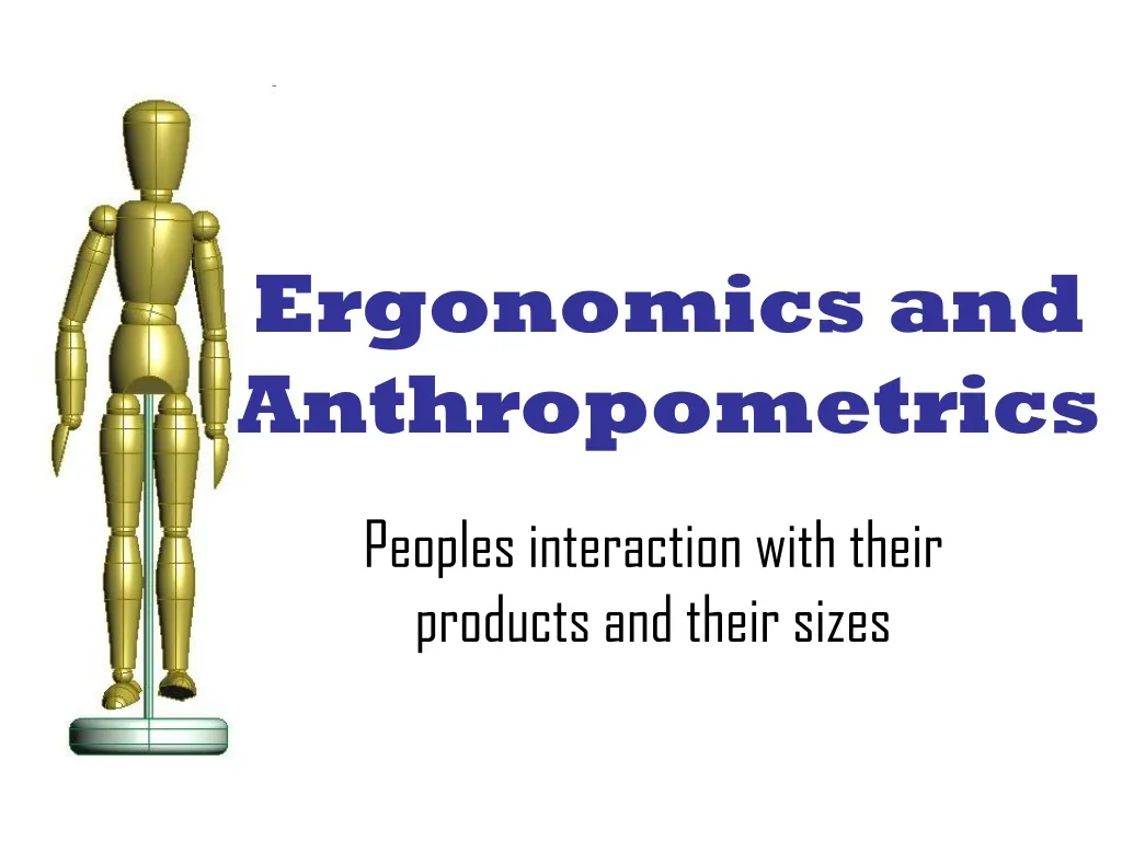
Ergonomics and Anthropometrics Peoples interaction with their products and their sizes
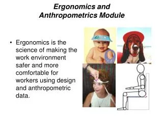
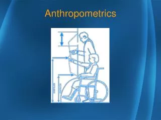
Ergonomics is about the relationship of people with products From how easy it is to open a jar to the discomfort of sitting on a bus to the positioning of the controls in a fighter jet, ergonomics is how a person interacts with a product. As a designer we always need to consider how easy and comfortable any product will be to use. One of the ways to do this is to look at ANTHROPOMETRIC DATA. ANTHROPOMETRY is the study of statistics that have been gathered and combined over many years of the sizes of the human body. As designers we can use this data to decide on the sizes, weights and proportions of our products so as to provide the best ergonomics for the end user. Ergonomics & Anthropometric Data And how it affects designers
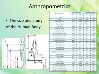
Anthropometric Data Explained Of course not all people are the same size. There will be huge differences between the heights, weights, and other dimensions due to: gender, age, diet, growth rate, genetic make up and other factors. Therefore the Anthropometric data needs to be organised in a specific way. If we were to plot a graph with peoples heights along the bottom and how many people are at that height up the side we end up with a graph that looks like this. The shape is called a “Bell Curve” The percentage of people at each height (or weight or whatever) is called the percentile. The average (mean) size is therefore the 50th percentile. We sometimes use this as the best size to design for. However really we should design for everyone between the 5th and 95th percentile. The top and bottom 5% being just to big or too small to practically design for. Tough luck for them!