Download
1 / 21
210 likes | 530 Vues
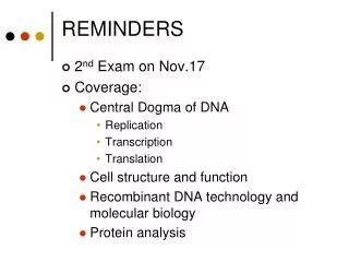
Marketing Reminders Where are those logos, templates and guidelines? Use Current Logos from Marketing Resources Page http://ces.ca.uky.edu/marketing/ Please read this when you return to your offices. Use Current Templates from Marketing Resources Page http://ces.ca.uky.edu/marketing/

E N D
Marketing Reminders Where are those logos, templates and guidelines?
Use Current Logos from Marketing Resources Page • http://ces.ca.uky.edu/marketing/ • Please read this when you return to your offices.
Use Current Templates from Marketing Resources Pagehttp://ces.ca.uky.edu/marketing/
Use Current Templates from Marketing Resources Pagehttp://ces.ca.uky.edu/marketing/
Use Current Templates from Marketing Resources Pagehttp://ces.ca.uky.edu/marketing/
Graphic Design Tips Designing material that will catch your audiences attention!
When Creating a New Document in Publisher: • Set your margins to .25. • This will allow you to have more white space on your page. • The blue line around the page will be the boundaries that you will • need to stay inside of to avoid being cut off by the printer! .25 Margin 1in Default Settings
Set Up a Baseline Grid. • This will help to center items on the page. Blue line will not print. Arrange (Tab) Layout Guides Grid Lines Columns 2
Avoid Using the Middle Dots to Size Photos and Clipart. • Using middle dots to size will cause your image to be stretched. • Holding down CTRL + Shift and using the corner dots will size from • the center of the image instead of just sizing from one side.
Inserting Text Box with Columns: • Instead of creating multiple text boxes to continue story use, one text box and columns. On an 8.5 by 11 page, two columns work well. More than two columns will cause the reader to get lost in the text.
Word Hyphenation • Documents will look more professional if you set them to not include hyphenation! To remove hyphenation select your text box, go to Tools, select language. Click on Hyphenation. Uncheck the box and hit Okay. All of your hyphen’s should be removed.
Color Talks… Are You Listening? • Next time you want to make a bold statement, try saying it with color!Depending on what type of message or meaning you wish to convey, the color combinations you choose can support, emphasize, or contradict your message. Color stimulates the senses, symbolizes abstract concepts and thoughts, expresses fantasy or wish fulfillment, and produces an aesthetic or emotional response.According to the Institute for Color Research, humans make a subconscious judgment about a person, environment, or item within 90 seconds of initial viewing, and the majority of that assessment is based on color alone. Because color delivers an instant impression that is generally understood universally, color is very important in conveying a mood or idea where verbiage is not used or understood. • Source Liberty Printing • If you are printing in color, fill the page up with color. If you are printing in black • and white, the printer will use gray scales. • Using the same color family throughout allows for easier reading. • Try to limit yourself to 2-3 fonts per newsletter and 2 per flyer. Using more fonts • than this will cause the reader to skip over important information. • 12 point is a good reading font size.
Use of WordArt for Titles: • Will allow you to be more creative using outlines, drop shadows, and • color schemes. • Use the dots to adjust WordArt size. CTRL + Shift will shrink WordArt down from the center. Use of Word Art Typing in the Box
Centering Text in Object / Text Box: • Right click on box • Format auto shape or text box • Click on text tab • Vertical alignment – puts it in the center. Not Centered Centered
Think of Your White Page as a Canvas. • Use objects in the background. • Don’t worry about going outside the white area on the page, the printer will cut off any excess. • Using photos over clipart will make your document more professional. Print View
Need to Remove the White Box from Behind an Object You Inserted? • Click the object. • Then the transparent button on the picture toolbar. • Then click inside the object. Most of the time the object will loose the • background color. • To change the all black use the brightness keys to click until all the black is • gone. • To find the picture toolbar. Go to View – Toolbars – and select Picture. Transparent Button Brightness Button
Enhance with Clip Art • Visual images can often create interest, express meaning, and clarify content in a way that words alone cannot accomplish. Here are a few tips on how to easily select and utilize clip art to enhance your next project: • Select an image that makes sense in the context you're using it in, not just because it's pretty. Avoid • using too many images, which can make your document look cluttered. • Use adequately sized images. If an image is too small, readers may struggle to see it. If the image is too • large, it can distract readers from the text as well as increase your document's file size. • Choose a style of clip art that matches the personality of your piece. The use of coloring, shading, • contours, etc. can create completely different looks and feels. • Be sure the shape of the image matches the area where you will be using it. For example, a tall vertical • image may not work well on a horizontal business card. • Consider using captions or labels to connect the image to your text. • Choose the right format for your needs. For example, GIFs are easily animated for online use but do • not provide the high quality that can be obtained from a TIFF file.
Enhance with Clip Art Continued • Visual images can often create interest, express meaning, and clarify content in a way that words alone • cannot accomplish. Consider modifying stock clip art to increase its usefulness. Flip, resize, • rotate, distort, convert, and combine multiple pieces of clip art into new pictures. • Crop clip art images to easily simplify or change the meaning of images. Clip art can often be used as • separate bits and pieces. • Colorize images or convert to black and white or grayscale. Not only can you control the colors used, • but also the focus of the image. • Consider how the publication will be printed. If it will be photocopied, crisp black and white clip art is • ideal. • If you're interested in a copyrighted image, contact the owner and ask for permission to use it. Be sure • to specify where and how the image will be used. • Keep a copy of any written permission you receive, and give credit where credit is due. • Source: Liberty Printing
Uploading Material to the Website: • Upload documents as PDF – Some clients will not have Publisher or • the current Word and may not be able to open documents. • Websites That Have Useful Information: • www.sxc.hu Free High Quality Photo’s • www.mybinding.com Great for laminating material, name tags, etc. • www.royaltyfreemusic.com Free music for education for presentations • www.qualitylogoproducts.com Promotional Material • www.photodex.com Photo/Video Program $49.00 Education Version