Download
1 / 10
100 likes | 332 Vues
Elements of Good Yearbook Design. A brief overview. Awesome yearbook. Design Matters. How can design create a function and a feel/tone ? Why is the look of a yearbook so important? What is a yearbook “theme?”. Steps to creating good layout.

E N D
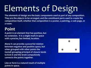
Elements of Good Yearbook Design A brief overview
Awesome yearbook Design Matters How can design create a function and a feel/tone? Why is the look of a yearbook so important? What is a yearbook “theme?”
Steps to creating good layout Set your dominant photo - often 2.5 times larger than other photos on spread Set your hook – place the headline, make it dominant, make the size and font decisions now. You can take risks with your headline that aren’t appropriate with body copy. Add other copy and photos - often, these are just placeholders you leave to reserve the space for later.
3. Add captions to photos – build from middle out, match them up with the photos they talk about. 4. Graphics– add any graphics, often in another layer. They should draw the readers’ eye to something important, not just be cute! 5. Check – run a check over formatting and style considerations – color, font, size, etc. for consistency
Column vs. Grid Layout Column layouts help you balance and distribute items on the spread. The columns can be used as guides to maintain even spacing and straight lines. There can be 4-10 columns on a page. Grid – serves the same balance function, but with much smaller spaces to visualize. Looks like a piece of graph paper. Small spaces (picas) are useful to count out precision measurements.
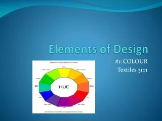
Color Use color to convey mood, carry the theme, attract attention, or as a graphic element. Headlines – color ok Body copy – color not ok Dark on light OR light on dark Always check the poster/books
Text Enough to tell story, not enough to bore Text as graphic: large first letter, word art, headlines, sub-headlines, folios
Photos The size of the photo is proportionate to its importance – subject, quality, who is in it White space – more photos is not the goal, more = busier/cluttered/faster Every photoshould tell a story – it should be in line with the overall goal for the spread Type – is it the appropriate type of photo for this spread? (Portrait, action, candid)
Shooting Rules – the basics Portraits – well lit, straight posture, chin slightly up, face turned slightly to right, smile, looking at camera Candids – frame group or individual, we need to see what they’re doing, energy and emotion need to come through Action – shoot ahead of the moving subject, high shutter speed (or sports setting), adjust to gym light, individuals or pairings better than big old scrum
Shooting Rules – the basics Always be ready – have a camera with you, sometimes you just get lucky. Feel the vibe – if you think/feel like something is going on or is about to happen, be ready to shoot. Don’t get sucked in – at events it’s important to be shooting the whole time; if you stop to watch, you’ll miss something cool!