Download
1 / 33
340 likes | 612 Vues
Learn about balance in design, symmetry types, why balance is vital, tips to achieve balance, rhythm, variety, emphasis, and movement. Discover how visual elements like shapes, lines, and colors affect balance and create engaging compositions.

E N D
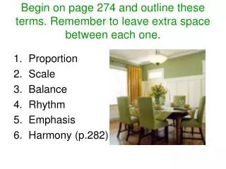
Design Principles (Part 2):Balance, Rhythm, Pattern, Emphasis, Movement, Unity & Variety
Balance– is the visual weight of an image. How to Be a Wicked Witch, Book Cover by Dennis Clouse
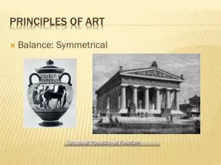
Different Types of Balance Symmetrical Balance: - an even placement of visual weight in the design Asymmetrical Balance: - creates uneven spaces, a sense of imbalance & tension - gives a dynamic suggestion of visual movement - space and shapes don’t need to be evenly dispersed on a page Radial Symmetry: - relates to images emitting from a point (Ex: like ripples from a pebble tossed into a pond)
Symmetrical Balance– The vertical axis is the implied center of gravity. Forms on either side of the axis correspond to one another other in size, shape and placement. Tibetan Mandala – “world in harmony” Deer’s Skull with Pedernal, Georgia O’Keeffe, 1936
SYMMETRICAL BALANCE The Two Fridas, Frida Kahlo, 1939
ASYMMETRICAL BALANCE 2 sides do not match, but the image seems to be well balanced because the visual weight in the two halves is similar. Death and Life, Gustav Klimt, 1911
Why is Balance Important? Balance is vital. A design can be ruined by poor balance! Balance should not be 50/50 in a boring mathematical sense. Different elements should add up to balance. How to Achieve Balance? Colors: all colors have visual weight Baby Blue = Light; Brown = Heavy
How to Achieve Balance? Shapes: squares can appear heavier than circles, etc. Lines: thick lines appear heavier than thin lines Size: larger = heavier
ASYMMETRICAL BALANCE 1. A textured form appears heavier than a smooth form of the same size. 2. Two or more small shapes can balance a larger one.
ASYMMETRICAL BALANCE • 3. A complex form is visually • heavier than a simple one • of the same size. • 4. A smaller darker form • can balance a larger • light form.
How do you achieve balance if you don’tplace objects in the center? Apply the Rule of Thirdsa) create a grid that tri-sects the image horizontally and vertically b) objects should be put at points where lines intersect c) objects should be aligned along common axis
Rhythm– is the repetition of visual movement: colors, shapes or lines. Varietyis essential to keep rhythms exciting and active, and to avoid monotony. Movement and rhythm work together to create the visual equivalent of a musical beat. Nude Descending a Staircase, Marcel Duchamp, 1912
Through repetition any visual element can take on a rhythm within a work. “UCLA” Brochure & “Earth Day” Cover, Paul Rand, 1993
Pattern– uses the art elements in planned or random repetitions to enhance visual surfaces. http://www.youtube.com/watch?v=2HXVZmry0QE
Visual Movement– used by artists to direct viewers through their work, often to a focal area. Westinghouse Ad, Paul Rand
Movement in Graphic Design – also known as flow. Flow is the combination of elements to guide the viewer around the design in the correct direction. It begins and ends with the dominant element to help keep the eye moving constantly around the design.
Why is Movement Important? - Helps to insure that the viewer sees everything in the correct order - Helps to retain viewer’s interest and attention for a period of time How to Achieve It? Lines: The eye will naturally follow lines from start to end Text: Create emphasis using headlines Shapes: Use repetition
Contrast – refers to differences in values, colors, textures, shapes, & other elements - can create visual excitement - can help add interest to the work If all the art elements - value, for example - are the same, the result is monotonous & unexciting.
Find 8 Different Types of Contrast Below Still Life with Apples and Peaches, Paul Cezanne, 1905, oil on canvas
8 Types of Contrast (Ex: Cezanne’s work): - intricate pattern vs. no pattern - hard edge vs. soft edges - dark, middle and light values - pure colors vs. muted colors - cool colors vs. warm colors - textured surface vs. smooth surface - organic shapes vs. geometric shapes - large shapes vs. small shapes
Emphasis– our attention is drawn to certainparts of the composition or one area. Focal Point– when the emphasis is ona relatively small, clearly defined area. Subordination – certain areas of the imageare purposefully made less interesting to allow other, more important areas to stand out.
- Emphasis is used by artists to create dominance and focus in their work. - Artists can emphasize color, value, shapes, or other art elements to achieve dominance. - Various kinds of contrast can be used to emphasize a center of interest. Emphasis– What is It Used For?
Still Life with Compotier, Pitcher, and Fruit, Paul Sezanne, 1892-94
Emphasis– Why is it Important? Helps to create a specific start point on the design and, thus, let the viewer know where to start looking/reading. Helps the viewer to follow the correct direction, get information in the correct order, etc. It gets the viewer’s attention.
Emphasis– What to Avoid? • Be careful that your dominant element doesn’t • overwhelm the whole image. Too much dominance • and the viewer will see nothing else. • Many dominant features in a view tend to be distracting; the eye is drawn from one to another without the opportunity to focus on one major element.
UNITY Unity is a sense of oneness, of things belonging togetherand making up a coherent whole. Visual Unity(based on color, shape, etc.) American Gothic, Grant Wood, 1930
CONCEPTUAL UNITY-elements are unified through a unity of ideas. The Hotel Eden, Joseph Cornell, 1945, assemblage
CONCEPTUAL UNITY -the purpose of the object unifies the design.
Steven Heller The Anatomy of Design http://www.paul-rand.com/video_heller_lecture_books_part1.shtml