Download
1 / 12
120 likes | 160 Vues
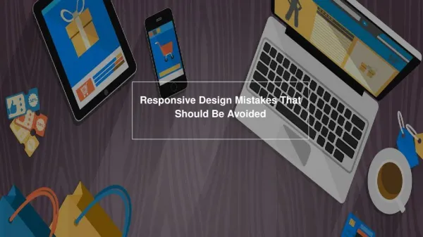
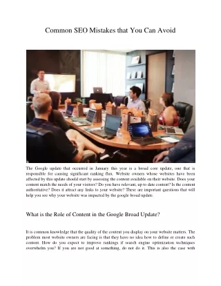
Did you know your website without responsive design can ruin your conversion rate? Hence, PSD to responsive conversion is one of the best experiments to undoubtedly acquire immense possibilities. Everybody hates constraint and would you too? If it is, cross the boundaries and float in sea of creativity gaining a plethora of opportunities that neither limits you nor your visitors.

E N D
HTML+CSS Let's create something awesome! Convert webpages to pdf online with PDFmyURL
Recent Posts Why to Switch to Sketch to Code CSS/HTML! 10 PSD to Responsive Mistakes That Can Cost You In 2016 PSD to Email Templates: Get Ready for Epic Digital Marketing Is Google Web Designer #1 Banner Ad Designing Approach? Bootstrap 4.0: New Development News (Update) for Designers 10 PSD to Responsive Mistakes That Can Cost You In 2016 August 18, 2016 admin Did you know your website without responsive design can ruin your conversion rate? Hence, PSD to responsive conversion is one of the best experiments to undoubtedly acquire immense possibilities. Everybody hates constraint and would you too? If it is, cross the boundaries and float in sea of creativity gaining a plethora of opportunities that neither limits you nor your visitors. Recent Comments Not a single website can flatter mind-liked visitors because beauty is not always the key generator of optimal results. While pleasing their eyes and catching their mind in just first impression will indeed your primary mission, that your competitors are unable to meet. So, craft a fully responsive site entitled with all crucial aspects to reaping the number of sales and helping you stand close to triumph. Archives April 2017 August 2016 July 2016 It’s time to break the wall of hindrance which is losing the visitors to reach you. Let’s zoom out those breakpoints stopping you to widespread your search visibility and engage potential audience. Think of all small to large reasons what mistakes you have made while converting PSD to responsive or why your website is costing you. Convert webpages to pdf online with PDFmyURL
There is no point of having website coupled with poor design if it ain’t returning search results and entertaining consumers. Am I right? According to study, nearly 94% user comments are for website designing elements. Thus, for all you webmasters, HTMLPLUSCSS brings a collection of 10 mistakes that may clog your ways in year 2016 journey, so must avoid as soon as possible. Move to the breakpoints seem like challenges and strive to balance them with appropriate solution required to meet all SEO needs. Categories HTML+CSS Let Us Begin With Common Mistakes To Avoid While Converting PSD to Responsive website Video Doing or repeating any of the below mistake would be a blunder and can seriously limit your worldwide visibility. Therefore, resolve them smartly and keep your success continuing. Mistake #1 – Feeding Desktop First Approach Bot Let us help you abreast with figure to agree on something that mobile users have overtaken desktop users in year 2014 and same scenario is still on the path. See the image. Convert webpages to pdf online with PDFmyURL
Now, it is sure that having desktop-first mentally for a while is good but only in imaginations because your visitors may get stuck if you made this mistake. Why would your visitors compromise especially when they do have an ample of options to find the same what you offer. To be very honest, audience is quite smart nowadays and prefer to website that don’t leave any loophole (in terms of UI) of feeling guilty for them. So, stop your brain to thinking of this old fashion way and let it work with desktop & mobile approaches so that you won’t lose any point to left your customers at all. Mistake #2 – Work Harder on Navigations The second most pretty but challenging aspect cum mistake is poor navigation system on website. Are you one struggling with the issue? What the experts’ experience says; navigation must intuitive, easy to understand, and smooth so that it is free from the device dependency and can be used wherever user wants. This mistake can lead user frustration. Though it’s obviously onerous to move on another routine getting off personal preferences, but if the way is right and can reach you the target, then must be followed. Similarly, it’s tough to leave traditional trend (desktop navigation), to which, you are rigid, but considering the mobile devices and their soaring preferences in the Convert webpages to pdf online with PDFmyURL
considering the mobile devices and their soaring preferences in the market, you will indeed get better response from folks. In short, it’s a way-finding strategy if followed thoroughly and will return the same look & feel of navigation while accessing on smartphones as give on desktops. So, transform your existing navigation completely to bounce the level of profits and let your website access on desktop and mobile with same visual appearance. Mistake #3 – Keeping Content Behind Content over a website is like address direction or contact information and always being prioritized by the users. So, hiding it or making less visible on mobile versions; do you think worth it? No, it’s not. This is a dominant thinking like mobile users are always in haste and want everything short (means content) of a full site offers. What the InMobi report says – nearly 61% mobile users are busy with their devices even while watching TV. Now, you can imagine “mobile users are in rush is a myth”. If the content is providing relevant information on one device, it must provide on others too with no hidden away. Prioritizing content may good for you but never underground it Convert webpages to pdf online with PDFmyURL
away. Prioritizing content may good for you but never underground it forcefully. Mistake #4 – Meet With Disaster By Not Targeting Touch A quite general but major mistake is to lose touch capability in design and will call dumb move if implemented. Be sure that your items are not placed too closely because they lead the possibilities to access the wrong item mistakenly. Hence, strive to balance spacing in order to avoid errors. Suggested to place CTA buttons especially in lower left corner with minimum 44 points for the ease of users to access. Their use in upper corners is also a mind-range step. Applying interactive menus/submenus and crating simple navigation which fits to common hand gesture while swiping. Mistake #5 – Slow Performance/Page Loading Speed Convert webpages to pdf online with PDFmyURL
Mistake #5 – Slow Performance/Page Loading Speed Many eBooks are out there that address the reality of digital world where no place even to sit for those who don’t move with time and speed. Always maintain their balance to ensure utmost level of quality. In general, many seconds we waste but when it’s time to load any website, a single second also valuable for us. So, how could you choose bypass route. Your responsive site must be optimized for brisk loading speed and incredibly amazing performance so it can work well even on slow Internet connection. Salient tips for high performance at your glimpse: Remove unnecessary whitespace that you can do curtailing CSS. Additionally, it is also good to have compress file regardless of heavy one as it will speed up the performance. Limit the number of images and use only those are mandatory & you cannot move without. Stop 3 party and JS library dependencies. The number of HTTP request should be minimal. rd Mistake #6 – More Emphasize on Devices Regardless of Screens As we see new ads day by day launching and introducing new screen sizes, so it is challenge for all webmasters to having a perfectly Convert webpages to pdf online with PDFmyURL
sizes, so it is challenge for all webmasters to having a perfectly infrastructure website. Don’t ever strain your web pages on varied currently introduced small screen size devices! Let’s brief out the browser stats that define: 99% global visitors’ own resolutions within 200 pixel size. Target the smart wearable gadgets and Apple watch is one of the best examples for such devices and also attention-grabbing nowadays. The smallest smart watch is 144 pixels wide only. Henceforth, design keeping all micro-screens in your mind. Mistake #7 –Choosing Small is a Big Dump Step We agree that 42% traffic is however coming from desktop users, but the ratio of mobile traffic is also climbing with unexpected increasing graph. That none of us can ignore. Give the equal attention to the smallest mobile screens as you do to large screens without any partiality. Your images shouldn’t lose quality during the length scaling up. Work with appropriate content hierarchy and fit it within the widest layout to show up all key features and content. Maintain the readability that you can achieve limiting the font size length increment because too much font size often slow down or reinforce audience to skip the content. So, don’t give any room to happen this mistake with you. Mistake #8 – Ignore Search Box It does not matter what sort of website you are united with but the matter is; do you have search box on your site for smooth finding. It is a great way to reach your services or products directly instead of browsing a wide list appeared under menus to make every visitor’s task of finding anything at your place simpler. If it absents on your web pages, the possibilities to take exit route and never ever coming back are quite high. Therefore, search box should be there for all your potential and new visitors to help them find whatever they’re looking for. Convert webpages to pdf online with PDFmyURL
new visitors to help them find whatever they’re looking for. Mistake #9 – Bold, Dark and Large Images Play with images smartly because they can say thousands word without containing content. But, they must clear and perfect in size. Bold and large one might obscure your vital content while accessing on mobile screens. They cause user distraction influencing them negatively that also leads less conversion aspects and slows speed. Grabbing attention for short span is not enough these days as browsing the large images can delay/affect your performance. Thus, use small to large device compatible images that automatically adjust size to fit on each small to large mobile device with perfect visualization. Mistake #10 – Forget Webpage Testing Give few precious minutes to the process of testing, running your responsive website on real users’ devices of diverse screen resolutions to unveil the issue prior to release. If you cannot afford testing person due to short on budget, do it on your own to reduce the development errors that can hamper you beyond your thinking. Treat this as a crucial Convert webpages to pdf online with PDFmyURL
errors that can hamper you beyond your thinking. Treat this as a crucial step and focusing it, give your enough time for aesthetic testing regardless of missing this big picture. Time To Sum It Up: All aforementioned mistakes can break your website’s backbone in small pieces, and collecting them to restructure can almost impossible. Therefore, suggested to not employ any of these mistakes accountable to ruin you. Responsive design, one of the trendiest approaches is weaving a strong foundation and not even a single one now in oppose of it. That means it’s working perfectly. If your time and resources don’t allow to recovering such mistakes or developing fresh responsive designs through PSD to responsive conversion, quote HTMLPLUSCSS – transcendent HTML service provider. We are ready to help and serve with top-notch solutions. permalink About admin See all posts by admin Convert webpages to pdf online with PDFmyURL
PREV NEXT Leave a Reply Your email address will not be published. Required fields are marked * Comment Name * Email * Website Convert webpages to pdf online with PDFmyURL
POST COMMENT Recent Posts Social Profiles Video Why to Switch to Sketch to Code CSS/HTML! 10 PSD to Responsive Mistakes That Can Cost You In 2016 Convert webpages to pdf online with PDFmyURL