Download
1 / 112
1.15k likes | 1.58k Vues
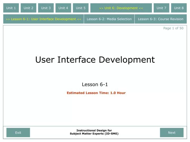
Unit 1. Unit 2. Unit 3. Unit 4. Unit 5. >> Unit 6: Development <<. Unit 7. Unit 8. >> Lesson 6-1: User Interface Development <<. Lesson 6-2: Media Selection. Lesson 6-3: Course Revision. Page 1 of 50. User Interface Development. Lesson 6-1. Estimated Lesson Time: 1.0 Hour. Exit.

E N D
Unit 1 Unit 2 Unit 3 Unit 4 Unit 5 >>Unit 6: Development<< Unit 7 Unit 8 >>Lesson 6-1: User Interface Development<< Lesson 6-2: Media Selection Lesson 6-3: Course Revision Page 1 of 50 User Interface Development Lesson 6-1 Estimated Lesson Time: 1.0 Hour Exit Instructional Design for Subject Matter Experts (ID-SME) Next
Analyze revision revision Implement Evaluate Design Develop revision revision Unit 1 Unit 2 Unit 3 Unit 4 Unit 5 >>Unit 6: Development<< Unit 7 Unit 8 >>Lesson 6-1: User Interface Development<< Lesson 6-2: Media Selection Lesson 6-3: Course Revision Page 2 of 50 Welcome to Lesson 6-1: User Interface Development. In the preceding lessons, you learned about the first two stages of the ADDIE Instructional Development process: Analysis and Design. At this point, it should be clear to you that prior to any development, it is essential that you take the time to plan your analysis, perform your learner and task analysis, and design your learning objectives and course assessments. Exit Instructional Design for Subject Matter Experts (ID-SME) Previous Next
Analyze revision revision Implement Evaluate Design Develop revision revision Unit 1 Unit 2 Unit 3 Unit 4 Unit 5 >>Unit 6: Development<< Unit 7 Unit 8 >>Lesson 6-1: User Interface Development<< Lesson 6-2: Media Selection Lesson 6-3: Course Revision Page 3 of 50 • Once you’ve completed the first two phases of the ADDIE process, it’s time to start developing your web-based courseware. • In this lesson you will learn the importance of developing your courseware using established interface design techniques. Exit Instructional Design for Subject Matter Experts (ID-SME) Previous Next
Analyze revision revision Implement Evaluate Design Develop revision revision Unit 1 Unit 2 Unit 3 Unit 4 Unit 5 >>Unit 6: Development<< Unit 7 Unit 8 >>Lesson 6-1: User Interface Development<< Lesson 6-2: Media Selection Lesson 6-3: Course Revision Page 4 of 50 • By the end of this lesson, you will have the knowledge and skills necessary to: • Generate web-based course materials which use established interface design techniques. • So, without further adieu, let’s jump right into the lesson… Exit Instructional Design for Subject Matter Experts (ID-SME) Previous Next
Unit 1 Unit 2 Unit 3 Unit 4 Unit 5 >>Unit 6: Development<< Unit 7 Unit 8 >>Lesson 6-1: User Interface Development<< Lesson 6-2: Media Selection Lesson 6-3: Course Revision Page 5 of 50 Have you ever taken a course, or visited a web site, that used background colors and text colors that just didn’t work well together? How easy is it to read this text? Does it hurt your eyes? Can you imagine being forced to take an entire course that used colors like this? Do you think you would learn much, or do you think you might quit early because of a headache? This is one example of poor interface design. Exit Instructional Design for Subject Matter Experts (ID-SME) Previous Next
Unit 1 Unit 2 Unit 3 Unit 4 Unit 5 >>Unit 6: Development<< Unit 7 Unit 8 >>Lesson 6-1: User Interface Development<< Lesson 6-2: Media Selection Lesson 6-3: Course Revision Page 6 of 50 Is there something wrong with this slide? Don’t actually read all the text below, just step back and look at the overall slide layout. Could it be that there is just too much text on this one slide? Would taking an entire course full of slides like this motivate you to learn? This is another example of poor interface design. Don’t read this part, it’s just filler text designed to make a point…As described in Assignment 2, ID-SME is a web-based course designed for subject matter experts (SMEs) who need to create instruction that effectively transfers their expertise to others. As a basic course in instructional design, ID-SME discusses the ADDIE process with a focus on “how” one goes about designing and developing effective instruction, without delving too far into the theory or details behind the “why” of the ADDIE process. ID-SME provides SMEs with the basic knowledge and skills needed to create web-based course materials that are based on sound instructional design principles. At a high level, the target audience for this instruction is SMEs who have little to no knowledge of instructional design practices. Their primary job responsibilities revolve around their area of expertise – software engineering – not instructional design or development, and they may or may not have access to an instructional design staff. They are interested in instructional design only as a means to better transfer their subject matter knowledge to others. More specifically, the target for this project is a software engineer with an advanced degree who is very comfortable with technology. Exit Instructional Design for Subject Matter Experts (ID-SME) Previous Next
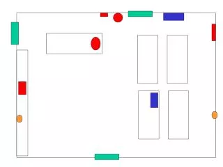
Unit 1 Unit 2 Unit 3 Unit 4 Unit 5 >>Unit 6: Development<< Unit 7 Unit 8 >>Lesson 6-1: User Interface Development<< Lesson 6-2: Media Selection Lesson 6-3: Course Revision Page 7 of 50 Next Previous Exit What about this slide? The problem with this slide is a little more subtle. It has to do with the placement of the navigation buttons. Although their placement may work okay, it’s not ideal. This is a third example of poor interface design. Instructional Design for Subject Matter Experts (ID-SME)
Unit 1 Unit 2 Unit 3 Unit 4 Unit 5 >>Unit 6: Development<< Unit 7 Unit 8 >>Lesson 6-1: User Interface Development<< Lesson 6-2: Media Selection Lesson 6-3: Course Revision Page 8 of 50 And finally, is there something about this slide that doesn’t look quite right? Could it be that the graphic is a bit too large and the text box a bit too small? This is a fourth and final example of poor interface design. Exit Instructional Design for Subject Matter Experts (ID-SME) Previous Next
Unit 1 Unit 2 Unit 3 Unit 4 Unit 5 >>Unit 6: Development<< Unit 7 Unit 8 >>Lesson 6-1: User Interface Development<< Lesson 6-2: Media Selection Lesson 6-3: Course Revision Page 9 of 50 • As the preceding four examples illustrate, poor interface design can make learning frustrating. And in the worst cases… • …poor interface design can actually hinder the learning process. Exit Instructional Design for Subject Matter Experts (ID-SME) Previous Next
Unit 1 Unit 2 Unit 3 Unit 4 Unit 5 >>Unit 6: Development<< Unit 7 Unit 8 >>Lesson 6-1: User Interface Development<< Lesson 6-2: Media Selection Lesson 6-3: Course Revision Page 10 of 50 • Good interface design, on the other hand, offers your learners numerous advantages. Some of these advantages include… • Improved content clarity and organization. In most cases, learning is improved when information is presented in a clear, concise, and organized fashion. Exit Instructional Design for Subject Matter Experts (ID-SME) Previous Next
Unit 1 Unit 2 Unit 3 Unit 4 Unit 5 >>Unit 6: Development<< Unit 7 Unit 8 >>Lesson 6-1: User Interface Development<< Lesson 6-2: Media Selection Lesson 6-3: Course Revision Page 10 of 50 • Good interface design, on the other hand, offers your learners numerous advantages. Some of these advantages include… • Improved content clarity and organization. In most cases, learning is improved when information is presented in a clear, concise, and organized fashion. • Improved readability. If you cannot read the content, or if the material is organized such that you miss certain parts of it, you’re not likely to retain the material. Good interface design helps to ensure that all content is, at the very least, seen by the learner. Exit Instructional Design for Subject Matter Experts (ID-SME) Previous Next
Unit 1 Unit 2 Unit 3 Unit 4 Unit 5 >>Unit 6: Development<< Unit 7 Unit 8 >>Lesson 6-1: User Interface Development<< Lesson 6-2: Media Selection Lesson 6-3: Course Revision Page 10 of 50 • Good interface design, on the other hand, offers your learners numerous advantages. Some of these advantages include… • Improved content clarity and organization. In most cases, learning is improved when information is presented in a clear, concise, and organized fashion. • Improved user readability. If you cannot read the content, or if the material is organized such that you miss certain parts of it, you’re not likely to retain the material. Good interface design helps to ensure that all content is, at the very least, seen by the learner. • Enhanced motivation. If students are overwhelmed with too much information, or if the information is presented in such a way that it’s difficult to read, motivation can be negatively effected. An unmotivated student does not learn as effectively as a motivated student. Exit Instructional Design for Subject Matter Experts (ID-SME) Previous Next
Unit 1 Unit 2 Unit 3 Unit 4 Unit 5 >>Unit 6: Development<< Unit 7 Unit 8 >>Lesson 6-1: User Interface Development<< Lesson 6-2: Media Selection Lesson 6-3: Course Revision Page 11 of 50 • This lesson will help you develop web-based course materials that leverage the advantages of good interface design. The lesson is composed of four main topics, they include… • Text & Background Colors • Text Usage • Navigation Buttons • Element Placement Exit Instructional Design for Subject Matter Experts (ID-SME) Previous Next
Unit 1 Unit 2 Unit 3 Unit 4 Unit 5 >>Unit 6: Development<< Unit 7 Unit 8 >>Lesson 6-1: User Interface Development<< Lesson 6-2: Media Selection Lesson 6-3: Course Revision Page 11 of 50 • This lesson will help you develop web-based course materials that leverage the advantages of good interface design. The lesson is composed of four main topics, they include… • Text & Background Colors • Text Usage • Navigation Buttons • Element Placement The lesson will end with a course summary and a list of follow-on activities to help enhance your knowledge and improve your ability to retain the newly learned material. Exit Instructional Design for Subject Matter Experts (ID-SME) Previous Next
Unit 1 Unit 2 Unit 3 Unit 4 Unit 5 >>Unit 6: Development<< Unit 7 Unit 8 >>Lesson 6-1: User Interface Development<< Lesson 6-2: Media Selection Lesson 6-3: Course Revision Page 12 of 50 Topic 1:Text & Background Colors You are approximately complete with this lesson. 15% Exit Instructional Design for Subject Matter Experts (ID-SME) Previous Next
Unit 1 Unit 2 Unit 3 Unit 4 Unit 5 >>Unit 6: Development<< Unit 7 Unit 8 >>Lesson 6-1: User Interface Development<< Lesson 6-2: Media Selection Lesson 6-3: Course Revision Page 13 of 50 Topic 1: Text & Background Colors • A bad choice of text and background colors can make any web-based slide difficult to read. • By the end of this section, you will be able to: • State the characteristics of text and background colors that make them easy to read. • Identify text and background color schemes that work well together. Some colors are easy to read. Some colors are easy to read. Some colors are hard to read. Some colors are hard to read. Some colors are easy to read. Some colors are easy to read. Some colors are hard to read. Some colors are hard to read. Some colors are easy to read. Some colors are easy to read. Some colors are hard to read. Some colors are hard to read. Exit Instructional Design for Subject Matter Experts (ID-SME) Previous Next
Some colors are easy to read. Some colors are easy to read. Some colors are easy to read. Some colors are easy to read. Examples of text and background colors with sufficient contrast. Some colors are easy to read. Some colors are easy to read. Unit 1 Unit 2 Unit 3 Unit 4 Unit 5 >>Unit 6: Development<< Unit 7 Unit 8 >>Lesson 6-1: User Interface Development<< Lesson 6-2: Media Selection Lesson 6-3: Course Revision Page 14 of 50 Topic 1: Text & Background Colors When choosing text and background colors, you must ensure that there is enough contrast between the text color and the background color. Exit Instructional Design for Subject Matter Experts (ID-SME) Previous Next
Some colors are easy to read. Some colors are easy to read. Some colors are easy to read. Some colors are easy to read. Examples of text and background colors with sufficient contrast. Without sufficient contrast,… Some colors are easy to read. Some colors are easy to read. Text can be very difficult to read. Unit 1 Unit 2 Unit 3 Unit 4 Unit 5 >>Unit 6: Development<< Unit 7 Unit 8 >>Lesson 6-1: User Interface Development<< Lesson 6-2: Media Selection Lesson 6-3: Course Revision Page 14 of 50 Topic 1: Text & Background Colors When choosing text and background colors, you must ensure that there is enough contrast between the text color and the background color. Exit Instructional Design for Subject Matter Experts (ID-SME) Previous Next
Some colors are easy to read. Some colors are easy to read. Some colors are hard to read. Some colors are hard to read. Examples of highly saturated text and background colors. Some colors are hard to read. Some colors are hard to read. Unit 1 Unit 2 Unit 3 Unit 4 Unit 5 >>Unit 6: Development<< Unit 7 Unit 8 >>Lesson 6-1: User Interface Development<< Lesson 6-2: Media Selection Lesson 6-3: Course Revision Page 15 of 50 Topic 1: Text & Background Colors Next, you want to avoid using highly saturated colors. Exit Instructional Design for Subject Matter Experts (ID-SME) Previous Next
Unit 1 Unit 2 Unit 3 Unit 4 Unit 5 >>Unit 6: Development<< Unit 7 Unit 8 >>Lesson 6-1: User Interface Development<< Lesson 6-2: Media Selection Lesson 6-3: Course Revision Page 16 of 50 Topic 1: Text & Background Colors • Highly saturated colors have two basic problems: • Similar to colors with insufficient contrast, highly saturated colors can be difficult to read; and • Highly saturated colors are hard on the eyes and can cause eye strain. Some colors are hard to read. Some colors are hard to read. Some colors are hard to read. Some colors are hard to read. Some colors are hard to read. Some colors are hard to read. Exit Instructional Design for Subject Matter Experts (ID-SME) Previous Next
Unit 1 Unit 2 Unit 3 Unit 4 Unit 5 >>Unit 6: Development<< Unit 7 Unit 8 >>Lesson 6-1: User Interface Development<< Lesson 6-2: Media Selection Lesson 6-3: Course Revision Page 17 of 50 Topic 1: Text & Background Colors Once you have properly accounted for contrast and saturation, there are two basic approaches to choosing your text and background colors: or 1. Use a dark background with light text. 2. Use a light background with dark text. Exit Instructional Design for Subject Matter Experts (ID-SME) Previous Next
Unit 1 Unit 2 Unit 3 Unit 4 Unit 5 >>Unit 6: Development<< Unit 7 Unit 8 >>Lesson 6-1: User Interface Development<< Lesson 6-2: Media Selection Lesson 6-3: Course Revision Page 17 of 50 Topic 1: Text & Background Colors Once you have properly accounted for contrast and saturation, there are two basic approaches to choosing your text and background colors: or 1. Use a dark background with light text. 2. Use a light background with dark text. NOTE: Many designers feel that a dark background with light text works better for slides that will be projected onto a screen. On the other hand, for web-based training that will be viewed on a computer monitor, most designers feel that a light background with dark text is easier to read and is less straining on the eyes. Exit Instructional Design for Subject Matter Experts (ID-SME) Previous Next
Unit 1 Unit 2 Unit 3 Unit 4 Unit 5 >>Unit 6: Development<< Unit 7 Unit 8 >>Lesson 6-1: User Interface Development<< Lesson 6-2: Media Selection Lesson 6-3: Course Revision Page 18 of 50 **Time to Check Your Knowledge**Topic 1:Text & Background Colors Exit Instructional Design for Subject Matter Experts (ID-SME) Previous Next
Unit 1 Unit 2 Unit 3 Unit 4 Unit 5 >>Unit 6: Development<< Unit 7 Unit 8 >>Lesson 6-1: User Interface Development<< Lesson 6-2: Media Selection Lesson 6-3: Course Revision Question 1 of 3 Topic 1: Text & Background Colors Practice Question 1-1: When choosing text and background colors, which of the following is your best option? (click on the letter of the correct answer)? A. High color contrast and high color saturation. B. High color contrast and low color saturation. C. Low color contrast and high color saturation. D. Low color contrast and low color saturation. Exit Instructional Design for Subject Matter Experts (ID-SME)
Unit 1 Unit 2 Unit 3 Unit 4 Unit 5 >>Unit 6: Development<< Unit 7 Unit 8 >>Lesson 6-1: User Interface Development<< Lesson 6-2: Media Selection Lesson 6-3: Course Revision Question 1 of 3 Topic 1: Text & Background Colors Practice Question 1-1: When choosing text and background colors, which of the following is your best option? (click on the letter of the correct answer)? A. High color contrast and high color saturation. Correct! Text and background colors should have a high color contrast and low color saturation. B. High color contrast and low color saturation. C. Low color contrast and high color saturation. D. Low color contrast and low color saturation. Exit Instructional Design for Subject Matter Experts (ID-SME) Next Question
Unit 1 Unit 2 Unit 3 Unit 4 Unit 5 >>Unit 6: Development<< Unit 7 Unit 8 >>Lesson 6-1: User Interface Development<< Lesson 6-2: Media Selection Lesson 6-3: Course Revision Question 1 of 3 Topic 1: Text & Background Colors Practice Question 1-1: When choosing text and background colors, which of the following is your best option? (click on the letter of the correct answer)? A. High color contrast and high color saturation. Incorrect Text and background colors should have a high color contrast and low color saturation. B. High color contrast and low color saturation. C. Low color contrast and high color saturation. D. Low color contrast and low color saturation. Exit Instructional Design for Subject Matter Experts (ID-SME) Next Question
Unit 1 Unit 2 Unit 3 Unit 4 Unit 5 >>Unit 6: Development<< Unit 7 Unit 8 >>Lesson 6-1: User Interface Development<< Lesson 6-2: Media Selection Lesson 6-3: Course Revision Question 2 of 3 Topic 1: Text & Background Colors Practice Question 1-2: Which of the following “slides” uses text and background color schemes that work well together (click on the correct slide)? A. Does this textand backgroundcoloring scheme work well together? B. Does this textand backgroundcoloring scheme work well together? C. Does this textand backgroundcoloring scheme work well together? D. Does this textand backgroundcoloring scheme work well together? Exit Instructional Design for Subject Matter Experts (ID-SME)
Unit 1 Unit 2 Unit 3 Unit 4 Unit 5 >>Unit 6: Development<< Unit 7 Unit 8 >>Lesson 6-1: User Interface Development<< Lesson 6-2: Media Selection Lesson 6-3: Course Revision Question 2 of 3 Topic 1: Text & Background Colors Practice Question 1-2: Which of the following “slides” use text and background color schemes that work well together (click on the correct slide)? D. Does this textand backgroundcoloring scheme work well together? Correct! Slide D uses text and background colors with high color contrast. Additionally, the colors are low in saturation. Exit Instructional Design for Subject Matter Experts (ID-SME) Next Question
Unit 1 Unit 2 Unit 3 Unit 4 Unit 5 >>Unit 6: Development<< Unit 7 Unit 8 >>Lesson 6-1: User Interface Development<< Lesson 6-2: Media Selection Lesson 6-3: Course Revision Question 2 of 3 Topic 1: Text & Background Colors Practice Question 1-2: Which of the following “slides” use text and background color schemes that work well together (click on the correct slide)? D. Does this textand backgroundcoloring scheme work well together? Incorrect Slide D uses text and background colors with high color contrast. Additionally, the colors are low in saturation. Exit Instructional Design for Subject Matter Experts (ID-SME) Next Question
Unit 1 Unit 2 Unit 3 Unit 4 Unit 5 >>Unit 6: Development<< Unit 7 Unit 8 >>Lesson 6-1: User Interface Development<< Lesson 6-2: Media Selection Lesson 6-3: Course Revision Question 3 of 3 Topic 1: Text & Background Colors Practice Question 1-3: True or False. Once you’ve accounted for color contrast and saturation, there are two basic approaches to choosing your text and background colors: 1) use a dark background with light text; or 2) use a light background with dark text. True False Exit Instructional Design for Subject Matter Experts (ID-SME)
Unit 1 Unit 2 Unit 3 Unit 4 Unit 5 >>Unit 6: Development<< Unit 7 Unit 8 >>Lesson 6-1: User Interface Development<< Lesson 6-2: Media Selection Lesson 6-3: Course Revision Question 3 of 3 Topic 1: Text & Background Colors Practice Question 1-3: True or False. Once you’ve accounted for color contrast and saturation, there are two basic approaches to choosing your text and background colors: 1) use a dark background with light text; or 2) use a light background with dark text. Correct! It is true that there are two basic approaches to choosing text and background colors. They are: 1)dark background/light text; or 2) light background/dark text. True False Exit Instructional Design for Subject Matter Experts (ID-SME) Next Topic
Unit 1 Unit 2 Unit 3 Unit 4 Unit 5 >>Unit 6: Development<< Unit 7 Unit 8 >>Lesson 6-1: User Interface Development<< Lesson 6-2: Media Selection Lesson 6-3: Course Revision Question 3 of 3 Topic 1: Text & Background Colors Practice Question 1-3: True or False. Once you’ve accounted for color contrast and saturation, there are two basic approaches to choosing your text and background colors: 1) use a dark background with light text; or 2) use a light background with dark text. Incorrect It is true that there are two basic approaches to choosing text and background colors. They are: 1)dark background/light text; or 2) light background/dark text. True False Exit Instructional Design for Subject Matter Experts (ID-SME) Next Topic
Unit 1 Unit 2 Unit 3 Unit 4 Unit 5 >>Unit 6: Development<< Unit 7 Unit 8 >>Lesson 6-1: User Interface Development<< Lesson 6-2: Media Selection Lesson 6-3: Course Revision Page 19 of 50 Topic 2:Text Usage You are approximately complete with this lesson. 30% Exit Instructional Design for Subject Matter Experts (ID-SME) Previous Next
Unit 1 Unit 2 Unit 3 Unit 4 Unit 5 >>Unit 6: Development<< Unit 7 Unit 8 >>Lesson 6-1: User Interface Development<< Lesson 6-2: Media Selection Lesson 6-3: Course Revision Page 20 of 50 Topic 2: Text Usage • Too much text on a single slide can easily overwhelm learners and reduce comprehension. • By the end of this section, you will be able to: • State how much text should appear on a single slide. • State the techniques that help make text more readable. • Identify slides that use an appropriate amount of text. • Identify slides that use appropriate techniques to improve readability. Example of a slide with too much text. Exit Instructional Design for Subject Matter Experts (ID-SME) Previous Next
Unit 1 Unit 2 Unit 3 Unit 4 Unit 5 >>Unit 6: Development<< Unit 7 Unit 8 >>Lesson 6-1: User Interface Development<< Lesson 6-2: Media Selection Lesson 6-3: Course Revision Page 21 of 50 Topic 2: Text Usage It is more difficult and takes longer to read text on a computer screen than in print. In fact, research has shown that people read text on a computer screen at a rate that is 28% slower than reading from a book. With this in mind, you must take time to ensure you do not overwhelm your learners with too much text on any one slide. Example of a slide with too much text. Exit Instructional Design for Subject Matter Experts (ID-SME) Previous Next
Unit 1 Unit 2 Unit 3 Unit 4 Unit 5 >>Unit 6: Development<< Unit 7 Unit 8 >>Lesson 6-1: User Interface Development<< Lesson 6-2: Media Selection Lesson 6-3: Course Revision Page 22 of 50 Topic 2: Text Usage As a general rule, two to four short sentences is the recommended amount of information or text that should appear on a web-based, multimedia slide. Too much text can overwhelm the viewer and crowd the screen. Exit Instructional Design for Subject Matter Experts (ID-SME) Previous Next
Unit 1 Unit 2 Unit 3 Unit 4 Unit 5 >>Unit 6: Development<< Unit 7 Unit 8 >>Lesson 6-1: User Interface Development<< Lesson 6-2: Media Selection Lesson 6-3: Course Revision Page 22 of 50 Topic 2: Text Usage Too little information will slow down the presentation and may make it a bit too boring. Exit Instructional Design for Subject Matter Experts (ID-SME) Previous Next
Unit 1 Unit 2 Unit 3 Unit 4 Unit 5 >>Unit 6: Development<< Unit 7 Unit 8 >>Lesson 6-1: User Interface Development<< Lesson 6-2: Media Selection Lesson 6-3: Course Revision Page 23 of 50 Topic 2: Text Usage If you have a lot of information to present about a topic, it’s usually better to add additional screens, as opposed to trying to squeeze it all on one slide. TCC History Tallahassee Community College opened in 1966. It serves the educational needs of post-high school students. These students are from a District composed of the counties of Leon, Wakulla, and Gadsden. Although most students come from this district, the College has enrolled student from Florida, from most states, and from several foreign countries. Graphic A little too crowded! Exit Instructional Design for Subject Matter Experts (ID-SME) Previous Next
Unit 1 Unit 2 Unit 3 Unit 4 Unit 5 >>Unit 6: Development<< Unit 7 Unit 8 >>Lesson 6-1: User Interface Development<< Lesson 6-2: Media Selection Lesson 6-3: Course Revision Page 23 of 50 Topic 2: Text Usage TCC History Tallahassee Community College opened in 1966. It serves the educational needs of post-high school students. These students are from a District composed of the counties of Leon, Wakulla, and Gadsden. Graphic If you have a lot of information to present about a topic, it’s usually better to add additional screens, as opposed to trying to squeeze it all on one slide. TCC History Tallahassee Community College opened in 1966. It serves the educational needs of post-high school students. These students are from a District composed of the counties of Leon, Wakulla, and Gadsden. Although most students come from this district, the College has enrolled student from Florida, from most states, and from several foreign countries. Less crowded slides with better text distribution and slide balance. Graphic TCC History Graphic Although most students come from this district, the College has enrolled student from Florida, from most states, and from several foreign countries. Exit Instructional Design for Subject Matter Experts (ID-SME) Previous Next
Unit 1 Unit 2 Unit 3 Unit 4 Unit 5 >>Unit 6: Development<< Unit 7 Unit 8 >>Lesson 6-1: User Interface Development<< Lesson 6-2: Media Selection Lesson 6-3: Course Revision Page 24 of 50 Topic 2: Text Usage • Sometimes it is necessary to include a large amount of information on one slide. When this happens, a number of techniques can be used to make the text more readable. These include: • Provide generous white space between separate blocks of information; • Use headings to summarize contents; • Convert long sentences into bulleted or numbered lists; and • Organize complex information into tables to help students mentally organize and integrate content. Exit Instructional Design for Subject Matter Experts (ID-SME) Previous Next
Unit 1 Unit 2 Unit 3 Unit 4 Unit 5 >>Unit 6: Development<< Unit 7 Unit 8 >>Lesson 6-1: User Interface Development<< Lesson 6-2: Media Selection Lesson 6-3: Course Revision Page 25 of 50 Topic 2: Text Usage • An additional way to ensure textual information does not overwhelm your learners is to use attention getting techniques to focus students’ attention. These include, but are not limited to… • using bold face • WRITING IN UPPER CASE LETTERING • underlining • using italics • highlighting with color • using different fonts Exit Instructional Design for Subject Matter Experts (ID-SME) Previous Next
NOTE: As a general rule of thumb, do not use more than three attention-getting techniques on a single screen. Overuse of these techniques reduces their overall effectiveness. Unit 1 Unit 2 Unit 3 Unit 4 Unit 5 >>Unit 6: Development<< Unit 7 Unit 8 >>Lesson 6-1: User Interface Development<< Lesson 6-2: Media Selection Lesson 6-3: Course Revision Page 25 of 50 Topic 2: Text Usage • An additional way to ensure textual information does not overwhelm your learners is to use attention getting techniques to focus students’ attention. These include, but are not limited to… • using bold face • WRITING IN UPPER CASE LETTERING • underlining • using italics • highlighting with color • using different fonts Exit Instructional Design for Subject Matter Experts (ID-SME) Previous Next
Unit 1 Unit 2 Unit 3 Unit 4 Unit 5 >>Unit 6: Development<< Unit 7 Unit 8 >>Lesson 6-1: User Interface Development<< Lesson 6-2: Media Selection Lesson 6-3: Course Revision Page 26 of 50 **Time to Check Your Knowledge**Topic 2:Text Usage Exit Instructional Design for Subject Matter Experts (ID-SME) Previous Next
Unit 1 Unit 2 Unit 3 Unit 4 Unit 5 >>Unit 6: Development<< Unit 7 Unit 8 >>Lesson 6-1: User Interface Development<< Lesson 6-2: Media Selection Lesson 6-3: Course Revision Question 1 of 3 Topic 2: Text Usage Practice Question 2-1: In general, what is the recommended amount of information or text that should appear on a web-based, multimedia slide? A. One to two short sentences. B. Two to three short sentences. C. Two to four short sentences. D. Three to five short sentences. Exit Instructional Design for Subject Matter Experts (ID-SME)
Unit 1 Unit 2 Unit 3 Unit 4 Unit 5 >>Unit 6: Development<< Unit 7 Unit 8 >>Lesson 6-1: User Interface Development<< Lesson 6-2: Media Selection Lesson 6-3: Course Revision Question 1 of 3 Topic 2: Text Usage Practice Question 2-1: In general, what is the recommended amount of information or text that should appear on a web-based, multimedia slide? A. One to two short sentences. Correct! In general, two to four short sentences is the recommended amount of text for a single slide. B. Two to three short sentences. C. Two to four short sentences. D. Three to five short sentences. Exit Instructional Design for Subject Matter Experts (ID-SME) Next Question
Unit 1 Unit 2 Unit 3 Unit 4 Unit 5 >>Unit 6: Development<< Unit 7 Unit 8 >>Lesson 6-1: User Interface Development<< Lesson 6-2: Media Selection Lesson 6-3: Course Revision Question 1 of 3 Topic 2: Text Usage Practice Question 2-1: In general, what is the recommended amount of information or text that should appear on a web-based, multimedia slide? A. One to two short sentences. Incorrect In general, two to four short sentences is the recommended amount of text for a single slide. B. Two to three short sentences. C. Two to four short sentences. D. Three to five short sentences. Exit Instructional Design for Subject Matter Experts (ID-SME) Next Question
TCC History Tallahassee Community College opened in 1966. It serves the educational needs of post-high school students. These students are from a District composed of the counties of Leon, Wakulla, and Gadsden. Graphic TCC History TCC History Tallahassee Community College opened in 1966. It serves the educational needs of post-high school students. These students are from a District composed of the counties of Leon, Wakulla, and Gadsden. Although most students come from this district, the College has enrolled student from Florida, from most states, and from several foreign countries. Graphic Graphic Tallahassee Community College is a good school. Unit 1 Unit 2 Unit 3 Unit 4 Unit 5 >>Unit 6: Development<< Unit 7 Unit 8 >>Lesson 6-1: User Interface Development<< Lesson 6-2: Media Selection Lesson 6-3: Course Revision Question 2 of 3 Topic 2: Text Usage Practice Question 2-2: Of the three slides below, which one appears to use the proper amount of text?(click on the letter of the correct slide) A. B. C. Exit Instructional Design for Subject Matter Experts (ID-SME)
TCC History Tallahassee Community College opened in 1966. It serves the educational needs of post-high school students. These students are from a District composed of the counties of Leon, Wakulla, and Gadsden. Graphic A. Unit 1 Unit 2 Unit 3 Unit 4 Unit 5 >>Unit 6: Development<< Unit 7 Unit 8 >>Lesson 6-1: User Interface Development<< Lesson 6-2: Media Selection Lesson 6-3: Course Revision Question 2 of 3 Topic 2: Text Usage Practice Question 2-2: Of the three slides below, which one appears to use the proper amount of text?(click on the letter of the correct slide) Correct! Slide A uses three short sentences and has good text distribution and slide balance. Exit Instructional Design for Subject Matter Experts (ID-SME) Next Question
TCC History Tallahassee Community College opened in 1966. It serves the educational needs of post-high school students. These students are from a District composed of the counties of Leon, Wakulla, and Gadsden. Graphic A. Unit 1 Unit 2 Unit 3 Unit 4 Unit 5 >>Unit 6: Development<< Unit 7 Unit 8 >>Lesson 6-1: User Interface Development<< Lesson 6-2: Media Selection Lesson 6-3: Course Revision Question 2 of 3 Topic 2: Text Usage Practice Question 2-2: Of the three slides below, which one appears to use the proper amount of text?(click on the letter of the correct slide) Incorrect Slide A uses three short sentences and has good text distribution and slide balance. Exit Instructional Design for Subject Matter Experts (ID-SME) Next Question
Unit 1 Unit 2 Unit 3 Unit 4 Unit 5 >>Unit 6: Development<< Unit 7 Unit 8 >>Lesson 6-1: User Interface Development<< Lesson 6-2: Media Selection Lesson 6-3: Course Revision Question 3 of 3 Topic 2: Text Usage Practice Question 2-3: Sometimes it is necessary to include a large amount of information on one slide. All of the following are techniques that can be used to make your text more readable, EXCEPT: Using four or five attention-getting techniques (e.g., bold, underline, all caps, and color). A. Providing generous white space between separate blocks of information. B. Converting long sentences into bulleted or numbered lists. C. Organizing complex information into tables to help students integrate content. D. Exit Instructional Design for Subject Matter Experts (ID-SME)