Download
1 / 25
250 likes | 470 Vues
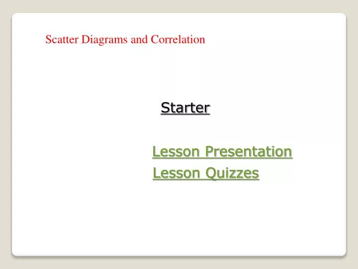
Scatter Diagrams and Correlation. Starter. Lesson Presentation. Lesson Quizzes. Starter Which of the following pairs do you think have a cause-and-effect relationship? 1. height and age 2. hand span and address 3. grade average and shoe size 4. temperature and date. yes. no. no.

E N D
Scatter Diagrams and Correlation Starter Lesson Presentation Lesson Quizzes
Starter Which of the following pairs do you think have a cause-and-effect relationship? 1. height and age 2. hand span and address 3. grade average and shoe size 4. temperature and date yes no no yes
Vocabulary scatter plot correlation positive correlation negative correlation no correlation
A scatter plot has two number lines, called axes—one for each set of data values. Each point on the scatter plot represents a pair of data values. These points may appear to be scattered or may cluster in the shape of a line or a curve.
Number of Endangered Species Type U.S. Only Rest of World Mammals 63 251 Birds 78 175 Reptiles 14 64 Amphibians 10 8 Fishes 70 11 Clams 61 2 Example 1: Making a Scatter Plot Use the data to make a scatter plot. Describe the relationship between the data sets. 300 240 180 120 60 0 0 20 40 60 80 Step 1: Determine the scale and interval for each axis. Place the number of animals endangered in the U.S. on the horizontal axis and the number of animals endangered in the rest of the world on the vertical axis.
300 240 180 120 60 0 Number of Endangered Species Type U.S. Only Rest of World Mammals 63 251 Birds 78 175 Reptiles 14 64 Amphibians 10 8 Fishes 70 11 Clams 61 2 0 20 40 60 80 Example 1 Continued Step 2: Plot a point for each pair of values.
300 240 180 120 60 0 Number of Endangered Species Type U.S. Only Rest of World Mammals 63 251 Birds 78 175 Reptiles 14 64 Amphibians 10 8 Fishes 70 11 Clams 61 2 0 20 40 60 80 Example 1 Continued Use the data to make a scatter plot. Describe the relationship between the data sets. Number of Endangered Species Rest of World U.S. Step 3: Label the axes and give the graph a title.
300 240 180 120 60 0 Number of Endangered Species Type U.S. Only Rest of World Mammals 63 251 Birds 78 175 Reptiles 14 64 Amphibians 10 8 Fishes 70 11 Clams 61 2 0 20 40 60 80 Example 1 Continued Use the data to make a scatter plot. Describe the relationship between the data sets. Number of Endangered Species Rest of World U.S. There appears to be no relationship between the data sets.
Year Number of farm workers in thousands 1940 8,995 1950 6,858 1960 4,132 1970 2,881 1980 2,818 1990 2,864 Example 2 Use the data to make a scatter plot. Describe the relationship between the data sets. 10,000 8,000 6,000 4,000 2,000 1940 1960 1980 2000 Step 1: Determine the scale and interval for each axis. Place the year on the horizontal axis and the number of farm workers on the vertical axis.
10,000 8,000 6,000 4,000 2,000 Year Number of farm workers in thousands 1940 8,995 1950 6,858 1960 4,132 1970 2,881 1980 2,818 1990 2,864 1940 1960 1980 2000 Example 2 Continued Step 2: Plot a point from each pair of values.
10,000 8,000 6,000 4,000 2,000 Year Number of farm workers in thousands 1940 8,995 1950 6,858 1960 4,132 1970 2,881 1980 2,818 1990 2,864 1940 1960 1980 2000 Example 2 Continued Number of Farm Workers Number (in thousands) Year Step 3: Label the axes and give the graph a title.
10,000 8,000 6,000 4,000 2,000 Year Number of farm workers in thousands 1940 8,995 1950 6,858 1960 4,132 1970 2,881 1980 2,818 1990 2,864 1940 1960 1980 2000 Example 2 Continued Number of Farm Workers Number (in thousands) Year The number of farm workers decreased from 1940 to 1970.
A correlation is the description of the relationship between two data sets. There are three ways to describe data displayed in a scatter plot. Positive Correlation Negative Correlation No Correlation The values in both data sets increase at the same time. The values in one data set increase as the values in the other set decrease. The values in both data sets show no pattern.
Determining Relationships Between Two Sets of Data Write positive correlation, negative correlation, or no correlation to describe each relationship. Explain. The graph shows that as area increases, population increases. So the graph shows a positive correlation between the data sets.
Determining Relationships Between Two Sets of Data Write positive correlation, negative correlation, or no correlation to describe each relationship. Explain. height and number of vacation days The number of vacation days is not related to height. So there would not be any correlation between these two variables.
Determining Relationships Between Two Sets of Data Write positive correlation, negative correlation, or no correlation to describe each relationship. Explain. outdoor temperature and coat sales As the outdoor temperature increases, the number of coat sales will decrease. So there would be a negative correlation between the data sets.
Check It Out Write positive correlation, negative correlation, or no correlation to describe each relationship. The graph shows that as the year increases, number of tornados increases. So the graph shows a positive correlation between the data sets.
Check It Out Write positive correlation, negative correlation, or no correlation to describe each relationship. The graph shows that as the length of string increases, frequency decreases. So the graph shows a negative correlation between the data sets. vps = vibrations per second
Check It Out: Example 2C Write positive correlation, negative correlation, or no correlation to describe each relationship. eye color and age There would not be any correlation between these two variables.
Classwork 1. Use the data to make a scatter plot. Describe the relationship. Temperature Attendance 70 100 80 350 75 250 85 400 74 200 82 375 72 260
classwork (solution) 1. Use the data to make a scatter plot. Describe the relationship. Temperature Attendance 70 100 80 350 75 250 85 400 74 200 82 375 72 260 The graph shows a positive correlation.
Lesson Quiz 2. Write positive, negative, or no correlation to describe each relationship. Explain negative correlation; as age increases, attendance decreases.
Lesson Quiz for Student Response Systems 1. Identify the scatter plot and the description corresponding to the given data. A. Shoe size decreases as height increases. B.Shoe size increases as height increases.
Lesson Quiz for Student Response Systems 2. Identify positive, negative, or no correlation to describe the relationship. Explain. A. positive correlation; as age increases, walking speed increases B.negative correlation; as age increases, walking speed increases C. negative correlation; as age increases, walking speed decreases