Download
1 / 11
110 likes | 274 Vues
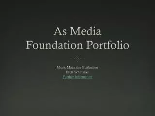
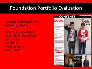
Foundation Portfolio Evaluation. Katie Ebbs. Evaluation. In my evaluation, I intend to cover the following criteria: Forms & Conventions Representation Institutions & potential distribution Audience Technologies Progression. Forms and Conventions - Front Cover.

E N D
Foundation Portfolio Evaluation • Katie Ebbs
Evaluation • In my evaluation, I intend to cover the following criteria: • Forms & Conventions • Representation • Institutions & potential distribution • Audience • Technologies • Progression
Forms and Conventions - Front Cover Column inch: This promotes the secondary features that aren’t important enough to take centre-fold. The text-types follow standard conventions by alternating bold, capitalized text for the heading, and smaller, lower-case text for more detailed. Brand identity: My magazine is called OCMD which stands for Obsessive Compulsive Music Disorder. It will promote the latest information on new and old music and is designed for music lover, while also making a statement about the magazine. I got the idea for using an acronym from reading different magazine titles online. I also think the background circles work well, making the title stand out with it being a bold red against a duller background. Image: My mid-shot image of ‘Amelia White’ bleeds to the edges and bottom of the page. Her face takes up most of the page, representing the importance's of her and how big she is in the music industry. Text types: The white block text is instantly attention-grabbing and stands out against the background colour. The black text is bold against the red colours across the page. I got this idea from looking at the colours used in Q magazine. Text: The quote from my artist acts as a callout to hook the reader in. The colour stands out as it is in contrast with the red. I’m really happy with the way the white looks on the black background, and the purple, matching the sleeves, gives an almost 3D effect on the text. Also, the red ’50’ matches the title colour but I think the other text could have been a different colour to black, as it blends in slightly with her hair.
Representation • The model “Amelia White” is represented in a fun and mischievous way. She takes up most of the page, showing that she is important and big in the music industry. Her image bleeds out the edges and bottom of the page and the bright mise-en-scene is attractive to the eye.
Institutions • If my magazine were to be published and distributed, I think a company like the Bauer Media would be most suitable. Bauer Media is owned by the Bauer Media Group, which owns more than eighty influential media brands, including 300 magazines in 15 countries. Their business is built on influential media brands with millions of personal relationships with engaged readers and listeners. They connect audiences with excellent content through their broad multi-touch point brand platforms. Their wide portfolio of influential brands gives them advantages over pure play magazine or radio competitors. My magazine is closely based on Bauer’s “Q Magazine”. The magazine looks at both old and new music, aiming at both young and old audiences, which is what inspired the style and content of my magazine
Audiences • I have made my OCMD Magazine to appeal to these two specific audiences; • Primary audience: Older adults, with an income that lets them not only buy the magazine but access features (Albums, Gig tickets etc). Mainly males and females aged 25 + social groups B-C1: Middle to lower middle class, they would probable be listening to the music they grew up with and would be interesting in seeing what their bands are doing. • Secondary audience: A younger class, most likely students, with a less flexible income that may only let them buy the magazine. Whilst having more time to engage in more features, their income isn’t likely to stretch far for them to access them. These would be essential for loyalty, as their social group would be E now, with the hope they carry on buying the magazine as they work up through the social classes.
Addressing the audience • Primary Audience: • A good price that reflects and represents • the quality of content. • Essential information is covered such • as what the bands they listen to are doing now. • Information they can relate to – such as • The Beatles summed up in 50 words, some • of the readers may be able to relate to the events. • Secondary Audience: • Price – possibly a special student discount to • encourage loyalty. • Exclusive features on new artists • Gig Reviews • The latest bands to listen to.
Technologies • Photoshop: When I first started using Photoshop my skills were very limited and I didn’t know how to use most tools. However, I feel like my Photoshop skills have improved to the point where I can use most, If not all the tools available in the best ways possible. I believe my work with the lasso tool has improved the most as I now know how to use it to the best standard of editing. • Photography: I believe my photography skills are of a good standard. I knew before hand about the lighting for photos, and how to compose a photo to get the right mise-en-scene. I am very happy with the shots used, If I were to change one thing it would be the camera used, to be a more high quality camera. • Blogging: Before this coursework, I had no experience of blogging on the internet. However I found little problem with using Wordpress, other than my timing with putting pieces on there. • Scanning: I had a lot of experience with scanning before hand, and therefore had no problems with this.
Progression • I believe my progression has been good. I have tried to be precise in my work, paying attention to detail and following my specification closely. I did a lot of magazine research in to targeting specific audiences and found out what specific audiences liked and disliked, and tried to apply this into my work. I also use three magazines to help with my forms and conventions, using ideas from them such as the placement of text and colour schemes. I think my presentation of my production pieces is okay, I am very happy with the look of my contents page, and I am very happy with my front cover, although I think I maybe could have spent a bit more time on it. I am least happy with my article as I could have ordered the text a lot better, putting it into columns and adding more text, If I had more time that is what I would improve. Also I believe my time management wasn’t as good as it could have been, with late blog uploads and late finishing of the production pieces. However, I am happy with my overall progress, and have enjoyed the practical work very much.
Progression - Student to Music magazine There is a significant difference between the two front cover pieces. The music magazine is a lot more clear and evidently has a lot more detail. The student magazine is unfinished due to computer errors and lack of time to finish it. The main differences, are the title, image, text and mise en scene. The title on the student magazine is bold and clear, possibly a bit too dark but works against the light background. It is a very simple title, which shows my lack of Photoshop skills. The improvement on the music magazine means it looks clear, and uses more skills to do. This reflects on how much my Photoshop skills have improved throughout the corse. Secondly, The editing and lassoing on the photo have improved a lot since my student magazine piece. The student magazine looks untidy and again, showing my lack in Photoshop skills compared to my music magazine. The lassoing looks more cleaner and less obvious than my student piece. Also, my use of a variety of texts has improved, as for y student piece I only used two different texts, whereas on the music piece, I used more different styles and sizes. Finally the mise en scene has improved the most, with a very dull, darker piece that looks very monotone, to a piece with a lot more bright colours and looks overall, more light and pleasing on the eye.