Download

1 / 31
310 likes | 375 Vues
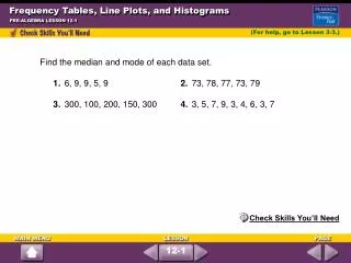
Grade 8 Algebra1 Frequency and Histograms. Warm Up. Use the circle graph for Exercises 1–3. 1) Which two types of gifts make up just over half of the donated gifts?. 2) Which type of gift represents 1/5 of the total donated gifts?. 3) If there were 160 gifts donated, how many were books?.

E N D
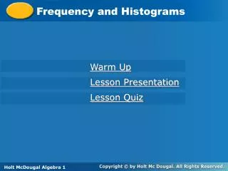
Grade 8 Algebra1Frequency andHistograms CONFIDENTIAL
Warm Up Use the circle graph for Exercises 1–3. 1) Which two types of gifts make up just over half of the donated gifts? 2) Which type of gift represents 1/5 of the total donated gifts? 3) If there were 160 gifts donated, how many were books? CONFIDENTIAL
2 3 Frequency and Histograms A stem-and-leaf plot arranges data by dividing each data value into two parts. This allows you to see each data value. The last digit of a value is called a leaf. The digits other than the last digit of each value are called a stem. The key tells you how to read each value. Key: 2|3 means 23 Stem-and-leaf plots can be used to organize data, like the number of students in elective classes. CONFIDENTIAL
Making a Stem-and-Leaf Plot A) The numbers of students in each of the elective classes at a school are given below. Use the data to make a stem-and-leaf plot. 24, 14, 12, 25, 32, 18, 23, 24, 9, 18, 34, 28, 24, 27. Thetens digits are the stems. Theones digits are the leaves. List the leaves from least to greatest within each row. Title the graph and add a key. Key: 2|3 means 23 CONFIDENTIAL
B) Marty’s and Bill’s scores for ten games of bowling are given below. Use the data to make a back-to-back stem-and-leaf plot. Marty: 137, 149, 167, 134, 121, 127, 143, 123, 168, 162 Bill: 129, 138, 141, 124, 139, 160, 149, 145, 128, 130 Thefirst two digits are the stems. Theones digits are the leaves. Put Marty’s scores on the left side and Bill’s scores on the right. Title the graph and add a key. The graph shows that three of Marty’s scores were higher than Bill’s highest score. Key: |14|1 means 141 Key: 3|14| means 143 CONFIDENTIAL
Now you try! • The temperature in degrees Celsius for two weeks are given below. Use the data to make a stem-and-leaf plot. • 7, 32, 34, 31, 26, 27, 23, 19, 22, 29, 30, 36, 35, 31 CONFIDENTIAL
The frequency of a data value is the number of times it occurs. A frequency table shows the frequency of each data value. If the data is divided into intervals, the table shows the frequency of each interval. CONFIDENTIAL
Making a Frequency Table The final scores for each golfer in a tournament are given below. Use the data to make a frequency table with intervals. 77, 71, 70, 82, 75, 76, 72, 70, 77, 74, 71, 75, 68, 72, 75, 74 Step1 Identify the least and greatest values. The least value is 68. The greatest value is 82. Step2 Divide the data into equal intervals. For this data set, use an interval of 3. Step3 List the intervals in the first column of the table. Count the number of data values in each interval and list the count in the last column. Give the table a title. CONFIDENTIAL
Now you try! 2) The number of days of Maria’s last 15 vacations are listed below. Use the data to make a frequency table with intervals. 4, 8, 6, 7, 5, 4, 10, 6, 7, 14, 12, 8, 10, 15, 12 CONFIDENTIAL
A histogram is a bar graph used to display the frequency of data divided into equal intervals. The bars must be of equal width and should touch, but not overlap. CONFIDENTIAL
Making a Histogram Use the following frequency table to make a histogram. Step1 Use the scale and interval from the frequency table. CONFIDENTIAL
Step2 Draw a bar for the number of scores in each interval. All bars should be the same width. The bars should touch, but not overlap. Step3 Title the graph and label the horizontal and vertical scales. CONFIDENTIAL
Now you try! 3) Make a histogram for the number of days of Maria’s last 15 vacations. 4, 8, 6, 7, 5, 4, 10, 6, 7, 14, 12, 8, 10, 15, 12 CONFIDENTIAL
Cumulative frequency shows the frequency of all data values less than or equal to a given value. You could just count the number of values, but if the data set has many values, you might lose track. Recording the data in a cumulative frequency table can help you keep track of the data values as you count. CONFIDENTIAL
Making a Cumulative Frequency Table The heights in inches of the players on a school basketball team are given below. 72, 68, 71, 70, 73, 69, 79, 76, 72, 75, 72, 74, 68, 70, 69, 75, 72, 71, 73, 76 a) Use the data to make a cumulative frequency table. Step1 Choose intervals for the first column of the table. Step2 Record the frequency of values in each interval for t he second column. Step3 Add the frequency of each interval to the frequencies of all the intervals before it. Put that number in the third column of the table. CONFIDENTIAL
Step4 Title the table. CONFIDENTIAL
b) How many players have heights under 74 in? All heights under 74 in. are displayed in the first two rows of the table, so look at the cumulative frequency shown in the second row. There are 14 players with heights under 74 in. CONFIDENTIAL
Now you try! 4) The number of vowels in each sentence of a short essay are listed below. 33, 36, 39, 37, 34, 35, 43, 35, 28, 32, 36, 35, 29, 40, 33, 41, 37 a. Use the data to make a cumulative frequency table. b. How many sentences contain 35 vowels or fewer? CONFIDENTIAL
Assessment 1) The ages of professional basketball players at the time the players were recruited are given below. Use the data to make a stem-and-leaf plot. CONFIDENTIAL
2) The average monthly rainfall for two cities (in inches) is given below. Use the data to make a back-to-back stem-and-leaf plot. CONFIDENTIAL
3) The finishing times of runners in a 5K race, to the nearest minute, are given below. Use the data to make a frequency table with intervals. CONFIDENTIAL
4) The breathing intervals of gray whales are given. Use the frequency table to make a histogram for the data. CONFIDENTIAL
5) The scores made by a group of eleventh-grade students • on the mathematics portion of the SAT are given. • Use the data to make a cumulative frequency table. • b. How many students scored 650 or higher on the mathematics portion of the SAT? CONFIDENTIAL
6) The numbers of people who visited a park each day over two weeks during different seasons are given below. Use the data to make a back-to-back stem-and-leaf plot. CONFIDENTIAL
2 3 Let’s review Frequency and Histograms A stem-and-leaf plot arranges data by dividing each data value into two parts. This allows you to see each data value. The last digit of a value is called a leaf. The digits other than the last digit of each value are called a stem. The key tells you how to read each value. Key: 2|3 means 23 Stem-and-leaf plots can be used to organize data, like the number of students in elective classes. CONFIDENTIAL
Making a Stem-and-Leaf Plot A) The numbers of students in each of the elective classes at a school are given below. Use the data to make a stem-and-leaf plot. 24, 14, 12, 25, 32, 18, 23, 24, 9, 18, 34, 28, 24, 27. Thetens digits are the stems. Theones digits are the leaves. List the leaves from least to greatest within each row. Title the graph and add a key. Key: 2|3 means 23 CONFIDENTIAL
B) Marty’s and Bill’s scores for ten games of bowling are given below. Use the data to make a back-to-back stem-and-leaf plot. Marty: 137, 149, 167, 134, 121, 127, 143, 123, 168, 162 Bill: 129, 138, 141, 124, 139, 160, 149, 145, 128, 130 Thefirst two digits are the stems. Theones digits are the leaves. Put Marty’s scores on the left side and Bill’s scores on the right. Title the graph and add a key. The graph shows that three of Marty’s scores were higher than Bill’s highest score. Key: |14|1 means 141 Key: 3|14| means 143 CONFIDENTIAL
Making a Frequency Table The final scores for each golfer in a tournament are given below. Use the data to make a frequency table with intervals. 77, 71, 70, 82, 75, 76, 72, 70, 77, 74, 71, 75, 68, 72, 75, 74 Step1 Identify the least and greatest values. The least value is 68. The greatest value is 82. Step2 Divide the data into equal intervals. For this data set, use an interval of 3. Step3 List the intervals in the first column of the table. Count the number of data values in each interval and list the count in the last column. Give the table a title. CONFIDENTIAL
Making a Histogram Use the following frequency table to make a histogram. Step1 Use the scale and interval from the frequency table. CONFIDENTIAL
Step2 Draw a bar for the number of scores in each interval. All bars should be the same width. The bars should touch, but not overlap. Step3 Title the graph and label the horizontal and vertical scales. CONFIDENTIAL
You did a great job today! CONFIDENTIAL