Download
1 / 21
400 likes | 972 Vues
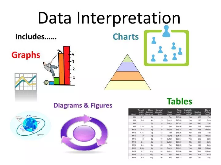
Data Interpretation. Charts. Includes……. Graphs. Tables. Diagrams & Figures. Step 1 – Scan the Passage. Bar Graphs :. Text: very little text SKIP the introduction Come back if problem with the graph. Step 2 – Scan the Graph. A “thing” that has some type of value.

E N D
Data Interpretation Charts Includes…… Graphs Tables Diagrams & Figures
Step 1 – Scan the Passage Bar Graphs: • Text: • very little text • SKIP the introduction • Come back if problem with the graph Step 2 – Scan the Graph A “thing” that has some type of value • What are the variables? • How are they measured? Liters, grams, days, minutes, meters, °C, percent, etc
Bar Graphs = represent information by height or length of bar Dependent variable = DATA Independent variable = “I Manage”
Step 2 – Scan the Graph (continued) Air temperature & water temperature What are the variables? How are they being measured? Degrees Fahrenheit
Step 2 – Scan the Graph (continued) What is the variable? Amount of elements in Earth’s CRUST Amount of elements in WHOLE Earth How is it being measured? Percentages
Step 2 – Scan the Graph (continued) What is the variable? The four diseases How is it being measured? Percentages
Where is the greatest difference between a black and white bar? Bar Graph Analysis At which time is the difference between air and water temperature the greatest? 4 P.M. ≈ 73° According to the graph, what is the water temperature when the air temperature is 69°? Draw a horizontal line beginning with 69°. Where does the black bar line up? Now look where the white bar lines up.
Bar Graph Analysis Which sequence of times shows the four highest air temperatures in order from greatest to least? 1. Find the greatest air temperature (black bar) and label 1. 1 2 4 3 2. Find and label the next three highest air temperatures. 3. Write the times associated with each of the air temperatures. 1 = 1 P.M. 2 = 2 P.M. 3 = 12 Noon 4 = 3 P.M.
Bar Graph Analysis Based on the graph, what was the likely air temperature at 11:30 A.M.? 1. Draw a diagonal line from the top of 11A.M. air temperature bar to the top of the 12 Noon air temperature bar. 2. Mark 11:30 halfway between 11 and 12. 3. Draw a line from 11:30 straight up to the diagonal line. 4. Then draw a line straight over to the vertical axis. 70°F
Coordinate Graphs = there are four types • Linear graphs • Graphs with curves • Scatter diagrams • Flat lines • Look at: • What the variables are • How they’re measured • How they’re related
Coordinate Graphs Vertical axis = Y axis = Dependent Variable The thing that changes. Horizontal axis = X axis = Independent Variable The thing that’s being manipulated
Coordinate Graphs – adding points Each point represents a value for…. Independent Variable = X - Variable Dependent Variable = Y - Variable
Coordinate Graphs – analyze What are the variables? The independent variable is…… Brain type The dependent variable is….. Behavior
Dr. Frankenstein’s Experiment When building his monster, Dr. Frankenstein can use the brain of either a normal person or a psychopath. Normal brain & Normal behavior = X1Y1 Psychopath’s brain & Deranged behaviors = X4Y4 X2Y2represents what type of brain and behavior? Mostly normal brain and mostly normal behavior.
Linear Graphs = Points follow a straight line DIRECT INDIRECT Relationship between variables? Positive Linear Relationship = an increase in X leads to an increase in Y (as X gets bigger, Y gets bigger) Negative (inverse) Linear Relationship = an increase in X leads to a decrease in Y (as X gets bigger, Y gets smaller)
Name that Relationship! + as X gets bigger, Y gets bigger - As X gets bigger, Y gets smaller
Graphs with Curves = the amount that Y changes with each change in X is different at different points on the graph Graph C shows that for every increase in X, the Y value becomes larger. However the changes in Y are exponential and become greater the more X increases.
What happens when the wind speed is 60 km/hr? Graphs with Curves (continued) When the wind speed is 40 km/hr, what is the rate of sand movement? 1.0 .3 What happens when the wind speed is 50 km/hr? As you pick larger values for wind speed, the rate of sand movement will shoot up in value. .6 The rate of sand movement DOUBLED.
Scatter Diagrams “Best fit line” = if you took the average of all the points on the graph and lined them up, they would fit on this line The graph tells you two things: What the points would look like if they were averaged and lined up (a straight line) How the points really look on the graph (scattered)
Flat Lines = there is no relationship between the variables A line with no slope accurately graphs data in which there is no change.
Flat Lines(continued) What is the effect of time on the size of a soda can? There is NO effect!