Download
1 / 28
280 likes | 379 Vues
Comparing Many Group Means. One Way Analysis of Variance. Data Situation. The data situation has k populations and we wish to determine if there are any differences in the population means. If there are differences, we need to describe them.

E N D
Comparing Many Group Means One Way Analysis of Variance
Data Situation • The data situation has k populations and we wish to determine if there are any differences in the population means. • If there are differences, we need to describe them. • Each population is sampled so that n_1 to n_k observations are obtained.
Examples • An agricultural researcher wishes to know what color of bug trap catches the most bugs. Four colors are considered: yellow, white, green, blue. • An education researcher wishes to know if where a student sits in a classroom has any relationship to the grade the student will receive in the class. Three seating locations are considered: front, middle, and back.
Hypotheses • The null hypothesis is that all population means are equal. That is, no differences. • The alternative hypothesis is that not all of the population means are equal. • Note in this situation the Ha cannot be represented by using just symbols.
Test Statistic • The idea is that if the population means differ, the variation between the group sample means will be large relative to the variation within the groups. • The test statistic is based on this idea – it is a ratio of the variation between groups divided by the variation within groups. • This ratio has an F distribution under Ho.
F Distribution • The F distribution is a skewed right distribution with minimum value zero, and can extend out to infinity. • The F distribution is indexed by two sets of degrees of freedom: the first is the numerator degrees of freedom, and the second is the denominator degrees of freedom.
Degrees of Freedom • The numerator degrees of freedom are the number of groups, k, minus one giving k-1. • The denominator degrees of freedom are n-k, the number of observations minus the number of groups.
Test Statistic • The test statistic formula looks complex, but is pretty easy to understand: the denominator is simply finding the variation of each observation yij around its group average y-bar_i. This variation is summed over all observations within each group. This gives the total squared variation within groups. • The numerator gives the variation of each group sample mean around an overall average y-bar.
P-Value • The p-value is found using an F-table with the appropriate degrees of freedom. • If the null hypothesis is not true, the test statistic F will be large and the probability of getting beyond a large positive F will be small. • This means that a small p-value implies evidence to doubt the Ho, just like it always does. • The test will always be one-sided, positive tail.
Conclusion • The data is unlikely to occur if the Ho was true. The data are inconsistent with the Ho. • There is evidence to doubt the Ho. • There is evidence to support the Ha. • There is evidence that not all of the trap color means are equal. There are differences between the colors in how many bugs they catch.
Conclusion • The sample summary shows how the colors differ. Sample means:
Conclusion • The means show that yellow is by far the best color at catching bugs. • The next best color is green.
ANOVA Table ANOVA table:
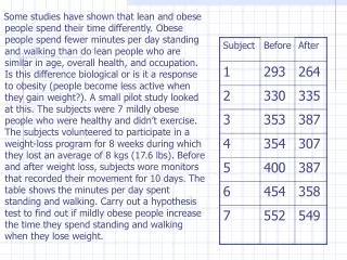
Row Seating Analysis • The response variable is grade in the course (grade points). • The grouping variable is seating location at three levels: front, middle, back. • The idea is that academic performance may be related to seating location in the classroom.
Row Seating Analysis Sample means: ANOVA table:
Conclusion • The data are unlikely to occur if the Ho is true. The data is inconsistent with the Ho. • There is evidence to doubt the Ho. • There is evidence to support the Ha. • There is evidence the group means differ by seating location. That is, the seating location mean gpas differ.
Conclusion • The table of means and the plots show clearly that the front of the classroom has higher grades than the other locations. • From the graphs it is clear that the middle and the back of the room have similar grades. • Where do you sit?
Math Scores ANOVA table: