Download
1 / 71
720 likes | 891 Vues
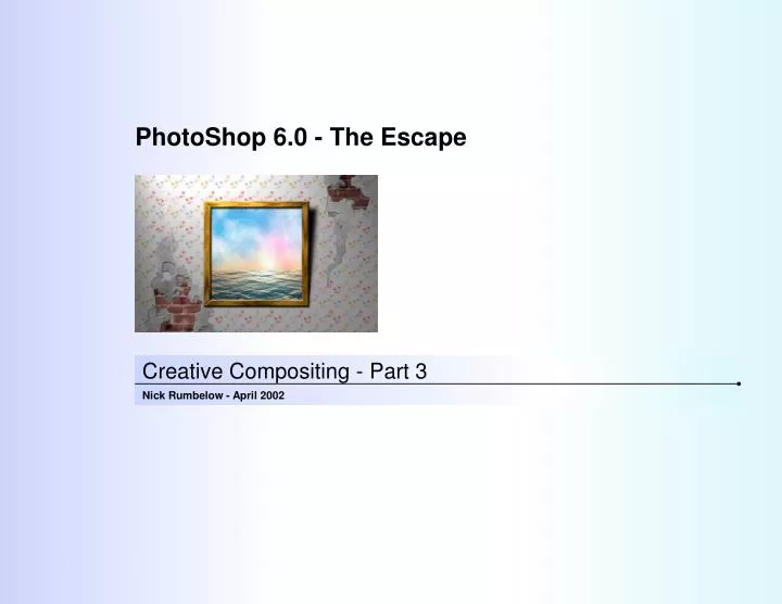
PhotoShop 6.0 - The Escape. Creative Compositing - Part 3. Nick Rumbelow - April 2002. Table of Contents. Section 1. Introduction. Section 2. The Wall. Section 3. Decorating. Section 4. The Frame. Section 5. The Sunset. Section 6. Finishing Touches. Section 7. Summary. Section 8.

E N D
PhotoShop 6.0 - The Escape Creative Compositing - Part 3 Nick Rumbelow - April 2002
Table of Contents Section 1 Introduction Section 2 The Wall Section 3 Decorating Section 4 The Frame Section 5 The Sunset Section 6 Finishing Touches Section 7 Summary Section 8 Where to Go From Here?
The Final Result Fig.1 The Completed Composition 1
Section 1 Introduction
Introduction Objectives • Continuing with the Creative Compositing series, “The Escape” helps you learn how PhotoShop 6.0 can be used creatively and effectively in our work in Presentations. • The series takes an “immersive” approach, throwing you in at the deep end, with detailed explanations of what’s happening, why it’s happening, and how to deal with it. The Tools are explained as they are being used, which allows PhotoShop to reveal its secrets sooner, and you can begin to enjoy discovering your creative potential. • By guiding you through the production of creative compositions, these tutorials aim to provide you with enough experience to anticipate some of the issues you may face in your work, and the confidence to experiment and understand the results of what you do. • But most of all, it is hoped that you will enjoy using the software, and not be held back by considering anything to be beyond you. Although PhotoShop may appear daunting at first, once you understand a few simple concepts about how graphics are produced, it is a very easy application to use. If you can imagine it, there’s a way of creating it in PhotoShop, just experiment. • In this tutorial, the focus is on creating photo-realism. It may sound obvious, but the truth is that to be able produce convincing results, you must first learn how to look! Don’t be held back by self-doubt - experiment, experiment, experiment. • The pace of this tutorial is a little faster than the others, so to help keep things clear, styles of text in this tutorial indicate the following; • Bold, black Arial: Instructions • Bold, blue Arial: Menu items, options or tools • Bold, red Arial: Settings or selections • Times New Roman: Theory • Italic Times New Roman: Illustrations 2
Introduction Topics Covered • Palette Well • Custom patterns • Define Pattern • Seamless Patterns • Offset Filter • Clone Stamp Tool • Clouds Filter • Add Noise Filter • Define Brush • Hue/Saturation • Units and Ruler Preferences • Guides • Actions • Mosaic Filter • Shear Filter • Transform Selection • Colour Balance • Bevel & Emboss Style • Layer Mask • Perspective • Gradients • Snapshots • Bas Relief Filter • Colour Channels • Texture Channel • Lighting Effects • Focal Depth • Shadows • Pen Tools • Alpha Channels 3
Section 2 The Wall
The Wall Getting Started 1: The Plan 2: Create a New Document • First, you’re going to build the wall with bricks • Cover it with plaster • Hang the wallpaper • Create the frame • Paint the picture • Tear away some of the wallpaper • Hack away some of the plaster • Distort some wallpaper as though the wall is uneven • Bring it all together by creating some lighting effects • To create the image at the correct dimensions to fit a PH1 placeholder; • Open a new image using the following settings(Fig. 2) • Width: 17.42 cm • Height:11.20 cm • Resolution:300 dpi • Mode:RGB Colour • Contents:White 3: The Bricks Fig. 2 New Image • Leaving the Background layer blank, create a new layer and name it “Bricks” • As well as filling an area with colour, you can also fill with a pre-defined repeating tile pattern. But first you need to define the pattern you want to use; • Open the file S:\Training Department\Staff Personal Training\PS Training - The Escape\Escape Files\Bricks.jpg(Fig. 3) 4
The Wall Repeating Tile Pattern 4: Define a Custom Pattern Fig. 3 Bricks.jpg • Select All by pressing Ctrl+A • Select Edit > Define Pattern • Accept the default name for the pattern and click OK • The contents of the selection have now been copied into a store of patterns, which will always be available as a fill until it is deleted. • Switch back to the composition and make sure the Bricks layer is still selected • Select Edit > Fill (Shift+F5) • Set the Contents to Use Pattern(Fig. 4). • The Custom Pattern option becomes active • From the Custom Pattern drop-down list, select the brick pattern you just created • Choose Normal for the Blending Mode, and set the Opacity to100% • Click OK • The image fills with the brick pattern, but it doesn’t look natural because it is a repeating tile and you can see the edges of the pattern tiles where they join. The pattern is not seamless. Fig. 4 Fill Patterns 5
The Wall Offset the Edges 5: The Offset Filter Fig. 5 The Offset Filter • Go back to the Bricks.jpg • To solve the problem, you will shift the top and left edges of brick into the centre of the pattern, and get the bottom and right edges to be shifted out of the pattern and wrapped back to replace the top and left edges; • Select Image > Image Size • You need to note the pixel dimensions, in this case 400 x 450 pixels • Click Cancel • Now select Filter > Other > Offset(Fig. 5) • You need the edges to offset half the pattern’s width and height; • Set the Horizontal edges to be shifted 200 pixels to the right • Set the Vertical edges to shift 225pixels down • The UndefinedAreas should be set to Wrap Around • Click OK Fig. 6 The Offset Bricks 6
The Wall Hide the Seams 6: The Clone Stamp Tool Fig. 7 The Clone Stamp Tool • So now the seams have moved away from the edges, into the centre, where you can edit them (Fig. 6). You will subtly clone from different areas of brick and paint over the seams; • Select the Clone Stamp Tool(Fig. 7) • Choose a 21-pixel brush set at 0%Hardness (100% feathered) • In the Clone Stamp Options at the top of the screen, set the Mode to Normal, and the Opacity to 50% • Select Aligned • This means that the point you are sampling from will follow relative to your cursor movements. If this option was not checked, you would keep on sampling from the same place, which can make it look very obvious that you have been cloning • You want to sample from this layer only, so keep Use All Layers unchecked 7
The Wall Seamless Tile 7: Cloning Fig. 8 The Edited Bricks as a Seamless Tile • To set the point from which you wish to sample first, hold the Alt key down • Notice the cursor has changed into a stamp icon. This indicates that the sample point can be set • With the Alt key still held down, left-click to one side of the seam you are about to cover • Let go of the Alt key, move the cursor over the seam, and left-click a few times • Whenever you click, the seam is replaced with the area sampled • Sample the brickwork from the other side of the seam, and continue to cover it • For the best, least noticeable effect, keep changing the sample point, and just “dab” with mouse, rather than painting in long strokes • Eventually all the seams will have vanished (Fig. 8) • SelectAll again (Ctrl+A), and define the pattern once more (Edit > Define Pattern) • Accept the default name again • Close Bricks.jpg without saving • Now swap back to the composition • Press Shift+F5 to open the Fill dialog box (Edit > Fill) • This time, when you pull-down the Custom Pattern menu, a second brick pattern has appeared. New patterns are always added top to bottom, left to right 8: Adding & Deleting Custom Patterns • Delete the old pattern (the one on the left) by right-clicking it and selecting Delete Pattern • Select the new brick pattern, and keep the other settings as before • Click OK • Now the bricks are seamless, and the wall is filled more convincingly (Fig. 9) • Save your composition 8
The Wall The Edited Brick Wall Fig. 9 The Brick Wall 9
The Wall Plastering • You can display the names of the colours in the Swatches palette by clicking the little arrow at the top-left of the palette to show the Swatch Options, and then selecting Small List 9: Plaster Mixture Fig. 10 Add Noise to the Plaster • Create a new layer above the bricks, and name it “Plaster” • For this, you will basically create a grey layer with some noise in the tones. Think of graphic noise as visual white noise, like a random disturbance. The best starting point for getting some natural variations in the tone is to generate some clouds; • Choose 15% Grey as the Foreground colour from the Swatches palette by left-clicking the colour • Hovering the cursor over the colour swatch will reveal its name • Set the Background colour to 40% Grey by holding Alt while you left-click the colour • Select Filter > Render > Clouds • Repeat the filter (Ctrl+F) until you are happy with the balance of tones • Add some grain to the texture, by selecting Filter > Noise > Add Noise • Use the settings as in Fig. 10 • Finally, blur the effect by selecting Filter > Blur > Gaussian Blur, using a Radius of 4 Pixels • The texture should now look like Fig. 11 • You will come back to these two layers later, but for now, hide them so that they do not interfere with the next stage • Save your composition 10
The Wall The Plaster Texture Fig. 11 The Plaster Texture 11
Section 3 Decorating
Decorating Design the Wallpaper 10: The Plan Fig. 12 Draw the Flowers • As we’re too poor to buy our wallpaper, you’re going to design and make it yourself; • You will draw a flower (or any other shape) • Repeat and transform it • Define it as a brush • Paint more flowers • Define the flowers as a pattern • Fill the wall 11: Create a New Layer • Create a new layer above the Plaster layer. Don’t worry about naming it, as it will be merged later • Set Black as the Foreground colour • Draw the flower’s leaves using a small feathered Paintbrush, then use a slightly larger brush to draw the petals (Fig. 12) • You don’t have to draw flowers, you can create whatever shape you like, even just a couple of squiggles 12
Decorating Design the Wallpaper (cont’d) 12: Scale and Arrange Fig. 13 The Finished Flowers • Scale the flowers down to about a quarter of their size, then move them out of the way so that you can draw the next flower • Create another new layer and draw the other flower in the same way • Scale this flower so that it is the same size as the others • Arrange them all offset from each other as in Fig. 13 13
Decorating Design the Wallpaper (cont’d) Fig. 14 Scale Options Reference Point Location Use RelativePositioning Horizontal Scale Vertical Scale Horizontal Skew Horizontal PositionReference Point Vertical PositionReference Point Maintain Aspect Ratio Set Rotation Vertical Skew 13: Merge the Flower Layers 14: Define a New Brush • Link the flower layers together, then merge them into one and name it “Wallpaper”(Layer > Merge Linked) • Select Edit > Transform > Scale • In the Transform Options at the top of the screen, click the Maintain Aspect Ratio chain icon to constrain the proportions (Fig. 14), then set the Width Scale to 1cm and press Enter twice • Now the flowers are ready to become a brush; • Zoom-in by drawing around the flowers using the Magnifying Glass Tool • Use the Rectangle Marquee Select Tool to draw a square selection over the flowers (Fig. 15) • If you begin to select, then hold the Shift key, the selection will be constrained to a square • Select Edit > Define Brush, and name the new brush “Flowers” (Fig 16) • Deselect 14
Decorating Design the Wallpaper (cont’d) Fig. 15 Preparing the Flower Brush 15: Create the Wallpaper Pattern • You are now ready to use the new brush to create a pattern; • Create a new RGB Colour image, measuring 250 x 250 pixels at 300dpi, with the contents set to White • Select the Paintbrush Tool • From the Paintbrush Options at the top of the screen, click the Brushes drop-down menu, and select the Flowers brush from the bottom of the list • Notice the brush is about a quarter the size of the canvas • Choose four similar colours from the Swatches palette as the Foreground colour, and stamp the four flowers as inFig. 17 • Select All by pressing Ctrl+A • Select Edit > Define Pattern, and also name the new pattern “Flowers” • Close the new image without saving Fig. 16 Defining the Brush 15
Decorating Create the Wallpaper Fig. 17 The Flower Pattern 17: Adjust the Appearance • If you’re not happy with the over-all appearance of your wallpaper, you can shift the colours; • Later on, you will be applying Lighting Effects to the wall, and much of the pattern might fade into the shadows, so add definition to the pattern by using Auto Contrast (Image > Adjust > Auto Contrast) • Select Image > Adjust > Hue/Saturation (Ctrl+U) • Adjust the Hue and Saturation sliders until you are happy with the tones • Save the composition 16: Fill the Wall With Flowers • In the developing composition, zoom-out again, make sure the Wallpaper layer is active, then select Edit > Fill (Shift+F5) • From the Contents drop-down, choose Pattern, and then select the Flowers from the Custom Pattern menu • Make sure Blending is set to Normal, the Opacity is set to 100%, and Preserve Transparency is not selected • Click OK • The layer fills with the pattern, replacing the original contents (Fig. 18) 16
Decorating The Finished Wallpaper Fig. 18 The Wallpaper 17
Section 4 The Frame
The Frame Setting-Up 18: The Rulers and Guides Fig. 19 The Guides in Place • With the wall built, now you can make the frame; • Create a new layer at the top of the palette • Don’t worry about the name yet, as it will be merged with others later • The frame is going to measure 7.5 x 7.5cm, it will be 0.5cm thick, and you will use guides to set it up; • If the Ruler is not visible along the left and top edges of the screen, select View > Show Ruler (Crtl+R) • Select Edit > Preferences > Units & Ruler, and make sure the Ruler Units are set to centimetres before clicking OK • Zoom-in so that you can see half-centimetre marks on the rulers • Select View > Snap To and make sure Guides is ticked • Select the Move Tool and drag a guide from the vertical ruler, and set it at 5.5cm • Drag another guide from the vertical ruler, and set it at 6cm • Drag two more guides, and set them at 12.5 and 13cm • Now drag four guides from the horizontal ruler and set them at 2, 2.5, 9 and 9.5cm(Fig.20) 18
The Frame Build the Frame 19: Select the First Piece of the Frame 20: Actions • Select the Rectangular Marquee Select Tool, and from the Select Options at the top of the screen, make sure Feather is set to 0px and the Style is set to Normal • Select the rectangle that forms the bottom piece of the frame (Fig. 20) • From the Swatches palette, select a Pale Brown for the Foreground colour, and a Dark Brown for the Background colour • To create the wood effect on each piece, you will need to perform the same actions four times. Similar to using Macros in Microsoft Word, you can record a series of actions to be repeated at the click of a button by creating a new Action; • If the Actions palette is not visible, select Window > Show Actions • From the bottom of the Actions palette, click the Create New Action button, or click the Actions Options arrow and select New Action (Fig. 21) • Name the new Action “Wood”, leave the other settings as their defaults, and if it is not already activated, click Record • Notice the Record button has turned red • Select Filter > Render > Clouds • Select Filter > Noise > Add Noise, using the following settings; • Amount:20% • Distribution:Uniform • Monochromatic:On • Select Filter > Pixelate > Mosaic, using a Cell Size of 4 Square Fig. 20 First Frame Selection 19
Actions Action Name Stop Record Play Selected Action Create New Action Set Create New Action Delete Action The Frame Build the Frame (cont’d) Fig. 21 Actions Palette 21: Shear the Wood Texture • Select Filter > Distort > Shear using the settings as in Fig. 25using the following method; • Position the bottom handle first (Fig. 22) • Create a new handle by left-clicking on the line where it is intersected by the first gridline. Drag this handle to near the left edge of the box (Fig. 23) • Click the line where it is intersected by the top gridline to create another handle, and drag it into position as in Fig. 24 • For the final handle, click the middle of the line and drag upwards (Fig. 25) • Set the Undefined Areas to Wrap Around • Click OK • The speckled effect is now warped into a wood grain pattern. 20
The Frame Shearing the Wood Texture Fig. 22 First Shear Handle Fig. 23 Second Shear Handle Fig. 24 Third Shear Handle Fig. 25 Fourth Shear Handle 21
The Frame Create the Other Pieces 22: Use the Wood Action Fig. 26 The Four Pieces of the Frame • Rather than just duplicating the layer, each piece will be unique; • Create another new layer • With the Rectangular Marquee Select Tool still selected, click inside the selection and the drag it up so that it is above the piece you just created (the wood pattern does not move, just the selection) • To constrain the movement to a straight line, start moving the selection first, then press and hold Shift • Now the process will be repeated, so end the Wood Action recording by clicking the Stop button (Fig. 22) • To apply the Wood Action, click the Name in the Actions palette to activate it, and then click the Play button • Repeat this another two times, to make the four pieces of the frame (Fig. 27) • Delete the last empty layer created by the Action and Deselect 22
The Frame Create the Other Pieces (cont’d) 23: Reposition the Pieces Fig. 27 The Pieces in Place • Now to put the pieces together; • Select the layer containing the top piece, and select Edit > Transform > Flip Horizontal • The grain now flows in the correct direction • Select the Move Tool, and move the piece into position at the top of the guides • Activate the next layer down, and select Edit > Transform > Rotate 90o CW • Move this into position as the left piece • For the next layer down, select Edit > Transform > Rotate 90o CCW, and position it as the piece on the right • The frame should now look like Fig. 27 23
The Frame Create the Other Pieces (cont’d) 24: Mitre Joints Fig. 28 Cut the Mitre Joint With a 450 Selection • Join the pieces by cutting them into mitre joints; • Select the layer containing the bottom of the frame • Make this the only layer visible by holding Alt while clicking the layer’s eye icon in the Layers palette • Use the Rectangular Marquee Select Tool to make a small square selection anywhere (hold the Shift key) • This selection will become a cutting tool • Choose Select > Transform Selection, then holding the Shift key, rotate the selection 45o, then press Enter • With the Rectangular Marquee Select Tool still active, move the selection into place as inFig. 28(a), and press Delete • Move the selection to the other end of the frame piece, and press Delete again as inFig. 28(b) • Now for the next piece; • Activate the next layer above • It becomes visible • Hide the previous layer by clicking its eye icon • Move the selection into place, and cut the corner away by pressing Delete • Move the selection to the other end and cut that corner too • Repeat this process for the remaining frame pieces (a) (b) 24
The Frame Join the Pieces Together 25: Merge the Frame Layers 27: Bevel the Frame • With all the pieces in place, you can now join them together in one layer; • Reveal all the layers (including the brick and plaster) • If there are any gaps, just scale the piece so that the piece fits the guides by snapping to them • Link all the frame layers together • Merge the linked layers by selecting Layer > Merge Linked (Ctrl+E) • Rename the layer “Frame” • Hide the guides, they will not be required again till later (Ctrl+H) • Finally, bevel the frame by selecting Layer > Layer Style > Bevel and Emboss • Use the following settings (Fig. 29); • Style: Inner Bevel • Technique: Smooth • Depth: 500% • Direction: Up • Size: 10 px • Soften: 0 px • Angle: 120o • Use Global Light: On • Altitude: 30o • Gloss Contour: Linear • Anti-aliased: On • Highlight Mode: Screen (White) • Highlight Opacity: 75% • Shadow Mode: Multiply (Black) • Highlight Opacity: 75% 26: Adjust the Colour Balance • Use the Auto Contrast function (Crtl+Alt+Shift+L) to enhance the grain • What kind of wood would you like this to be? • Select Image > Adjust > Colour Balance (Ctrl+B) • By default, the Midtones are selected, and Preserve Luminosity is on • Adjust the sliders to change the balance of colours in the Midtones to however you want, then do the same to the Shadows and Highlights • By adjusting the colour balance, you can make the frame look like mahogany, rosewood, teak, oak or pine, etc, you can even stain the wood your favourite colour. 25
The Frame Bevel and Emboss Layer Style Fig. 29 Bevel the Frame 26
The Frame Align the Frame to the Wallpaper • When layers are aligned, the linked layers will move to alignment with the active layer 28: Align the Frame 29: Save • With the frame complete, all that remains is to align it to the centre of the wall; • Activate the Wallpaper layer • Link it to the Frame layer, but keep the Wallpaper layer active. When layers are aligned, the linked layers will move to alignment with the active layer • Select the Move Tool • Use the buttons in the Move Tool Options at the top of the screen to align the frame to the centre of the wallpaper (Fig. 30) • Unlink the layers • Your composition should now look like Fig. 31 • Save your work Fig. 30 Layer Alignment Options Align Vertical Centres Align Left Edges Align Right Edges Distribute Vertical Centres Distribute Left Edges Distribute Right Edges Distribute Horizontal Centres Align Top Edges Align BottomEdges Align HorizontalCentres Distribute Top Edges Distribute Bottom Edges 27
The Frame Complete the Frame Fig. 31 The Completed Frame 28
Section 5 The Sunset
The Sunset Setting the Sun 30: Create a New Layer Set 31: Edit the Transparency • The sunset scene is going to be made from several layers. Since the new layers are going to be related, create a new layer Set between the Wallpaper and Frame layers to keep them in. (Layer Sets and Gradients are covered in the previous tutorial “Creative Compositing Part 2 - The Forest) • Name the Set “Picture” • Create a new layer within the Set and name it “Gradient” • Display the guides again by pressing Ctrl+H (View > Show Extras) • Delete the existing guides by dragging them to back to the rulers with the Move Tool or selecting View > Clear Guides • Drag a new horizontal guideline from the ruler to about one third of the way up from the bottom of the frame • This will be the guide for the horizon • Make a rectangular selection the size of the frame • You will need this selection several times later, so save it by choosing Select > Save Selection, naming the selection as “Frame” • Select the Gradient Tool • Set the Foreground colour to Pastel Yellow Orange, and the Background colour to Pure Orange Red • Click the sample in the Gradient Options at the top of the screen (not the arrow next to it) to edit the gradient (Fig. 32) • Make sure there are only two Opacity Stops (above the sample gradient), and two Colour Stops (below the sample), and that they are at the ends of the sample • Set the Opacity Stops at 100% as no transparency is involved • Set both Colour Stops to RedOrange by left-clicking them, setting the Colour to Background, then clicking the stop a second time to apply it • Move the cursor to just underneath the sample until it changes from the pointer to a finger, and left-click to set the middle Colour Stop • Set the Location of the new Stop to 45%, and set the Colour to the ForegroundPastelYellow Orange • Set the Location of the left Colour MidpointController (the little diamond) to 75% • Click the middle Colour Stop again to display both Midpoint Controllers, and set the one on the right to 25% • Click OK • Drag from the top to the bottom of the frame, holding Shift to constrain the gradient in a straight line • The frame should look like Fig. 33 29
The Sunset Setting the Sun (cont’d) Fig. 32 The Sunset Gradient Start Opacity Stop End Opacity Stop Start Colour Stop End Colour Stop Middle Colour Stop Midpoint Controller Stop Settings 30
The Sunset Setting the Sun (cont’d) Fig. 33 The Gradient Applied 32: Add Some Clouds • Create a new layer above the Gradient layer, within the Picture Set, and name it “Clouds” • Set the Foreground colour to CMYK Cyan, and set the Background to White • Select Filter > Render > Clouds • You can keep pressing Ctrl+F to repeat the Clouds filter until you have a pattern you are happy with 31
The Sunset Layer Masks 33: Fade Using a Layer Mask Fig. 34 Layer Mask • To fade the clouds into the gradient you will apply a Layer Mask. A Layer Mask is similar to a Quick Mask, where black will add to the selection and white deletes from it, but the main difference is that the layer remains untouched, while the attached Layer Mask hides or reveals the contents; • Select Layer > Add Layer Mask > Reveal All • Reveal All means the layer will remain visible, while areas covered by the Layer Mask will be hidden. Hide All would hide the layer, revealing only the areas covered by the Mask. • Notice the colour swatches on the Toolbar have changed to black and white, ready for the Mask. • Make sure the Foreground colour is White, and the Background is Black • Select the Gradient Tool • From the Gradients drop-down menu, select or create a Foreground to Background gradient (White to Black) • Drag from the top to the bottom of the frame, holding Shift to constrain it to a vertical movement • The black areas of the gradient cause the attached layer to become transparent • In the Layers palette, the Layer Mask appears as an extra thumbnail next to the Clouds thumbnail, with a chain icon between them to indicate they are linked (Fig. 34) Layer Mask Selected Indicator Layer Mask 32
The Sunset Snapshot vs. History • It is strongly advised to take regular snapshots, as the History palette is limited 34: Take a Snapshot Fig. 35 History Palette • We’re going to experiment with the Layer Mask, but afterwards, we want to be able to return the composition to the way it is now. Instead of having to work your way back through the History palette, you can take a snapshot; • Left-click the New Snapshot icon in the History palette (Fig. 35) • A thumbnail representation of the composition appears in the top section of the palette. Later, when you need to return to this point, you can just click this thumbnail. Snapshot Create New DocumentFrom Current State Create New Snapshot 33
The Sunset Hide All vs. Reveal All 35: Experiment 36: Create the Sea • Now back to the Layer Mask. Suppose you’ve changed your mind about having the sky fade out like that, and you want to remove the Mask; • Drag the Mask in the Layers palette to the Trash Bin • You are prompted to either apply or discard the Mask before it is removed. • Click Discard • The graduated transparency is deleted from the layer. • Staying in the Clouds layer, select Layer > Add Layer Mask > Hide All • This time the clouds disappear, though the layer is still intact. • Select the Gradient Tool again, and apply any Black to White gradient • By applying a Hide All Mask, the Clouds layer is only revealed through the white areas of the Mask • Return the composition to the state recorded in the earlier snapshot by left-clicking its thumbnail at the top of the History palette (Fig. 35) • Notice all the events in the History palette are greyed-out ready to be erased by whatever you do next. • While they are greyed-out they are still available, and clicking one will take the composition back to that stage. • Deselect • Save your work • To be able to add perspective to the sea, you will create it too big for the frame, and then distort it; • Create a new layer within the PictureSet, above the Clouds layer, and name it “Sea” • Make a large selection extending outside of the frame as inFig.36 • Set the Foreground colour to Pure Cyan Blue, and the Background to White • Select Filter > Render > Clouds • Use the Auto Contrast function to brighten the pattern (Ctrl+Shift+Alt+L) • SelectFilter > Sketch > Bas Relief, and use the following settings; • Detail: 15 • Smoothness: 1 • Light Direction: Top • The texture now looks as though your are looking down on the sea, raised where the white areas of the clouds were, and depressed in the darker areas (Fig. 37). • The sea texture was discovered by experimenting with the filters. 34
Fig. 36 The Sea Selection Fig. 37 Bas Relief Filter Applied After Clouds The Sunset Create the Sea Texture • The Sea texture was discovered by experimenting with all the filters 35
The Sunset Creating Distance 37: Add Perspective Fig. 38 Delete Excess Texture • Now to add some depth and perspective; • Select Edit > Transform > Scale • Bring the top edge of the sea texture down to the horizontal guideline, and the bottom edge to within the bottom of the frame • Press Enter to confirm the transformation • Select Edit > Transform > Perspective • Drag one of the top corners in towards the picture, so that it is under the frame. The other top corner follows with it • Press Enter to confirm the transformation • Make a selection over the areas of the texture which are left outside the frame, and press Delete(Fig. 38) • Deselect • You can adjust the tones of the sea if you wish, by changing the Hue/Saturation, Levels, and ColourBalance • Add to the story; if the sun is setting over the Caribbean or the Indian Ocean, the sea will be a bright cobalt blue, whereas if it were setting over Brighton, it would be paler, desaturated, and the blue would have a grey-green tint • Save your composition Delete These Areas 36
The Sunset Create the Sun • Lens flares are discussed in detail in Creative Compositing Part 2 - The Forest 38: Add a Lens Flare Fig. 39 The Sun Spot • To make the sun, you will create a lens flare and colourise it; • Create a new layer named “Sun”, and position it between the Sea and Clouds layers • Fill the new layer with Black • Paint a small white dot, using a 21px brush to mark the position of the sun (Fig. 39). For artistic effect, avoid placing the sun in the centre of the scene, as the secondary flares will be more dramatic from the side • Select Filter > Render > Lens Flare • Set the Brightness to 100%, and select the 50-300mm Zoom as the Lens Type • Position the flare on the white spot in the Flare Centre window • Click OK • Some of the flare extends outside the frame. To delete this you need the selection you saved earlier; • Select Select > Load Selection and choose the Frame selection from the Channels drop-down menu • The shape of the frame is selected, but you actually need to select everything outside the frame; • Select Select > Inverse (Ctrl+Shift+I) • Deselect 37
The Sunset Create the Sun (cont’d) 39: Adjust the Flare Fig. 40 The Lens Flare, Rendered and Adjusted • Change the Sun layer Blending Mode to Screen to allow the rest of the layers to show through • Select Image > Adjust > Hue/Saturation (Ctrl+U), and adjust the Saturation to +50 • Press Ctrl+B (Image > Adjust > Colour Balance) and experiment with the tones • Now that the sun is in place, if necessary, you can adjust the appearance of the sky; • Left-click the Clouds Layer Mask in the Layers palette (Fig. 36) • Select the Gradient Tool • Set the Foreground colour to White, and the Background to Black • Experiment with creating different gradients, fading the clouds into the sunset, until you are happy with the balance (Fig. 40) • If you want to change the height of the horizon, just select the Sea layer, and scale it 38
The Sunset Colour Channels vs. Alpha Channels • Alpha Channels are greyscale representations of saved selections 40: Colour Separations Fig. 41 The Channels Palette - RGB Selected • The sea needs to look as though it is being lit by the sunset, but before that, a quick word about Channels; • An RGB image contains three greyscale versions of itself; these are the Colour Channels. Each one represents the distribution of one colour in the image. For example, you have a channel to determine where red needs to be, and how transparent the red should be in those places, and the same for the greens and the blues. • A Channel is a Mask, or rather Masks are Channels. The areas of a Channel’s colour are represented by white, while the areas that do not contain that Channel’s colour are represented by black. Shades of grey represent a percentage of colour present in that area. • To demonstrate this, view the Channels palette by selecting Window > Show Channels(Fig. 41), and then left-click each of the channels in turn (Figs. 42-45) • The three Colour Channels are combined to create the composite image. Being able to separate colours means that you can target a particular colour and adjust all occurrences of it in isolation. For example, in a photo of green fields under a blue sky, you could apply Levels to just the fields by targeting the Green Channel, without affecting the blue sky, etc. • In addition to the Colour Channels, selections can also be saved as channels. The Frame selection you saved earlier has been stored as an extra channel at the bottom of the palette, and by dragging a channel onto the Load Channel As Selection button (Fig. 41), its shape becomes that selection again. Selections stored in this way are known as Alpha Channels. Colour Channels Load Channel As Selection Alpha Channel 39
The Sunset Separated Colour Channels Fig. 42 Red, Green & Blue Channels Together Fig. 43 Red Channel Fig. 44 Green Channel Fig. 45 Blue Channel 40
The Sunset Lighting Through a Texture Channel • Texture Channels emboss Lighting Effects through Colour or Alpha Channels 41: Lighting Effects 42: Texture Channel • With this in mind, you can apply some lighting to affect the Blue Channel of the sea; • Select the RGB Channel to make sure all the Channels are on • You no longer need the guideline, so delete it by selecting View > Clear Guides • Select the Sea layer • Load the Frame selection either via the Channels palette or by selecting Select > Load Selection • Select Filter > Render > Lighting Effects • Use the following settings and place the light source as inFig. 46; • Style: Default • Light Type: Omni • Intensity: 35 • Gloss: 100 - Shiny • Material: 100 - Metallic • Exposure: 0 • Ambience: 21 • Texture Channel: Blue • White is High: On • Height: 12 • To set the Light Colour, click the swatch and set the RGB values to 255,255 & 200 respectively • Set the Ambience Colour the same way, using 255,125 & 75 for the RGB values • Position the light above the horizon, slightly to the right, to correspond to the position of the lens flare • The Texture Channel will emboss one of the Colour Channels, or any other selection saved as a Mask (Alpha Channel). By checking the White is High option, any white areas will be lifted according to the amount set in the Height control. If this option is not selected, but a Texture Channel has been chosen, the dark areas will be raised instead. • This is a very powerful feature for adding form to your textures, and if it is used subtly, it can really enhance your photo-realism. • Click OK • Deselect 41
The Sunset Lighting Effects Fig. 46 Lighting the Sea Light Colour Swatch Light Position/ Direction Ambience Colour Swatch Texture Channel 42
The Sunset Create Focal Depth 43: Add a Graduated Blur Fig. 47 The Sea With Lighting Effects Applied • The sea is looking more natural now, but it is still in stark contrast to the rest of the image; • Set the Sea layer Opacity to 85%. This allows some of the Yellow-Orange gradient to show through, adding to the ambient effect • To be more convincing, the sea should blur as it gets further away. For this you will create a Quick Mask; • Double-click the Quick Mask Mode icon to display the Quick Mask Options and make sure Colour Indicates is set to Selected Areas • Click OK • Select the Gradient Tool • Make sure the gradient runs from Black to White • Click on the horizon, and drag down to the bottom of the frame • Return to Standard Mode so that the selection is represented by the “Marching Ants” • Apply a 1-pixelGaussian Blur filter • Deselect • The image should now look like Fig. 47 • Try fine-tuning the Sea layer if you wish, by adjusting the Levels, Colour Balance, and Hue/Saturation • The picture is complete now, so to keep the Layers palette tidy; • Collapse the Picture Set • Save your work 43