Download
1 / 48
480 likes | 560 Vues
UI Design and Development. +Roman Nurik +Nick Butcher. Agenda. Designing for Android Layouts and resources Tablet considerations System UI integration UI prototyping. Designing for Android. Design for…. Touch Interact primarily with your fingers Expect direct manipulation Mobile

E N D
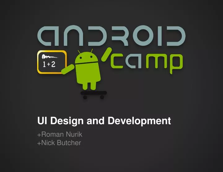
UI Design and Development +Roman Nurik+Nick Butcher
Agenda • Designing for Android • Layouts and resources • Tablet considerations • System UI integration • UI prototyping
Design for… • Touch • Interact primarily with your fingers • Expect direct manipulation • Mobile • Often on the go • Often without network connectivity • Heterogeneity • Different screen sizes and densities • Different hardware features • Different OS versions
Key principles “Pictures are faster than words.” “Only show what I need when I need it.” “Make the important things fast.” “Do the heavy lifting for me.”
Dark Holo variations Dark Action Bar Light
Activity UI structure Action bar Tabs Content(activity layout)
Activity UI structure Action bar
Action bar • App icon andoptional Up caret • View control(Title/tabs/dropdown) • Action buttons • Action overflow
Action bar • Android 3.0 and above • Automatically part of Holo themes • Customize: • getActionBar().setDisplayOptions() • getActionBar().setNavigationMode()
Tabs • Part of the ActionBar APIs • Usually gesture-enabled using ViewPager getActionBar().setNavigationMode(NAVIGATION_MODE_TABS); ActionBar.Tab tab = actionBar.newTab(); tab.setText(“Tab 1”); tab.setTabListener(this); getActionBar().addTab(tab);
Activity UI structure Content(activity layout)
Layout system • The UI for an activity is a tree consisting of view groups and views (leaf nodes). • Most commonly defined in XML under res/layout/. <view group> <view group> <view> <view group> <view> <view>
Views and View Groups Views View Groups Ordered listof Views and View Groups In charge of positioning and sizing their child views and layouts Simple layouts and more complex groups(e.g. ListView) • Reusable individualUI components • Optionally interactive(clickable/focusable/etc.) • Bare minimum functionality is to draw themselves
Views and View Groups Views Layouts (simple View Groups) FrameLayout LinearLayout RelativeLayout GridLayout Your own custom layouts Complex View Groups ScrollView ListView • TextView • EditText • Spinner • ImageView • Button • WebView • SurfaceView • Your own custom views
<FrameLayout> <LinearLayout orientation=“vertical”>
<LinearLayout orientation=“vertical”> <EditText> <Button> <ScrollView>
<ScrollView android:layout_width="match_parent" android:layout_height="match_parent"> <LinearLayout android:layout_width="match_parent" android:layout_height="wrap_content" android:orientation="vertical" android:padding="16dp"> <EditText android:id="@+id/email" android:layout_width="match_parent" android:layout_height="wrap_content" android:hint="@string/prompt_email" android:inputType="textEmailAddress" android:singleLine="true" /> <EditText android:id="@+id/password" android:layout_width="match_parent" android:layout_height="wrap_content" android:hint="@string/prompt_password" android:inputType="textPassword" android:maxLines="2" android:singleLine="true" /> <Button android:id="@+id/sign_in_button" android:layout_width="wrap_content" android:layout_height="wrap_content" android:layout_gravity="right" android:layout_marginTop="16dp" android:paddingLeft="32dp" android:paddingRight="32dp" android:text="@string/action_sign_in_register" /> </LinearLayout> </ScrollView>
App resources • One universal app binary contains all resources • System chooses at runtime which resources to use
Drawable XML PNGs, 9-patch PNGs,optimized for multi. densities Layout XMLoptimized forphysical size and orientation Strings, styles, themes, etc. Strings XML localized for your target regions
Screen density and DIP units DIP units keep things thesame physical size across any screen. 1 dip = 1 pixel @ MDPI (160 dpi) 1 dip = 2 pixels @ XHDPI (320 dpi)
Q: What is the Nexus 7’s screen resolution in DIPs if it’s 1280x800pxand 213dpi? A: ~960x600 dip
Screen density and DIP units Icons and other PNG files should generally be provided for multiple densities
Drawables • Bitmaps (.png) • 9-patches (.9.png) • State Lists (.xml) • Basic Vector Shapes (.xml) • Color Drawables (.xml)
9-patches – foo.9.png • Border pixels indicate stretchable regions • Make density-specific versions (-xhdpi)
State Lists (selector) foo.xml: <selector> <item android:drawable="@drawable/foo_disabled" android:state_enabled="false" ... /> <item android:drawable="@drawable/foo_pressed" android:state_pressed="true" ... /> <item android:drawable="@drawable/foo_focused" android:state_focused="true" ... /> <item android:drawable="@drawable/foo_default" /> </selector>
State Lists (selector) foo_default.pngfoo_disabled.pngfoo_focused.pngfoo_pressed.png foo_default.pngfoo_disabled.pngfoo_focused.pngfoo_pressed.png
Information hierarchy and flow Traditional desktop app or website
Information hierarchy and flow Tablet or mini desktop app
Information hierarchy and flow Mobile phone
Fragments • A single piece of UI and/or implementationof an Activity, defined in its own class • Help with supporting phones + tablets • <fragment> in layout XML • Automatically instantiates the given fragment • Acts as a placeholder for the fragment’s view to be inserted in that part of the layout tree
Why prototype? • Record your ideas andasses their real-world feasability • Test your your ideas and rapidly iterate • See which work and which don’t, evolve them • Map out user flow and activity diagrams • Re-arrange/add/remove interactions quickly • Scope UI complexity • Plan out intra-app “Intent-based API”
Without prototyping, you’ll find yourself doing a lot ofUI refactoring.
Lots of wireframing tools Time/Effort Photoshop Fireworks OmniGraffle(Mac) Keynote/Powerpoint Eclipse Layout Editor Balsamiq Pencil(Firefox addon) Sketches Fidelity
Interactive (clickable) wireframes Time/Effort Photoshop Fireworks OmniGraffle(Mac) Keynote/Powerpoint Eclipse Layout Editor Balsamiq Pencil(Firefox addon) Sketches Fidelity
Demos • “Pencil” (Firefox add-on) • Android stencils at http://j.mp/androiduiutils • Fireworks-generated interactive PDF • Eclipse Android Layout Editor