Download

1 / 12
130 likes | 306 Vues
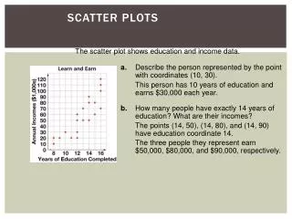
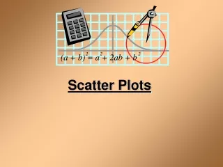
Scatter Plots. Learn to create and interpret scatter plots. A scatter plot shows relationships between two sets of data. Example 1. Making a Scatter Plot of a Data Set. Use the given data to make a scatter plot of the weight and height of each member of a basketball team.

E N D
Scatter Plots Learn to create and interpret scatter plots.
A scatter plot shows relationships between two sets of data.
Example 1 Making a Scatter Plot of a Data Set Use the given data to make a scatter plot of the weight and height of each member of a basketball team. The points on the scatter plot are (71, 170), (68, 160), (70, 175), (73, 180), and (74, 190).
Example 2 Use the given data to make a scatter plot of the weight and height of each member of a soccer team. 200 190 180 170 160 150 140 130 120 Height (in) Weight (lbs) 63 125 67 156 69 175 Weight 68 135 62 120 The points on the scatter plot are (63, 125), (67, 156), (69, 175), (68, 135), and (62, 120). 60 61 62 63 64 65 66 67 68 69 Height
Correlation describes the type of relationship between two data sets. The line of best fitis the line that comes closest to all the points on a scatter plot. One way to estimate the line of best fit is to lay a ruler’s edge over the graph and adjust it until it looks closest to all the points.
No correlation Negative correlation; as one data set increases, the other decreases. Positive correlation; both data sets increase together.
Try This: Do the data sets have a positive, a negative, or no correlation?. A. The size of a car or truck and the number of miles per gallon of gasoline it can travel. Negative correlation: The larger the car or truck, the fewer miles per gallon of gasoline it can travel.
Try This: Do the data sets have a positive, a negative, or no correlation? B. Your grade point average and the number of A’s you receive. Positive correlation: The more A’s you receive, the higher your grade point average.
Try This: Do the data sets have a positive, a negative, or no correlation?. C. The number of telephones using the same phone number and the number of calls you receive. No correlation: No matter how many telephones you have using the same telephone number, the number of telephone calls received will be the same.
Using a Scatter plot to Make Predictions Use the data to predict how much a worker will earn in tips in 10 hours. According to the graph, a worker will earn approximately $24 in tips in 10 hours.
Try This Use the data to predict how many circuit boards a worker will assemble in 10 hours. 141210 8 6 4 2 Hours According to the graph, a worker will assemble approximately 10 circuit boards in 10 hours. 2 4 6 8 10 12 14 Circuit Board Assemblies
Lesson Quiz: 1. Use the given information to make a scatter plot. Tell how to graph each point.