Download
1 / 4
40 likes | 209 Vues
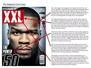
MUSIC MAGAZINE FRONT COVER ANALYSIS. Marie E pton. KERRANG.

E N D
MUSIC MAGAZINE FRONT COVER ANALYSIS Marie Epton
KERRANG The ‘Kerrang’ font is distressed and all the letters are cramped together. This may be used to show a sense of being carefree and being different. The letters being cramped together could also have been a way of having the title fit and still having it quite big on the page. Branding – Band logo and font. Fans of the band will recognise the logo and more likely to buy the magazine to look at what I tis about. The masthead is at the top of the page so that when it is on the shelves in shops it is easy to see what magazine it is. The word Kerrang is covered as it is a big recognisable company that you don’t need to see the title in order to know what it is. The name ‘Kerrang’ is onomatopoeia for the sound of a guitar tremolo which is quite common in this style of music. The writing used to describe the picture on the front cover is the same as the font used on their new album which is why they are on the front cover. Top and bottom banners are the only straight thing on the page. They are used to show different things that are in the magazine as there are not many sell lines down the side of the front cover telling you what else is included in the magazine. The front cover uses lots of exclamation marks possibly show that everything is big and almost presents a sense of the front cover shouting stuff at you and making everything stand out.
BIG CHEESE The band all have very stern faces and are quite aggressive which can show a sense mystery and makes them interesting, different and edgy. Masthead from an older copy of the magazine shows a very rough font with rough edges possibly showing that the magazine is quite rough cut and is not just a basic mainstream magazine. The font used to present the band name on the front cover is in the same font as their album ‘The Black Parade’ which is both promoting the band and also their album. The sell lines down the side of the front cover are very straight and follows a basic magazine layout, making it easy for the reader to follow what is going to be in the magazine. A lot of the writing on the page is wonky and shows that it is trying to be edgy and different from mainstream magazines. A lot of the wonky writing is information to do with the featured band on the cover of the magazine showing their own edginess compared to the magazine. The top and bottom banner of the page contain extra information that is inside the magazine, showing just how much information is inside the magazine.
NME The colour scheme of the whole front cover is red black and white and is all very basic. The picture and other information on the page is slanted possibly showing that the band is edgy and different so they are trying to show this on the front cover. The picture of the band is quite happy and could be showing that the band is quite relaxed and up for a laugh The title of the magazine is in full view and placed in the corner. And is straight to the page unlike everything else on the page. The picture of the bad is very happy and relaxed. This could be because this is how the bad is or it could be because the magazine is a mainstream magazine so they don’t want the front cover to be too serious. NME –New Music Express mainstream magazine. Shortened after it was seen as too long across the top of the magazine.