Download
1 / 18
220 likes | 513 Vues
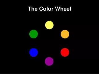
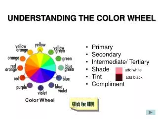
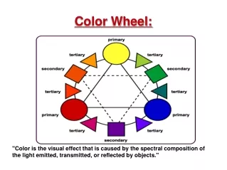
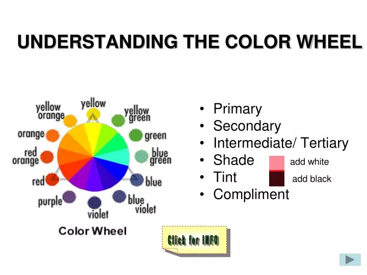
Primary Secondary Intermediate/ Tertiary Shade add white Tint add black Compliment. UNDERSTANDING THE COLOR WHEEL. Click for INFO. Monochromatic Complementary 3. Split-complementary. Analogous Triadic 6. Tetrad. THE SIX COLOR RELATIONSHIPS (COLOR SCHEMES).

E N D
Primary Secondary Intermediate/ Tertiary Shade add white Tint add black Compliment UNDERSTANDING THE COLOR WHEEL Click for INFO
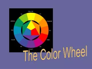
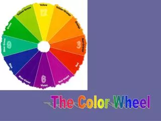
Monochromatic Complementary 3. Split-complementary Analogous Triadic 6. Tetrad THE SIX COLOR RELATIONSHIPS (COLOR SCHEMES) The 4 Major Color Harmonies/Relationships or Schemes Two additional Color Harmonies or Schemes Click here for definitions
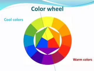
THE THREE PROPERTIES OF COLOR • Hue (blue, red, yellow, green, etc) • Value (light/dark) • Chroma (intensity) Click here for definitions (de-saturated) (saturated)
Hexadecimals(66ff99) A combination of letters and numbers to identify a color.
Color: • Enhances a message • Enlivens a presentation • Adds richness and depth to screen design
Color Can Be Used to: • Distinguish between like and unlike elements on a screen. • Indicate the importance or progression of data by increasing value and saturation level. • Emphasize or draw attention to elements by using lighter or brighter colors. • Set a mood.
Color Tips- DO : • Use color conservatively. • Use color to draw attention to elements. • Use a color pallet of 3 to 4 major colors to establish consistency and a uniform feel to a project. • Be sensitive to cultural biases and associations with some colors.
Color Tips - DON’T : • Sacrifice readability for pleasing color. • Use too many colors in one project. • Use red/green combinations. They will not be visible to those with red/green color blindness. • (Note: You can use these combinations if---when you print in black and white there is a lot of difference between the two colors. Lots of contrast means that the person with red/green color blindness could still distinguish the different objects/words.)
View the examples of Color • Go the following website:
View the examples of Value Go the following website:
Check your Understanding In your Design Packet complete the questions on page 8 regarding Color
Assignment #2 Examples of the 4 major color harmonies Open from the Media:/Student/Shared/ assignment #2 Color Harmonies. Monochromatic Analogous Complementary Triad
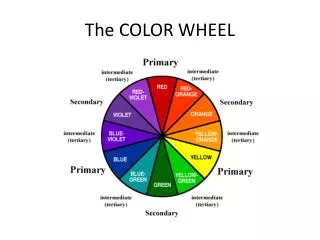
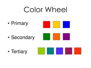
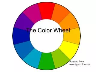
A color is described in three ways: 1. by its name 2. how pure or de-saturated it is 3. and its value or lightness. Primary Colors: Colors at their basic essence; those colors that cannot be created by mixing others. On the computer: red, green and blue. In Paint or otherwise: red, yellow and blue. Secondary Colors: Those colors achieved by a mixture of two primaries. Tertiary Colors: Six colors created by mixture of a primary color and its adjacent secondary: for example: blue and green make blue-green; yellow and orange make yellow-orange,… etc. Shade and tint are terms that refer to a variation of a hue Shade: A hue produced by the addition of black. Tint: A hue produced by the addition of white. Complementary Colors: Those colors located opposite each other on a color wheel.
Monochromatic Colors: Variations of shades or tints of the same hue. Complementary Colors: Those colors located opposite each other on a color wheel. Split-complementary Colors: A color and it’s compliments analogous colors on either side of it on the color wheel. Analogous Colors: Those colors located close together on a color wheel. Triadic: Like Red, Green and Blue. The three colors in the triangle on the color wheel. Tetradic The tetradic (double complementary) scheme is the richest of all the schemes because it uses four colors arranged into two complementary color pairs. This scheme is hard to harmonize; if all four colors are used in equal amounts, the scheme may look unbalanced, so you should choose a color to be dominant or subdue the colors. Page 1. Click for page 123
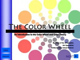
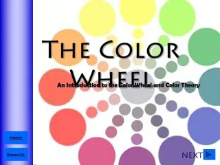
COLOR THEORY Color theory encompasses a multitude of definitions, concepts and design applications. All the information would fill several encyclopedias. As an introduction, here are a few basic concepts. The Color Wheel A color circle, based on red, yellow and blue, is traditional in the field of art. Sir Isaac Newton developed the first circular diagram of colors in 1666. Since then scientists and artists have studied and designed numerous variations of this concept. Differences of opinion about the validity of one format over another continue to provoke debate. In reality, any color circle or color wheel which presents a logically arranged sequence of pure hues has merit. Page 2 Click for page 123
PRIMARY COLORSRed, yellow and blueIn traditional color theory, these are the 3 pigment colors that can not be mixed or formed by any combination of other colors. All other colors are derived from these 3 hues SECONDARY COLORSGreen, orange and purpleThese are the colors formed by mixing the primary colors.TERTIARY COLORSYellow-orange, red-orange, red-purple, blue-purple, blue-green and yellow-green. These are the colors formed by mixing a primary and a secondary color. That's why the hue is a two word name, such as blue-green, red-violet, and yellow-orange. Page 3 Click for page 123
Hue: The name of the color Intensity or Value: The brightness or dullness of a hue. One may lower the intensity by adding white or black. Chroma: How pure a hue is in relation to gray Saturation: The level of purity of a hue.