Download
1 / 33
340 likes | 511 Vues
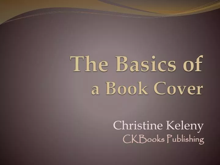
The Basics of a Book Cover. Christine Keleny CKBooks Publishing. What’s Important. A Cover should represent: - The Spirit of the story - The Tone of the story - The Time period the story is set in A Cover Must Appear Professionally Done. Aspect of a Cover. Choosing Color (s)

E N D
The Basics of a Book Cover Christine Keleny CKBooks Publishing
What’s Important A Cover should represent: - The Spirit of the story - The Tone of the story - The Time period the story is set in A Cover Must Appear Professionally Done
Aspect of a Cover • Choosing Color (s) • Image should tell a story • Design should match the story, or at least not conflict with it • Typography - the style, arrangement, or appearance of the text should also match
Where to Start • Look at covers at book stores • In your genre or not! • Find a designer or illustrator • (linkedin groups, professional associations, other author’s artists…) • Give the designer a synopsis of your book • Including genre, time period, your title, - if asked: examples of book covers you like
Design • Things to think about ahead of time. • Do you want… • A photograph • Artwork (figure, specific object, abstract design…) • Just color(s) • A specific font • Or let the artist decide
Think about Color • – Sunshine, laughter, happiness, too much fatigues the eye • – Warmth, adventure, confidence. Children and young adults respond well to orange • – Anger, love, excitement, intensity • – Love, romance, the feminine, but overuse can elicit agitation. • – Royalty, wisdom, spirituality, individualism, magic • – Wisdom, loyalty, honor, can be calming • – fertility, balance, harmony, but also greed, envy • – Stability, structure, comfort, honesty, strength, boring • – Neutral, practicality, conformity, grief, sadness • – strength, power, authority, intelligence, death • – innocence, purity, space, peacefulness, coldness, sterility
Things to Watch out for Related to Story • Supposed to be “action-packed” • Why the Celtic looking text box?
Take a guess about the story on this one.The architecture tells you location and her clothes tells you approximate time but…(Also – way too busy, two many typefaces and hard to read title font. Generally simpler is better.)
Good examples:- you know the time period- you know about two of the main characters- the style mimics the title (and story)
- The subject matter is obvious- The style of the design and font gives you the time period, plus the age of the photo
Relate to Color- What is this book about?- The color doesn’t match the content- The texture is nice
Obvious what this white background does on this slide – or on a page on the internet
This is a fix done exclusively for the internet.(Also note how the red stands out against the white. The spine is also red.)
Good examples of use of color:- Red depicting conflict- Brown depicting strength- Nice use of the smoke to make the title stand out more
This just feels cold!(Not so sure about the subtitle location and Kerning – letter spacing)
Related to Image or Design:- Too busy- Why the ripped paper?
Obvious but not very creative image.(Also poor font style, color, kerning choice.)
- Nice, obvious image- Nice font choices- Odd image tacked onto the bottom(Another white on white issue)
Good examples of image and design:- It’s about repeating something- Nice negative (open) space- Simple design- Nice color contrast- Example of use of margins
- Interesting design- Tells about the story- Color choice of images and text telling
Related to Text:- Supposed to be letters in the sand- Angle makes it hard to read
Nice colors and font style for story but color choice makes it hard to read
-Title is Shouting at us- Hosseini is popular so why so big?- Subtitle isn’t needed and adds too much text to a lovely image
- Nice negative space- Nice colors- Text is a touch hard to read- Style doesn’t tell you the real time period- Base tells you location (maybe) but is it needed?
- Which is the author and which is the title?- Image and background are too similar- Why all the space with the image?
-Title is small - Font style hard to read and unsure if it tells you about the time period(Full color is nice idea but each book in the series in another color so might get into trouble later if there are a lot of series)
- Color and images tell you the time and about the characters- Nice negative space and font choice- Questionable title
- Pleasant Image- Image follows the title- Title is easy to read because of the textured insert
-You get the time period by the color, the title and three silhouetted images- Tells you bit about the characters in the story