Download
1 / 35

E N D
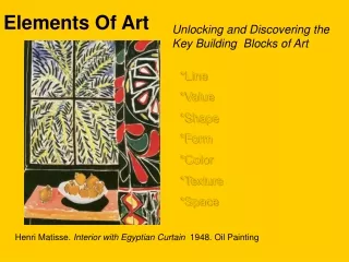
Element of Art • Element of Art • An element of art is a basic visual symbol that an artist uses to create visual art. These elements include: colour, line, shape, form, space and texture. It is through a blending of these elements that you are able to see the work as the artist meant you to see it.
Line • In geometry we see lines as one-dimensional shape and several lines can connect to make three • dimensional shapes. Virtually every photograph has lines in it. Lines can be straight or curved. Lines are defining borders between components of the photo. Lines do much more than just divide up a picture. Lines all suggest moods and rhythm, create patterns and indicate directions and structure. Lines are not passive. They can suggest distance and depth if they also show perspective. They are a strong visual force that pulls the viewer's eye around a photograph. They suggest movement and help to focus the viewer's attention on certain parts of a photograph. There are three main characteristics of lines in photography" • Pattern - the lines themselves interact in some interesting way that is more important than any other element in the photo. These lines suggest repetition. • Direction -line can help the viewer's eye travel around a picture. Without directing lines, the overall image can simply seem like chaos. • Structure -line divides a photo into smaller areas, Providing a skeleton to support the other elements and link them together. Think of lines as being the spine of the photo - just like your spine supports your body, arms, legs and head, lines in photos support the various parts of the photo.
Pattern • Pattern - the lines themselves interact in some interesting way that is more important than any other element in the photo. These lines suggest repetition.
Direction • Direction -line can help the viewer's eye travel around a picture. Without directing lines, the overall image can simply seem like chaos.
Structure • Structure -line divides a photo into smaller areas, Providing a skeleton to support the other elements and link them together. Think of lines as being the spine of the photo - just like your spine supports your body, arms, legs and head, lines in photos support the various parts of the photo.
Value . • In photography value refers to the range of light in the photograph - from black through shades of grey to white. • As a general rule, the more CONTRAST a photo has, or the wider the range between it's darkest and lightest elements, the greater its visual impact will be. • If everything in a photo is either black or white, with no greys, it will not have a lot of impact. It isn't something that the eye wants to keep looking at. • In addition to a good balance of black and white, it's desirable to have a range of greys to define shape and provide shading. • When taking a photo make sure that your light is correct. Too little light will result in a dark "muddy" print. • Too much light will cause highlights (white areas) to be washed-out (so white that no details are visible). • You will shoot ONE black and white photo.
Value • In photography value refers to the range of light in the photograph - from black through shades of grey to white.
Value • As a general rule, the more CONTRAST a photo has, or the wider the range between it's darkest and lightest elements, the greater its visual impact will be.
Value • If everything in a photo is either black or white, with no greys, it will not have a lot of impact. It isn't something that the eye wants to keep looking at.
Value • In addition to a good balance of black and white, it's desirable to have a range of greys to define shape and provide shading.
Value • When taking a photo make sure that your light is correct. Too little light will result in a dark "muddy" print.
Value • Too much light will cause highlights (white areas) to be washed-out (so white that no details are visible).
Colour • Colour is what the eye sees when sunlight or some other light bounces off an object. • There are three properties/traits of colour. Hue is a colour's name. Red, yellow and blue are PRIMARY HUES. These three are called Primary Hues because they can be used to mix all the other colours but cannot themselves be created by mixing any other colours. • SECONDARY HUES are green, orange and violet. Green is created by mixing blue and yellow. Orange is created by mixing yellow and red. Violet is created by mixing blue and red. INTERMEDIATE HUES are created by mixing one primary hue and one secondary hue. Intermediate colours have compound names such as Yellow-Orange, Yellow-Green, Blue-Green, etc. • Intensity is the brightness or dullness of a hue. A bright hue is high in intensity. • A dull hue is low in intensity. • Colours opposite each other on the colour wheel are called Complementary Colours. • Monochromatic Colours are different values of the same hue. • Analogous Colours are colours that are side-by-side on the colour wheel and share a hue. • War/cool colours As a group, reds and yellows are considered warm colors and blue a cool color. • You will shoot - ONE of the following: • - monochromatic • - complementary • - analogous • - warm/cool
Monochromatic Colours • Monochromatic Colours are different values of the same hue.
Complementary Colours. • Colours opposite each other on the colour wheel are called Complementary Colours. Monochromatic Colours are different values of the same hue.
Analogous Colours • Analogous Colours are colours that are side-by-side on the colour wheel and share a hue.
Warm -cool • As a group, reds and yellows are considered warm colors and blue a cool color.
Shape & Form • Shape & Form • Shape is an area clearly set off by one or more of the other five visual elements of art. • Geometric shapes are precise shapes that look as if they were made with a ruler or other drawing tool. The square, the triangle, the circle, the rectangle and the oval are the five basic shapes. • Organic shapesare not regular or even. Their outlines curve to make free-form shapes. Organic shapes are often foundin nature. • Form is an object with three dimensions. Forms have length and width and depth. • Shapehelps convey the nature of a subject. The functions of space can be grouped into three categories: • Mass (the amount of space a shape fills), • Proportion (how the mass of one object compares to that of another) • Relation (how the objects interact visually and physically with each other). • You will shoot ONE photo that emphasises shape or form.
Shape • Shape is an area clearly set off by one or more of the other five visual elements of art.
Geometric shapes • Geometric shapes are precise shapes that look as if they were made with a ruler or other drawing tool. The square, the triangle, the circle, the rectangle and the oval are the five basic shapes.
Organic shapes Organic shapesare not regular or even. Their outlines curve to make free-form shapes. Organic shapes are often foundin nature.
Space • Space is the distance or area between, around, above, below and within things. Space is empty • until objects fill it. All objects take up space. Artists have developed some techniques that imply space: • OVERLAPPING - having shapes overlap one another • SIZE - Making distant shapes smaller than closer ones. • FOCUS - Adding more detail to closer objects, less detail to distant objects. • PLACEMENT - Placing distant objects higher up in the picture, closer ones lower down. • INTENSITY & VALUE - Using colours that are lower in intensity and lighter in value for objects in the distance. • LINEAR PERSPECTIVE - Slanting lines of buildings and oth'er objects so they seem to come together in the distance. • Every object in a photo has two shapes - the first shape is obvious, the space an object takes up is called POSITIVE SPACE. The space around an object is called NEGATIVE SPACE. Shape is a careful composition of the two. Making negative space interesting is the difference between a snap shot and a photograph.
OVERLAPPING • OVERLAPPING - having shapes overlap one another.
SIZE SIZE - Making distant shapes smaller than closer ones.
PLACEMENT • PLACEMENT - Placing distant objects higher up in the picture, closer ones lower down.
INTENSITY & VALUE • INTENSITY & VALUE - Using colours that are lower in intensity and lighter in value for objects in the distance.
LINEAR PERSPECTIVE LINEAR PERSPECTIVE - Slanting lines of buildings and other objects so they seem to come together in the distance.
FOCUS • FOCUS - Adding more detail to closer objects, less detail to distant objects.