Download
1 / 5
50 likes | 58 Vues
Dazonn Technologies offers responsive design services in the United States. We provide logo design, which is a process that assists businesses in developing their brand. It is more accurately stated that it is a method by which companies encourage people to immediately think of their products and organizations, as well as giving them a reason to prefer their products over those of their competitors. For more information, please call 1-929-421-7136 or visit our official website at https://dazonn.com/designing/.<br>

E N D
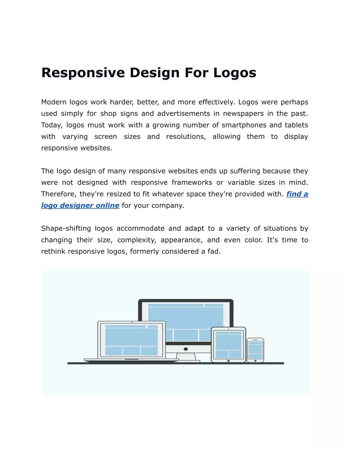
Responsive Design For Logos Modern logos work harder, better, and more effectively. Logos were perhaps used simply for shop signs and advertisements in newspapers in the past. Today, logos must work with a growing number of smartphones and tablets with varying screen sizes and resolutions, responsive websites. allowing them to display The logo design of many responsive websites ends up suffering because they were not designed with responsive frameworks or variable sizes in mind. Therefore, they're resized to fit whatever space they're provided with. find a logo designer online for your company. Shape-shifting logos accommodate and adapt to a variety of situations by changing their size, complexity, appearance, and even color. It's time to rethink responsive logos, formerly considered a fad.
Nevertheless, some brands thrive in the responsive web space. It is imperative to consider how brands appear within changing formats when designing them. Simple, flexible logos that can be formatted in varying ways and arranged in various forms are the best. This is because they will adapt as a site is optimized for different devices. Guidelines for designing responsive logos 1. Design for Simplicity In general, non-responsive logos are replete with detail and subtleties, making them challenging to make. Organizations' logos should reflect their brand values and traditions. It is difficult to let go of a particular element when there are too many, and squeezing too many into a smaller space only makes it more challenging. As designers strive for logos that remain clear at different sizes, load quickly, scale gracefully and have maximum impact, the latest graphic design ideals of simplicity and clarity have gained influence. A cleaner aesthetic has replaced overly ornamented graphical elements with a more structured one, thus eliminating trends such as glows, complex illustrations, color gradients, and drop shadows. When a logo design is reduced in detail, it becomes more readable in smaller sizes. Fill in and invert outline elements, illustrations as geometric shapes, thicken thin strokes, and smooth out detailed pieces. Flat design has become so popular. flatten gradients, redraw 2. Design for Versatility It is the prudence of logo designers to design designs that are versatile and last a lifetime. Our goal with responsive logo design is to ensure quality,
legibility, and design adjustments. Disney illustrates the advantage of simplified logos when conforming to a wide range of screen sizes, as an example in designer Joe Harrison's project "responsive logos." In spite of its lack of castle elements, the word "Walt Disney" evokes strong emotions in the audience attached to the brand name. As the browser size is reduced, the name "Disney" becomes easier to understand. In order to distinguish the brand from its competitors, the "D" in the Disney logo has been reduced to its bare essentials. 3. Declutter, Minimize, Reduce Detail Although many people believe otherwise, brand recognition and identity are not impacted when minor changes to a logo design are made due to physical constraints. The logo should lose some detail as the browser window narrows and becomes more abstract. It can be beneficial to remove small types from logos with small type features gradually. 4. Ditch The Wordmark The Hubspot wordmark readily displaces Hubspot when the browser window is narrower. It allows users to focus more fully on the content and experience of the app and is, therefore, less distracting. When Domino's is reduced to smaller resolutions, its wordmark is also discarded since its logomark stands out by itself. 5. Simplify The Logo Logo Marks should be let go of if they pose the risk of becoming blurry at smaller resolutions or if the company will be more recognizable with its wordmark. Pizza Express is an excellent example of letting go of the logomark for a more simple logo.
6. Abstract On Point The best way to retain elements of your logo design without losing the detail is to make it more abstract. As Jaguar has done, the logo is transparent on smaller screens. The alternate logo retains the elements necessary to recognize the logo since the chrome effect in the original is impossible to scale down. 7. Vertical Stacking It is easy to adapt a logo to design constraints by vertically stacking the logomark and wordmark. The vertical stack takes up much less space at smaller resolutions than the side-by-side logo for larger devices. Future-Proofing Logos Responsive logo design offers the benefit of maintaining legibility across all screen sizes, even at larger sizes, without contending with an ultra-minimal design.Logo designers can fine-tune icons in response to responsive design to portray the "sweet spot" related to legibility across various resolutions. The responsive icons are already optimized for multiple devices (because
there are plenty of screen sizes available). They are designed to display varying levels of detail depending on the device. Find a logo designer online for your company logo.