1 / 2
20 likes | 32 Vues
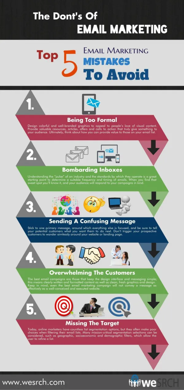
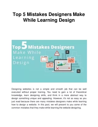
Here are five common mistakes that top website designers always avoid:

E N D
5 Mistakes Top Website Designers Avoid It is not a difficult task to build a website but to make it usable is the real challenge. Considering that a well-designed website can take any business to the next level, it is very important to ensure that designers are avoiding certain web design mistakes. Here are five common mistakes that top website designers always avoid: 1. The first and most common mistake that inexperienced designers make is cluttering the homepage. Homepage is the first thing that visitors see when they are browsing through a website. If the homepage is cluttered, then it will leave a bad impression of the site on them. In order to make a killer impression, the homepage should have few design elements and just what the visitors need to see. If the homepage is packed with unnecessary design elements and too much text or images, then the visitors won’t stay on your site. In website design, less is always more, so the use of too many texts, fonts or images should be avoided. 2. Second common mistake that all top website designers avoid is not-so- easy navigation. If the site has a complex navigation, the visitors will lose interest. It can be an extremely frustrating situation for the visitors if the buttons are placed in the wrong place or if the links aren’t working. They need to see the information they want within a few seconds. Or else, their interest will get over. It requires logic and intuition to organise the navigation of a website. It is a strict no-no to make navigation too flashy with images and sounds. It is recommended to make it easier for the visitors by giving textual description for all links or by providing alt text for images and organising as well as streamlining navigation as per the website theme. 3. Third mistake on the list is inconsistencies in the website interface. Being over creative can be a problem for your site. There are some designers who create different designs for every single web page in a site which gets too confusing to the visitors. Overall consistency is very important in the website or else the users won’t be able to relate to it. Professional designers make use of a standard and consistent template for every page. Also, the keywords they use on the website and the overall design is simple and they ensure that the visitors don’t get confused. 4. Fourth mistake that experienced designers avoid is not offering a call-to- action to the visitors. If the client wants visitors to either download,
register, subscribe, share or view something on the website, then a call- to-action is very important. There are many designers who forget to put it up and just focus on the design aspect. 5. The screen resolution shouldn’t be unfavourable. It is important for designers to develop sites that will fit appropriately on every screen size. Expert designers will always focus on creation of responsive sites for their clients.