Download
1 / 16
160 likes | 273 Vues
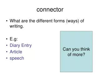
Connector. In pairs / groups of three, discuss: Is it more important to have text that looks good or that’s easy to read?. Key words. Serif and sans serif:. Sans serif means without serifs – the lettering is bolder and best used for short blocks of text like titles or slogans.

E N D
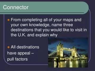
Connector • In pairs / groups of three, discuss: • Is it more important to have text that looks good or that’s easy to read?
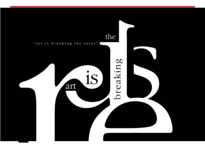
Key words • Serif and sans serif: Sans serif means without serifs – the lettering is bolder and best used for short blocks of text like titles or slogans Serif fonts have details, flicks and tails on there letters which draws your eye along it so it’s good for long sections of writing, like newspaper articles or books.
Learning Outcomes • All add text to their brochure design • All will try out different fonts • Most choose a suitable sans serif font for titles and a suitable serif font for longer text. • Most will experiment with different colour schemes. • Some may create colour schemes informed by market research of existing brochures and link this to their target audience • Some may create two different colour schemes aimed at different audiences.
Big Picture • Finish adding text to the brochure • Select a serif font (for long text) and san serif font (titles) and apply these font to design • Explore colour schemes • Look at examples and consider how it will appeal to your target audience.
Change your fonts These should be serif like Times New Roman Titles should be san serif like Arial
Fitting text around images You might find that you need to make your text fit around you image, like this Go to this symbol and click on it. You will then get options of how you would like your text to wrap around the image.
Adding a colour background Click on the box icon and draw a box the size of your whole brochure Then double –click on the colour fill box and select the colour you want for your background. Right-click, go to arrange and send this box to the back
Your document should now look like this: Now you can start to decide how your colour schemes Just like you did with your background box, you can change the colour of you other text boxes Make sure your text is still readable! You may need to change the colour of your text.
Gradient fill This icon allows you to have a gradient fill Drag and drop the line that you want your gradient to follow.
Strokes The tools here allow you change the colour quickly and to change the thickness of your line. 3-4 point is about medium Click on the box you want to frame then click on the icon with the box around it – here you can change the colour of the frame
Experiment! • Make sure you have changed all your fonts to serif for long text and sans serif for titles • Explore different colour schemes – harmonious or complimentary • Try adding borders to your boxes – think about width and colour? • Is you text readable? Do you want to make your titles larger.
Evaluate! • Have you use serif and san serif font correctly? • Have tried different colour schemes – harmonious and complimentary? • Have you added strokes to frame your boxes? • Have you considered how your colour scheme will appeal to the target audience?
Extension – do your own market research! • Show your brochure design to others in your class, teachers and TAs. • Do they find it readable? • Do they like the colour scheme? • Does the overall design appeal to them? • What would they like to see included in it ? • What would you do differently if you were starting this project over again?
Review • WWW: • What did you do successfully in this lesson • EBI: • What could you do to improve?