Download
1 / 9
90 likes | 211 Vues
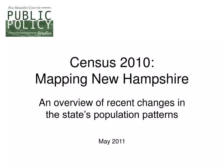
Census 2010: Mapping New Hampshire. An overview of recent changes in the state’s population patterns. May 2011. A search for patterns. New figures released this week by the U.S. Census Bureau add context to our understanding of the demographic forces shaping New Hampshire.

E N D
Census 2010:Mapping New Hampshire An overview of recent changes in the state’s population patterns May 2011
A search for patterns New figures released this week by the U.S. Census Bureau add context to our understanding of the demographic forces shaping New Hampshire. The following maps, prepared by Center staff, illustrate a handful of those data points to get a better grasp of how New Hampshire is changing. The illustrations are intended to provoke ideas, raise questions and inspire further conversations about the policy challenges and opportunities facing the state in the coming years. First, an animated snapshot of how we’ve aged over the past century….
Watch NH’s Population Change New Hampshire began the 20th Century with the majority of its population under the age of 30 and relatively few aged 60 and older. Watch how that shifts through the decades. Look out especially for the bump that arrives in the 1950 Census – the Baby Boom Generation – and see how they dominate the subsequent decades. (When you’ve watched the entire cycle, through 2010, press the down arrow key to continue the presentation.)
The most recent Census numbers help paint a more detailed portrait of New Hampshire’s demographic patterns. In this map, the darker the shade of the community, the older the median age of its residents. (The statewide median age was 41.1 years in 2010, up from 37.1 in 2000.) We see here that New Hampshire can essentially be divided into two regions when it comes to age: an older northern half, and a younger southern half. But even in the “younger” half, there is a further subdivision, with the eastern region – between Interstate 93 and the Seacoast -- significantly younger than the western portion. How might those divisions shape future policy discussions related to health care, education and public spending? (White areas of the map are unincorporated areas for which the Census Bureau did not release information.) 4
This map plots the oldest segment of the population – those aged 85 and older – town by town. (Statewide, 1.9 percent of New Hampshire’s population was 85 or older in 2010.) The darker communities, those with a higher share of elderly residents, will face additional challenges in caring for that population. And as New Hampshire ages faster than the nation as a whole, these communities will pave the way for the kinds of changes likely facing the rest of the state in coming years. An older population requires a different mix of social, health care, housing, transportation and other services. How can New Hampshire best prepare for those needs?
Here we see the number of seasonal homes in each community. The figures underscore the extent to which certain areas, mainly the Lakes Region and the lower White Mountains, rely on tourism and outdoor recreation for their economic vitality. In some of those communities, seasonal homes represent more than half of all housing units. (Statewide, roughly 10 percent of all residences were seasonal homes in 2010.) How might this distribution shape discussions about tax policy, environmental protection, and economic development? How are debates about local governance different in communities with a large share of part-time residents?
Regional population patternsare important, too Change in Population by County (1960 to 2010) 500,000 Each bubble represents a county’s population at the start of a certain decade, beginning in 1960. As the bubble rises, the county’s population increases. The size of the bubble represents the county’s share of total state population. Hillsborough 2010 400,000 Rockingham 2000 1990 300,000 1980 Population 1970 200,000 1960 Strafford Grafton Cheshire 100,000 Belknap Carroll Coos Sullivan Merrimack Hillsborough and Rockingham counties have seen the sharpest population growth, while only Coos County has seen a decline.
Still growing – but also growing older • New Hampshire continues to grow, but at a slower rate than in the recent past. Our population increased 6.5 percent over the past decade, compared to an 11.4 percent increase between 1990 and 2000. • The state also grew slightly more racially diverse over that period. • The aging of the population over the past two decades is also evident – from a median age of 33 in 1990 to 41 in 2010. And the population aged 35 to 64 years increased by 10 percent over the past two decades, while the portion aged 20 to 34 years fell by 8.5 percent. • However, both of those trends slowed in the past decade relative to the decade before that one. Source: U.S. Census Bureau
Want to find out more? • For more information on New Hampshire demographics, as well as many other public policy issues, visit the Center’s website at nhpolicy.org. • For more U.S. Census data, go to census.gov. • Check out the Center at facebook.com/nhpolicy and twitter.com/nhpublicpolicy.