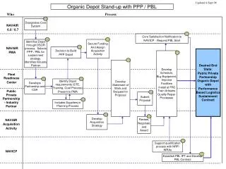
Download
1 / 15
150 likes | 307 Vues
6.7. Scatter Plots. 6.7 – Scatter Plots. Goals / “I can…” Write an equation for a trend line and use it to make predictions Write the equation for a line of best fit and use it to make predictions. 6.7 – Scatter Plots.

E N D
6.7 Scatter Plots
6.7 – Scatter Plots • Goals / “I can…” • Write an equation for a trend line and use it to make predictions • Write the equation for a line of best fit and use it to make predictions
6.7 – Scatter Plots • A scatter plot is a collection of data that explains a situation. We can enter a scatter plot onto our calculator.
An effective way to see a relationship in data is to display the information as a __________________. It shows how two variables relate to each other by showing how closely the data points _______ to a line. scatter plot fit The following table presents information on tornado occurrences. Make a scatter plot for the table.
1200 1000 800 600 400 Do you notice a trend? 200 1950 1955 1960 1965 1970 1975 1980 1985 1990 1995
Scatter plots provide a convenient way to determine whether a ___________ exists between two variables. correlation positive A __________ correlation occurs when both variables increase. negative A ___________ correlation occurs when one variable increases and the other variable decreases. If the data points are randomly scattered there is _______ or no correlation. little
Positive correlation Negative correlation little or no correlation
Example 1: The scatter plots of data relate characteristics of children from 0 to 18 years old. Match each scatter plot with the appropriate variables studied. 1. age and height 2. age and eye color 3. age and time needed to run a certain distance no correlation between age and eye color as your age increases your height also increases 2 1 as your age increases the time will decrease 3
Sometimes points on a scatter plot are represented by a trend line or a _______________________. You can study the line to see how the data behaves. You may have a basis predict what the data might be for values not given. line of best fit Example 2: Find the line of best fit for the scatter plot you made on the first page. To fit the line to the points, choose your line so that it best matches the overall trend. The line does not have to pass through any of the points.
6.7 – Scatter Plots • A trend line is the line that appears to explain the data. Where is a good line to fit the data you graphed? • Our calculator will find the line that explains the data the best. It is called the Line of Best Fit. (Regression Line)
Use the line of best fit to predict how many tornadoes may be reported in the United States in 2015 if the trend continues. 1200 1000 800 600 If the trend continues we predict that there will be 1200 tornadoes reported in 2015. 400 200 1950 1955 1960 1965 1970 1975 1980 1985 1990 1995 2000 2005 2010 2015
6.7 – Scatter Plots Steps to find line of best fit. 1. Make sure you have put your numbers into lists (STAT >> EDIT) 2. Press STAT 3. Press CALC 4. Press 4 - LineReg 5. Make sure the lists are L1 and L2 6. Press Enter
6.7 – Scatter Plots Your screen should have • A= • B= • r= • r is the Correlation Coefficient. This number explains how good of a fit is the data. If the number is close to 1 or –1 then the line of fit is really good.
If the data points are close to the line of best fit, it is said to have a ___________correlation. strong strong positive weak positive strong negative weak negative
6.7 – Scatter Plots Example: • Find the line of best fit for the given data.