Download
1 / 9
90 likes | 257 Vues
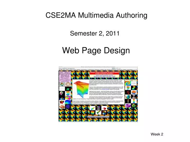
CSE2MA Multimedia Authoring. Web Page Design. Semester 2, 2011. Week 2. These days many web sites are full-on multimedia applications. The first aspect of the multimedia application that a client sees is the web site. The web site needs to be well-designed to capture a client’s attention.

E N D
CSE2MA Multimedia Authoring Web Page Design Semester 2, 2011 Week 2
These days many web sites are full-on multimedia applications. The first aspect of the multimedia application that a client sees is the web site. The web site needs to be well-designed to capture a client’s attention.
Web page components When designing a web site we need to consider the components of web pages Background – plain color or image Text – content, color, font, size Graphics – size, position, color, animated Links – text, graphics, buttons, color, size, position
What can we learn from bad web sites? Smith and Goldsmith DPGraph Gates N Fences Xerox
What can we learn from good web sites? Peter's Body Shop Stuart Row Landscapes RMJM ToysRus
Good web site design suggestions Text Not interrupted by background Big enough to read but not too big Columns of text are narrower than in a book Navigation Buttons and bars are easy to use Consistent throughout web site User always knows where they are in the site
Good web site design suggestions Links Colors coordinate with page colors Underlined so instantly clear to user Graphics Buttons not too big and dorky Every graphic link has matching text General Pages download quickly Width less than 1024 pixels Graphics used to break up large areas of text Consistency between pages in a web site
Poor web site design Backgrounds Color combinations that make text hard to read Distracting backgrounds Text Too small to read Stretches all the way across the page All in caps All in italics Underlined text that is not a link Links Don’t work Not underlined In the middle of text Not clear where they go Too many
Poor web site design Graphics Take ages to load Don’t fit on screen Too small to discern Missing Tables Dorky borders General A need to scroll sideways No focal point on page Too many focal points on the page Lack of contrast