Download
1 / 6
60 likes | 145 Vues
Media research . Simone Tierney . Text Platform Conventions. What the magazines includes: Mast head High quality photography Barcode Website link Images that are relevant to the magazine Information within the magazine Laminated paper Issue number Date Background image

E N D
Media research Simone Tierney
Text Platform Conventions What the magazines includes: • Mast head • High quality photography • Barcode • Website link • Images that are relevant to the magazine • Information within the magazine • Laminated paper • Issue number • Date • Background image • High quality colours
Genre Conventions • Student school magazine • Main header of the magazine • Bold headings which catch the readers eye saying what's in the magazine • Images of students representing the school • Clear, relevant fonts • Images of the school or the students showing the school uniform • Colours of the magazine need to match the colour of the school (logo)
Close Analysis of Good Magazine Example • Colour – purple and white.Connotations: It is a purple and white theme, the main image is a boy and a girl they are wearing very smart plain colours so that they don’t overtake the text. • Font – Sans Serif fontFormal font – the font is serif, and is clear to read for the readers, the headers are in italic and bold and are a bigger size than the rest of the text used on the magazine. The text is black and purple which must be relevant to the theme. • Image – one image Main image – the main image is the background image which is a girl and a boy smiling looking at the readers. The text is in front of the image, this is so that the image does not overtake the texts, as the magazine makers want the readers to see the information. • Language – FormatThere are rhetorical questions, the word ‘FREE!’ stands out to the readers as its in capital letters and in a circle on the corner of the magazine. • Layout – plainthe mast head is clear, and easy to read. There are small sections of texts that describe what is in the article.
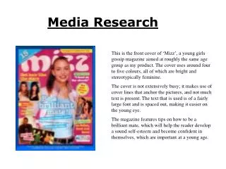
Close analysis of a bad magazine • Colour – blue, orange, yellow, pink This magazine is bad because they use different colours, it is not related to the colour of there school, the colours and random as it looks like someone hasn’t made much effort for this magazine. • Font – Sans Serif fontthe font Is used in different ways as there are different types of fonts, this is bad because it looks messy and scruffy, the title does not have capital letters which is bad as it makes it informal. They have made the title smaller than the other texts that are on the magazine. • Image – one image main image • There is a main image which overlaps the texts, it is an image of two students in there school uniform which what the magazine is about. • Language – Formatthe language format are used to persuade the readers. • Layout – plainThe layout is bad as it can look messy to certain readers, the image overlaps some parts of the texts which shows that people haven't made an effort with it.
Audience research Profilingyoung students that are in full time education • Images of - School Students • Topics - The schools news Uniform