1 / 0

Consistency in Communication Design

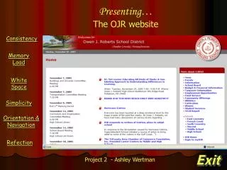
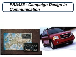
Consistency in Communication Design. Objectives. A strategic approach to communications. Determine the most appropriate communications tactics – does it always make sense to print? Achieve greater impact, implement high quality, effective communications.

edana
Télécharger la présentation

Consistency in Communication Design

An Image/Link below is provided (as is) to download presentation Download Policy: Content on the Website is provided to you AS IS for your information and personal use and may not be sold / licensed / shared on other websites without getting consent from its author. Content is provided to you AS IS for your information and personal use only. Download presentation by click this link. While downloading, if for some reason you are not able to download a presentation, the publisher may have deleted the file from their server. During download, if you can't get a presentation, the file might be deleted by the publisher.

E N D

Presentation Transcript


  1. Consistency in CommunicationDesign
  2. Objectives A strategicapproach to communications Determine the most appropriate communications tactics – does it always make sense to print? Achieve greater impact, implement high quality, effective communications. Create resource efficiency for both personnel and material.
  3. Electronic outreach is an effective strategy to reach the public
  4. Effective use of personnel and material Engineers, managers, and administrative staff producing postcards, flyers, etc. is NOT an effective use of their time By combining print runs, the city saves money and resources Producing electronic material instead of printed material saves additional funds For example: The amount of paper expected to be saved annually by producing the new electronic version of the city’s “Grady Grapevine”: 8,400 sheets Using multiple methods of communication achieves better results
  5. Creating Professional Publications Create a standard appeal that brands our city Leverage the mileage we have from the marketing campaign yet establish a distinct city presence Take advantage of the branding power of our website Ensure consistency and better alignment Streamline our process Establish standards and protocols for the use of logo, website address, ADA information, etc Create the ability to target Externally to appeal to diverse customer needs Internally to reflect the uniqueness of our programs and departments
  6. Previous City of Renton publications Diverse subject matter but no cohesive design standard,inconsistent logo use and no unified presence.
  7. Previous City of Renton publications Design inconsistent between city departments; sometimes inconsistent even within same department Many city brochures/flyersare being designed byengineers, administrativestaff and wide rangeof staff
  8. Recent City of Renton publications Diverse subject matter with numerous color choices and distinctive presentation, while subsequentlyproviding cohesive design standard, a more consistent logo use and unified presence.
  9. Recent City of Renton publications Create high-quality professional publications without expending additional resources while leveraging our “brand” Consistent use of city brand, city logo and “Ahead of the Curve” Consistent placement of website and other key information
  10. City’s Look New city “brand” isconsistent and cohesive, while allowing diversity with the use of images and color choices to target various audiences, promote varying events anddifferentiatedepartments
  11. Recent City of Renton publications Use of “Wave”with city logopulls fromwell establisheddesign elementssuch as the city’shome page onthe web
  12. Recent City of Renton publications Design lends itself well to photographs and many diverse functions, including posters, brochures, flyers, and Power Point presentations
  13. Recent City of Renton publications We’ve trained key staff to use standard software and follow consistent design guidelines Templates allow consistent look that is replicable by any/all members of trained communications team
  14. City’s current letterhead, business cards Out-of-date e-mail addresses Outdated color paper stock Lack of consistency, with several variations of business cards (e.g. gold foil on some, printed others) Complicated and more expensive printing process “Ahead of the Curve” marketing campaign logo not included on business cards
  15. Proposed new letterhead, business cards Includes new e-mail addresses Utilizes same “family” of paper, therefore no additional costfor transition to new paper New business cards, stationery and envelopes will be transitioned into service without incurring undue additional costs Streamlines printing process and potentially saves cost
  16. Next Steps City-wide needs assessment and roll-out of design options Create design templates and manual Transition to new stationary Create centralized photo library Continue communications training
  17. Examples “Wave” -vs- “Swoosh”
  18. Examples “Wave” -vs- “Swoosh”
  19. Examples “Wave” -vs- “Swoosh”
  20. Examples “Ahead of the Curve” use. When? Where? Front Cover Back Cover
  21. Examples “Ahead of the Curve.” When? Where? Upper Right
  22. Examples “Ahead of the Curve.” When? Where? Upper Right Lower Right
  23. Examples “Ahead of the Curve.” When? Where? Back Page, Centered Upper Right Lower Right
  24. Examples Color. Have fun with it…
  25. Examples Color. Have fun with it…
  26. Examples Color. Have fun with it…
  27. Discussion Any questions? Comments? Suggestions?
  28. Next Steps City-wide needs assessment and roll-out of design options Create design templates and manual Transition to new stationary Create centralized photo library Continue communications training
More Related