Download
1 / 22
250 likes | 285 Vues
INTRODUCTION TO TYPOGRAPHY DESIGN. Goals of typographic design. Typography plays an important role in how audiences perceive your document and its information. Good design is about capturing your audience ’ s interest and helping your audience gather information quickly and accurately.

E N D
Goals of typographic design • Typography plays an important role in how audiences perceive your document and its information. • Good design is about • capturing your audience’s interest and • helping your audience gather information quickly and accurately. • Typography creates relationships between different types of information, both organizing this information and keeping it interesting.
Design principles for typography • Legibility: Making sure the audience can read and understand your text. • Similarity, alignment: Using typography to create relationships between similar kinds of information. • Uniformity or consistency: Repeating familiar elements to focus your audience’s attention. • Contrast: Creating interest and distinguishing different types of information with different typefaces. One element of contrast is hierarchy—making sure the audience understands that information has different levels of importance.
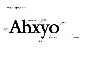
Typography and legibility • Legibility is a combination of factors: • Font family • Font size • Letter, word, and line spacing • Alignment
Stroke Line Stroke Legibility and font families
Legibility and body text size • Legibility of body text varies for different audiences: • Younger audiences may be able to read fonts sized at 8 or 9 points. • Older audiences may be able to read font sizes around 10 points or above. • Font sizes above 14 points break down the continuity of the text, making text appear too gray.
Legibility and spacing • If letters, words, or lines are too close together, readers have a hard time because text blocks tend to look too dark. • If letters, words, or lines are too far apart, readers have a hard time because blocks of text tend to look too light, causing readers to lose a sense of continuity. • Spacing between words needs to be consistent to promote legibility; too much variation leads to eyestrain.
Legibility and alignment • Left-aligned text is most legible, because spacing between words is uniform. • Justified text is also legible, though less so with shorter line lengths because it tends to create uneven spaces between words.
Legibility and alignment • Center-aligned and right-aligned text is generally harder to read, because your readers’ eyes are used to following text from left to right.
Font families and audience • Each font family has a different “personality.” • Use different font families to evoke tone and mood. • An advertisement for a school, for example, might use an “elegant” font such as • An advertisement for a financial firm, on the other hand, might use a more “modern” font such as
Font families for headings • For body text, you may want to use something fairly conventional and legible. • For headings, consider audience: teenagers respond to different fonts than businesspeople or academics. • Choose font families that support your subject matter, or deliberately use a contrasting font to create interest.
Similarity and alignment • Aligned text creates a line in your design; such lines help readers draw connections between different parts of a document.
Uniformity and font families • To maintain overall uniformity, limit the number of different font families per page to one or two. • Use the same font for headings and body text to produce a uniform look; this is known as concordance.
Contrast and font families • Using the same font family throughout creates uniformity but may make documents seem “flat” or uninteresting. • You can add interest by contrasting the display type and body type.
Contrast and font families • To create contrast, you could use two font families, one serif and one sans serif. Heading is set in Impact—a sans serif font Subheading is set in Georgia—a serif font
Conflict and font families • To avoid conflict, many designers avoid using two font families of the same variety, such as two serif fonts. Heading is set in Palatino—a serif font Subheading is set in Georgia—also a serif font
Contrast and tracking • Tracking refers to the space between all of the letters in a line. • Font families have built-in tracking that works well for body text. • For headings, you can change tracking to create contrast. Heading is set with wide tracking
Contrast and baseline shift • Designers shift baseline to create interest: Dropping the first letter adds a playful look. Moving other letters around creates a “jittery” effect.
Hierarchy and typography • Use typography to guide readers through the levels of your document. • Use different headings by changing font family, font type, font size, font color. • To promote uniformity and help your audiences navigate, keep typographic choices consistent for each subsection throughout the document.
Hierarchy and typography • Hierarchy helps your audience distinguish between levels of information, such as headings versus body text. • Many documents are divided into hierarchical sections: Main title Section Subsection Or Book Chapter Subheading Sub-subheading
Example of hierarchy Top-level headings can use unconventional fonts Different levels use different font sizes, font families, font colors, and leading. These headings look the same because they express the same level of hierarchy
Summary • Typography can play a key role in design. • Good typography starts with font family; choose these to meet your design goals, but keep them limited. • Use text alignment to create relationships between different kinds of information. • Create contrast by using a serif font for headings and a sans serif font for body text (or vice versa). You can also use italics, bold, tracking, or color to create contrast. • Use contrast to indicate hierarchy.